|
|
|
Showing 971 - 980 of ~9205 |
| Image |
Comment |
| 08/08/2008 04:21:01 PM | |  Photographer found comment helpful. Photographer found comment helpful. |
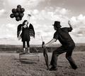
| 08/08/2008 04:18:37 PM | The Re-Trainingby ColeyComment: a neat idea, and setup, but it seems to lack some of the "mystique" of the earlier shots. Not sure why. | | Photographer found comment helpful. |
| 08/08/2008 04:17:16 PM | | | Photographer found comment helpful. |
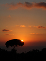
| 08/05/2008 05:00:50 PM | Sunset in southern Italyby Rino63Comment: CRITIQUE CLUB CRITIQUE
by karmat
Compositionally, I really like the placement of the tree and the "layers" in the sky. All of that combines to make a really nice, balanced composition.
Technically, the silhouette is nice, and you have done well not to "blow out" the sun.
Overall, I think this is a lovely image and very nicely done. It definitely conveys the idea of "heat" to me. The subject matter, unfortunately, may have made some voters gloss over it, but the score is respectable. It does seem a touch "flat" to me, and while this may happen some with silhoettes, I'm not sure of the best way to correct it, other than making more of the background visible.
Best to you in future challenges.
Karma | | Photographer found comment helpful. |
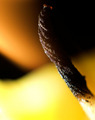
| 08/05/2008 04:44:26 PM | blackoutby pochvComment: CRITIQUE CLUB CRITIQUE
by karmat
Compositionally, I really like this. The colors are as much the subject as the wick, and they interact and work together nicely.
Technically, I think the focus is good, and the colors are awesome.
Overall, to me, it does convey a sense of "heat" and it is a very good abstract. I suspect, though, the sub-5 score is largely due to the fact that it is abstract, and many people may not have taken (or had) the time to really look at it and realize what it was. Also, the white area in the bottom right is very distinguishable and may have captured people's attention quickly. Since it is not in focus, that could have caused some to feel that the rest was unfocused as well.
Best to you in future challenges.
Karma |
| 08/05/2008 04:39:40 PM | HOT by Definition!by 777STANComment: CRITIQUE CLUB CRITIQUE
bykarmat
Compositionally, this shot doesn't feel really balanced. At the bottom, the numerals are "straight," but then the top of the sign is "tilted." That is just a bit disconcerting, I think. For whatever reason, I'm thinking having more of the bricks would help add context and interest (and color) to the shot.
Technically, the focus, lighting and contrast is good. It does seem a bit "flat" but a lot of times that happens when shooting signs with no surrounding area around them. Also, as has been mentioned, cutting half a logo out is always an attention getter.
Best to you in future challenges.
Karma | | Photographer found comment helpful. |
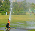
| 08/05/2008 04:35:47 PM | HOT by mshafeeqmComment: CRITIQUE CLUB CRITIQUE
by karmat
That looks like fun.
Compositionally, everything in your frame is leading the eyes out of the picture. While that may be your intent, the overall effect is that the viewer may not look at the picture long, and if they do, it tends to feel off-balanced. If the boy was in the lower right corner, and teh gentleman in white was where he is, you would have a strongly balanced shot, I think. As it is, though, the boy is near the edge of the frame, facing out, and the man in white is walking out. Those in the upper right, while not as distinguishable, also look like they are getting ready to run out of the frame as well.
Technically, you have captured the action well. The saturation of the greens is a bit much, to me, and I (personal opinion) think that bringing the greens and yellows down, would make this shot have a much more natural appearance.
Good work and best to you in future challenges.
Karma |
| 08/05/2008 04:30:49 PM | mmmmmmmmmmmm... Lighter Fluidby Shutter-For-HireComment: CRITIQUE CLUB CRITIQUE
by karmat
Interesting idea. I think if the background had been less textured, the "E" would have shown up better. Of course, it may have burned your background up, as well. :)
The focus and colors are good -- no major suggestions there.
The biggest thing I would look at is experimenting with crops. This one feels very centered, and leads it to seem static-y.
Perhaps the "E" in a corner with a lot of negative space would have been cool, or soemthing like that -- anything to draw attention to the fire.
A neat idea, though, and one that I think could really grow into something compelling and unique with some practice. | | Photographer found comment helpful. |
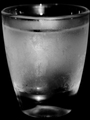
| 08/05/2008 04:25:56 PM | Ice Cold Vodkaby vladoComment: CRITIQUE CLUB CRITIQUE
by karmat
Overall, I think you have met the challenge in an obvious enough fashion. The visible thumprint is actually a neat touch (no pun intended) and adds a bit of interest and "story" to the shot. (again, no pun intended).
Compositionally, I like how it "fills" the frame, but it seems a bit static to me. There is really nowhere for the eyes to "go," or anything to see except the glass. As a result, the dpc voter probalby looked, said, "Cold glass," voted and moved on. Perhaps a more dramatic angle or perspective would have helped to add interest. As it is now, I feel like I am almost eye level with the glass, maybe a touch above, and while this is a natural viewing level, it doesn't add to the interest much at all. Also, the crop is just a touch off so it is not symmetrical, though it feels it should be.
technically, I think the bw is a good choice for this. the focus and exposure are very good.
Again, I think you had a good idea, and you executed it well, technically, but the composition leaves it a bit "ho-hum" and doesn't compel the viewer to stay with it long. | | Photographer found comment helpful. |
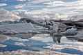
| 08/05/2008 02:09:32 PM | Ice cold by unnevaComment: CRITIQUE CLUB CRITIQUE
by karmat
What's not to like? :) It is a lovely scene that fits the challenge extraordinarily well.
The only little nitpick and it obviously didn't affect your score negatively, is that your horizon is completely in the middle. While this affords a nice view of both the sky and water, moving it up or down might have made it feel more dramatic.
THAT SAID, I think this image exemplifies how the "rules" of photography can be broken and still be a wonderful, strong image.
Great image and congrats on your ribbon.
Karma | | Photographer found comment helpful. |
|
Showing 971 - 980 of ~9205 |
Home -
Challenges -
Community -
League -
Photos -
Cameras -
Lenses -
Learn -
Help -
Terms of Use -
Privacy -
Top ^
DPChallenge, and website content and design, Copyright © 2001-2026 Challenging Technologies, LLC.
All digital photo copyrights belong to the photographers and may not be used without permission.
Current Server Time: 06/21/2026 03:22:25 PM EDT.
|