| Image |
Comment |
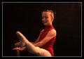
| 09/29/2008 10:58:00 AM |
IMG_7043-720.jpgby BarbBComment: I really like the composition and the lighting in this. The focus is a bit soft, though. Too soft to feel in focus and not soft enough to be soft. Looking at your settings, I'm thinking the plane of focus just isn't falling where the eyes expect it -- it is very shallow. The shoulder looks in focus, and her left eye, but the rest feels soft. Maybe a deeper dof would help? |
 Photographer found comment helpful. Photographer found comment helpful. |
| 09/29/2008 10:56:08 AM |
IMG_5772-720.jpgby BarbBComment: I like the lighting on this. The composition seems a bit off balance to me -- maybe tighter on the right, or a vertical crop? OR keep the horizontal and move her more to the right in the frame. |
| Photographer found comment helpful. |
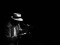
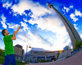
| 09/29/2008 10:55:03 AM |
The Poetby bvyComment: I like this and the use of negative space is effective. It almost looks like his hat is floating. |
| Photographer found comment helpful. |
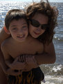
| 09/29/2008 10:39:59 AM |
My Kidsby KelliComment: I really like the cropping on this one, and the relaxed look that they both have.
I think the faces could be even a bit more bright/more contrasty. They just seem kinda flat. |
| Photographer found comment helpful. |
| 09/29/2008 10:38:17 AM |
Portrait 07by KenComment: Nice eyes.
She looks a little discontent -- or like she is thinking, "Go ahead and take the stinking picture."
The spokes out of her head are a bit distracting. Almost a statue of liberty look.
I like the lighting though -- very even and not too bright. I don't see a "light blob" on her head. |
| Photographer found comment helpful. |
| 09/29/2008 10:36:09 AM |
Her Handby bvyComment: Can you use a faster shutter speed for the drive by shooting?
I like the angle of the shot, and the overall colors, but there is something about the processing that just doesn't "sit" with me. Maybe a sharper focus might help (for your next drive by). |
| Photographer found comment helpful. |
| 09/27/2008 12:21:29 AM |
Number 6.jpgby karmatComment: I really didn't do anything but add a vignette to this, that I remember. I see what bvy is talking about, but I'm thinking that is resizing artifacts, etc. as it is not visible on the full size original. |
| 09/13/2008 12:04:10 AM |
But, Mommaby karmatComment: Lonni -- I think it was just the way the sun was shining. It is natural light, and the sun was beginning to set just behind me and to my right just a touch (model's left and front). |
| 09/10/2008 08:48:14 AM |
Allllmost got it... by Shutter-For-HireComment: Great idea, and I like the composition, and the effect you have achieved. However, and I say this in the nicest way possible, your saturation levels border on obnoxious. Actually, I think they cross the line, but I bet you will do really well. |
| Photographer found comment helpful. |
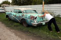
| 09/10/2008 08:46:32 AM |
Not giving upby badsilverfox66Comment: I think the composition of this shot would be helped greatly by getting a bit closer and not including quite so much of the surroundings. As it is, I find myself following the "wall" up and through the frame to the other cars, the RV, etc, and just generally looking at the surroundings rather than what you are showing. Maybe if you just included the backend of the car, and her hands, and had really good focus and exposure (which looks okay at this distance), it would be a more interesting shot. |
| Photographer found comment helpful. |
Home -
Challenges -
Community -
League -
Photos -
Cameras -
Lenses -
Learn -
Help -
Terms of Use -
Privacy -
Top ^
DPChallenge, and website content and design, Copyright © 2001-2026 Challenging Technologies, LLC.
All digital photo copyrights belong to the photographers and may not be used without permission.
Current Server Time: 06/21/2026 10:09:37 AM EDT.