| Image |
Comment |
| 06/04/2002 04:45:00 PM |
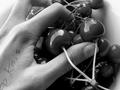
after schoolby ritaardComment: Black and white shows the contrast of the smooth texture of the cherries and teh rougher texture of the hands very well. I can also imagine that this shot would be awesome in color as well. |
| 06/06/2002 05:13:00 PM |
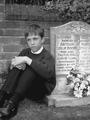
The one great certainty "No grey area's"by DogmanComment: Having the boy dressed in dark clothes helped set the "mood" and provided a good contrast. I almost felt like he looked kinda stiff and formal, but then again, that goes with the mood, I guess. His facial expression is very somber and solemn, as it is supposed to be. |
| 06/05/2002 05:01:00 PM |
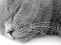
Zzzzzzzz...by jochenComment: Cats look so innocent when they are asleep. :-) I really like the way you've done this -- framing, lighting, focus, etc. Very well done. |
| 06/05/2002 04:22:00 PM |
Not a care in the world...by geekmediaComment: "Oh, my, it's that camera-thing again." Nice capture of the expression. It's a little too bright on the left side, but I'm not sure if that is a serious detraction. |
| 06/04/2002 04:43:00 PM |
|
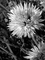
| 06/05/2002 06:00:00 PM |
Chive Flowerby KarenBComment: This picture is too sharp/pixelated. It looks to me like a digital zoom, or trying to stretch a low res picture to be bigger. If possible, try to take teh picture at your camera's highest resolution, then you will have some room to crop, etc. It's composed well, and I like how the flowers are focused, but the background is not. |
 Photographer found comment helpful. Photographer found comment helpful. |
| 05/31/2002 02:38:00 PM |
Is This Right?by Dangerous_bluesComment: Hilarious. If this wasn't set up, I can imagine that somebody came chasing after you! :-) Black and white works well to tone down the variety of colors that are obviously there. |
| 05/28/2002 08:29:00 PM |
Snuckby JohnnyBoyComment: That's an interesting way to frame the shot, but there is almost too much frame and not enough picture. I like the colors -- the blue against the bricks. |
| 05/28/2002 03:49:00 PM |
|
| 05/30/2002 08:55:00 PM |
The disguise of Innocenceby cthenkComment: You have filled up the frame nicely. This picture is one that would be good centered exactly, I think. As it is, it is just slightly left of center and it gives it a slightly off-balanced feeling to me. Great capture of the kids' expression. |
Home -
Challenges -
Community -
League -
Photos -
Cameras -
Lenses -
Learn -
Help -
Terms of Use -
Privacy -
Top ^
DPChallenge, and website content and design, Copyright © 2001-2026 Challenging Technologies, LLC.
All digital photo copyrights belong to the photographers and may not be used without permission.
Current Server Time: 06/20/2026 01:42:00 AM EDT.