| Image |
Comment |
| 06/13/2002 04:24:00 PM |
STOPby arnitComment: Very good (and ironic) use of blur. |
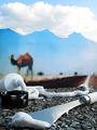
| 06/13/2002 04:33:00 PM |
|
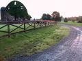
| 06/10/2002 05:16:00 PM |
Asphalt Mirageby hokieComment: This is so freaky, it's neat. I can't wait to see how you set this up. It has good depth and teh textures are really clean. |
| 06/13/2002 04:48:00 PM |
Stop Working on Sunday!by terrentiusComment: I like the concept, here. Since it is an "on the road" challenge, I wish the stop light was more the subject (more visible) than the buildings. |
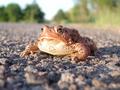
| 06/13/2002 04:49:00 PM |
Toad on the Road by connieComment: Good use of focus and blur. I love this picture, and the humor behind it. I thought about something like this (thinking of the video game "Frogger"), but you've done it better than I could ever have. I also like the colors. |
| 06/10/2002 05:08:00 PM |
Husky Hitch Hikerby Photo JimComment: I'm glad he's leaning, that keeps the pole from coming straight out of his head. I bet ya'll got some strange looks. :-) It's a little flat to me, and I think a different angle would've made a more effective picture. Having said that, dpc is great, but not worth getting run over for. Did you try experimenting by cropping it so that he was not in the exact middle? |
| 06/14/2002 11:28:00 PM |
Westbound Readerby ClubJuggleComment: had to look at it a couple of times before I "discovered" the title of the book. It was almost too subtle, but an excellent picture, nonetheless. |
 Photographer found comment helpful. Photographer found comment helpful. |
| 06/11/2002 04:41:00 PM |
Into the Nightby rcrawfordComment: I like the use of symmetry here. a more spectacular sunset (I fully understand that was completely out of your control) would have made this picture incredible. |
| Photographer found comment helpful. |
| 06/10/2002 05:23:00 PM |
Cotton Candy Stopby GordonComment: Nice color contrasts and capture of texture on the sign and pole. Cropped a touch too tight on the right, I think. |
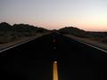
| 06/11/2002 04:42:00 PM |
|
Home -
Challenges -
Community -
League -
Photos -
Cameras -
Lenses -
Learn -
Help -
Terms of Use -
Privacy -
Top ^
DPChallenge, and website content and design, Copyright © 2001-2026 Challenging Technologies, LLC.
All digital photo copyrights belong to the photographers and may not be used without permission.
Current Server Time: 06/20/2026 11:55:00 AM EDT.