| Image |
Comment |
| 07/11/2002 12:29:00 PM |
|
| 07/14/2002 07:30:00 PM |
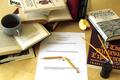
Should Have Studied Last Nightby sheyingshi88Comment: So glad I'm not in school anymore. Well, full time anyway. :-) It s a well shot picture: good composition, focus, lighting, etc. I think maybe the paper shoulg have been more of the focal point, and instead of running out of the picture, it would fill more of the frame. To me, the books seem to fight for attention. |
| 07/09/2002 10:44:00 PM |
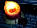
Blackoutby aelithComment: Interesting exposure and saturation. A touch of irony, too. Wonder what people would have said if you had shown a monitor that was on? (I doubt some would even catch it. :-)) |
| 07/10/2002 01:28:00 PM |
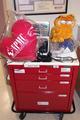
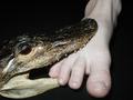
Heat Attackby jerryComment: Is Garfield a commentary for all of us who eat unhealthily? :-) Interesting composition, I think an upward angle might have given a more impending feeling. Then, the cart would have seemed bigger and more looming. Your angle gives the feeling that I am looking down on it, and thus have control over the situation. Of course, I understand you can't just go around in a hospital (?) taking pictures whereever you like. karmat PS -- Was it supposed to be "Heat Attack" or did you mean "Heart Attack" |
| 07/10/2002 01:42:00 PM |
Crikey!by crisa58Comment: I like the black background. Maybe needs a little more space at the bottom. It seems cropped a little too close. |
| 07/10/2002 03:14:00 PM |
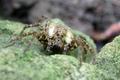
Lycosidae sp.by UberFishComment: Good focus. Well, executed photograph. I don't think I like looking spiders in the eyes even though spiders usually don't bother me. |
| 07/09/2002 04:56:00 PM |
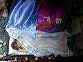
mask the fearby censuraComment: Took me a minute, but I think I understand what you may have been trying to do here. Thought-provoking. i like the colors, but the light is a little harsh on the lower left. Maybe you could bounce/reflect it to get a more even lighting situation. |
| 07/13/2002 02:20:00 PM |
Who's afraid, me or the goatby jimsappComment: I think this picture could be improved by adjusting it so that it has a little more contrast and/or brightness. Also, if it had been possible to get closer so that the goat filled up more of the frame, and wasn't so close to the bottom, it would have been better balanced, I think. |
| 07/09/2002 10:41:00 PM |
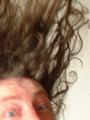
Scaredby RemieComment: interesting composition and framing. The blur gives it the impression of falling. Intentional? Or is your subject so scared their hair stands up on end? (hehehe). I think a touch less light on the left might have been better. |
| 07/08/2002 12:27:00 PM |
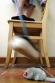
Eeek!by JonniboyComment: Hahahaha. I like the blur of the broom, and the clear focus elsewhere. Cats are more effective :-) karma |
Home -
Challenges -
Community -
League -
Photos -
Cameras -
Lenses -
Learn -
Help -
Terms of Use -
Privacy -
Top ^
DPChallenge, and website content and design, Copyright © 2001-2026 Challenging Technologies, LLC.
All digital photo copyrights belong to the photographers and may not be used without permission.
Current Server Time: 06/21/2026 01:31:24 PM EDT.