| Image |
Comment |
| 07/10/2002 02:58:00 PM |
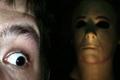
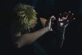
Did You Ever Get The Feeling...?by chuckComment: I think the model's head alone in the picture with a lot of negative space on teh left would have been effective. OR if the face in the forefront was as dark as the other. Did you use a flash? If so, maybe if you can cut it off and use other sources of light to illuminate your subject, then it won't be so bright or harsh. |
| 07/10/2002 01:39:00 PM |
Say ahhhhhhhh.by wargloryComment: Wish the needle had been focused, and the rest blurred. That would have been awesome. Good idea. May need to be cropped just a touch on the right. |
| 07/09/2002 10:47:00 PM |
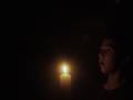
Who's There?by DogmanComment: The darkness and slight illumination on the kid's face really sets a mood. I know it is supposed to be dark, and on my monitor it is okay, but some people's seem to be darker. If you get a lot of comments to that end, sometimes it helps to submit a picture that is a shade or two brighter than what you really like. It may lose a touch of the effect on some monitors, but it seems to insure that everyone can see the picture. |
| 07/10/2002 02:49:00 PM |
The taxman comethby waltomlComment: Good composition and focus. I don't know if it would make it better or not, but maybe an angle slightly sideways to the mailbox, so that the mailbox fills up the frame that the letter doesn't. With the paper box on the right, it seems somewhat unbalanced. karmat |
| 07/10/2002 03:00:00 PM |
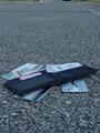
Lost Identity!by tjpierreComment: since you have so little of the horizon, it may have been better to go ahead and crop it out altogether. This is scary. A $100 sticking out of the wallet would have been interesting, but if your wallet is like mine, those may be scarce. :-) karmat |
| 07/10/2002 02:46:00 PM |
Fear Thisby David EyComment: that kinda unnerves me, frankly. good focus and use of blur to create depth. karmat |
 Photographer found comment helpful. Photographer found comment helpful. |
| 07/12/2002 12:44:00 PM |
A DaughtersFearby boyte1Comment: Awesome, one of my favorite 3 this week. Great colors, lighting, use of shadows. karmat |
| 07/09/2002 04:59:00 PM |
Before Piercingby darylbrownComment: She definitely looks uncomfortable, and the hand entering on the right adds a nice effect. I think it might have seemed more balanced if your subject was little further left in the picture. That would have gotten rid of some of that empty space too. The labtech sign in the back would make me fearful, too. |
| 07/10/2002 03:04:00 PM |
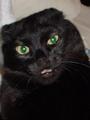
Scaredy Catby iggy386Comment: Ears back, claws will follow. Was this shot taken with a flash? It gives the cat a strange green-eyed look. |
| 07/14/2002 11:29:00 PM |
|
Home -
Challenges -
Community -
League -
Photos -
Cameras -
Lenses -
Learn -
Help -
Terms of Use -
Privacy -
Top ^
DPChallenge, and website content and design, Copyright © 2001-2026 Challenging Technologies, LLC.
All digital photo copyrights belong to the photographers and may not be used without permission.
Current Server Time: 06/21/2026 02:59:31 PM EDT.