| Image |
Comment |
| 08/06/2002 11:24:00 AM |
The Choice of An Old Generationby csbComment: Great job at adding interest to the picture. Don't know if it was possible, but would have been neat to see a new pepsi bottle coming out of the old one, or vice versa. Great job! karmat |
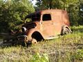
| 08/08/2002 04:40:00 PM |
Grandpa's Ice Wagonby NitenComment: I think the vehicle needed to be further to the right. It has nowhere to "go" as it is framed right now. (Like it is going anywhere). Also, if you ever get a chance to reshoot, those front lights look really interesting. Like little eyes, or something. karmat |
 Photographer found comment helpful. Photographer found comment helpful. |
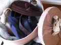
| 08/06/2002 03:19:00 PM |
hats hats hatsby snsComment: A little too bright in the lower left, and on top of the hat box lid, but you ahve shown the details nicely, and i like the colors. karmat |
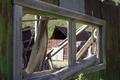
| 08/07/2002 03:46:00 PM |
Window of the pastby snoopyComment: I like how you have used the lighting and focus here. Good job, and neat idea. karmat |
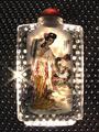
| 08/07/2002 11:08:00 PM |
Milenary Artby amonteforteComment: I love the effect of this. The little "starbursts" of light are also a neat effect. I think if the biggest one on the left was at a corner somewhere, that would be too cool (kinda a minor thing to mention, though, huh?) I really like this. karmat |
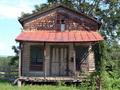
| 08/06/2002 02:12:00 PM |
General Storeby MaYzComment: what character. my only suggestion would be to move to the left just a hair, so the viewer could get an idea of depth by looking at the side of the biling as well. Looks like some of the terrain in my area. karmat |
| 08/06/2002 02:48:00 PM |
(c) 1897by malapropamComment: At first I read the title as "1987" and thought, "huh?" Anywya, I really like how the read ribbon provides some great contrast and pulls the viewer into the picture. It does feel a little off-balanced to me, though, because the candles go out of the frame, but there is still space to the right of the book. of course, dracula makes me unbalanced too. :-) karmat |
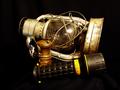
| 08/07/2002 03:38:00 PM |
untitledby darylbrownComment: cool set-up. I like the contrast/progress you have shown here. A color other than black may have helped the flashlight show up better, mayber. karmat |
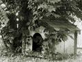
| 08/06/2002 11:42:00 AM |
Lucy's Doghouseby muckpondComment: the colors tones in this really give it soem interest, and the brightness helps to downplay the fence. nice job. karmat |
| Photographer found comment helpful. |
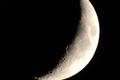
| 08/08/2002 04:47:00 PM |
Waning Crescentby MorganComment: Gorgeous shot. I love this. Would definitely hang it on my wall! karmat PS -- How did you get it so large? |
Home -
Challenges -
Community -
League -
Photos -
Cameras -
Lenses -
Learn -
Help -
Terms of Use -
Privacy -
Top ^
DPChallenge, and website content and design, Copyright © 2001-2026 Challenging Technologies, LLC.
All digital photo copyrights belong to the photographers and may not be used without permission.
Current Server Time: 06/23/2026 08:48:36 AM EDT.