| Image |
Comment |
| 09/18/2002 03:35:00 PM |
Silenceby jkiolbasaComment: Very nice work. Enough light on the mike to show details but not so much tha there is a lot of reflection. karmat |
| 09/20/2002 03:52:00 PM |
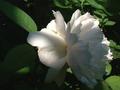
white roseby artgalaxyComment: Nice lighting. I like the simple green, white, black set up. karmat |
| 09/20/2002 03:43:00 PM |
|
| 09/18/2002 05:48:00 PM |
|
| 09/22/2002 10:59:00 PM |
|
| 09/20/2002 03:39:00 PM |
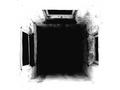
Shaftby millerComment: Almost feels like a black hole. I like the bw, and the high contrast of this. karmat |
 Photographer found comment helpful. Photographer found comment helpful. |
| 09/21/2002 11:34:00 PM |
|
| 09/13/2002 02:17:00 PM |
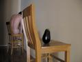
Untitledby cmcvetyComment: Okay, I will admit, I do not understand this picture at all. Photographically speaking, the focus is good and I like how the chairs pull your eyes up and to the left. I think it is a bit dark and could possible benefit from some brightening or contrast. The colors are a bit bland, for me. karmat |
| 09/13/2002 01:03:00 PM |
|
| 09/13/2002 01:04:00 PM |
Son of 'Son of Man' (Magritte Revisited)by ClubJuggleComment: Great shot. I only have two little nit-picky complaints (and they weren't enough to lower your score, I just noticed them). The shadow around your head, and I think the tie would have been more effective if it had been solid red. Otherwise, great shot. karmat |
| Photographer found comment helpful. |
Home -
Challenges -
Community -
League -
Photos -
Cameras -
Lenses -
Learn -
Help -
Terms of Use -
Privacy -
Top ^
DPChallenge, and website content and design, Copyright © 2001-2026 Challenging Technologies, LLC.
All digital photo copyrights belong to the photographers and may not be used without permission.
Current Server Time: 06/24/2026 12:46:00 PM EDT.