| Author | Thread |
Comments Made During the Challenge  |
|
|
09/20/2002 02:14:00 PM |
|
doesn't do it for me, sorry |
|
|
|
09/20/2002 12:41:00 PM |
|
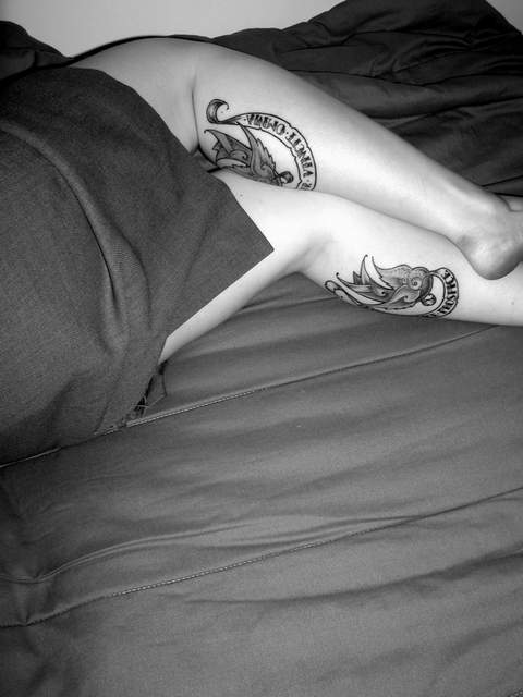
mmmmmmmmmmmmm legs & ass 8 total |
|
|
|
09/19/2002 04:28:00 PM |
|
Not sure how the neg space helps the composition. |
|
|
|
09/18/2002 05:48:00 PM |
|
Black adn white serves this picture well, I think. karmat |
|
|
|
09/18/2002 03:02:00 AM |
|
I don't like this one being in B&W. The flash kinda focuses right on the center of the shot. 4 |
|
|
|
09/17/2002 02:48:00 AM |
|
great use of black and white |
|
|
|
09/17/2002 02:14:00 AM |
Composition: 4 space 4
Lighting: good 5,
Appeal: 5, Total Rating 5 Sulamk
|
|
|
|
09/16/2002 11:59:00 PM |
|
great picture, hope they wash off though. |
|
|
|
09/16/2002 08:22:00 PM |
|
|
|
09/16/2002 04:20:00 PM |
|
Ok. I get the Seinfeld reference...but how does it apply to this picture? Nero |
|
|
|
09/16/2002 03:24:00 PM |
|
Tats! What do they say? Love this b&w, good work. Good Luck to ya! Score 7 Justine |
|
|
|
09/16/2002 02:06:00 PM |
|
i dont get how this is negative - maybe i'm stupid. lol! |
|
|
|
09/16/2002 12:09:00 PM |
|
I'm not getting it....starting from the title and working forward from there. |
|
|
|
09/16/2002 10:51:00 AM |
|
very detailed b&w--good photo--9bobgaither |
|
|
|
09/16/2002 03:55:00 AM |
|
I am not sure what the title indicates ......... but the photo is good social comment, (9): but I see weak graphic negative space presented (3). |
|
|
|
09/16/2002 12:49:00 AM |
|
Perhaps lose the wall, it doesn't sit nicely with the rest of the photo. |
|
Home -
Challenges -
Community -
League -
Photos -
Cameras -
Lenses -
Learn -
Help -
Terms of Use -
Privacy -
Top ^
DPChallenge, and website content and design, Copyright © 2001-2026 Challenging Technologies, LLC.
All digital photo copyrights belong to the photographers and may not be used without permission.
Current Server Time: 06/28/2026 04:11:45 PM EDT.