| Image |
Comment |
| 10/14/2002 03:20:00 PM |
Wantedby rj324Comment: The composition is good, but the colors are a little muted. Maybe saturation or adjusting the contrast would help. |
| 10/16/2002 02:28:00 PM |
|
| 10/14/2002 02:58:00 PM |
|
| 10/14/2002 02:24:00 PM |
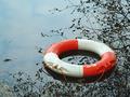
Envyby spankyComment: Definitely gets your attention. The only distraction for me is the shadow. Would it have been possible to use a source of backlighting or soemthing to get rid of it? Just a suggestion. karmat |
| 10/18/2002 03:38:00 PM |
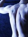
Hubris (Pride)by magnetic9999Comment: I like the "curves" this presents, and the overall presentation. While I like that theh bluish/purple gives it a "seductive/nighttime" feel, at the same time it makes me feel like his circulation is bad! haha. karmat |
 Photographer found comment helpful. Photographer found comment helpful. |
| 10/18/2002 01:22:00 PM |
Collection Item #12by DrJOnesComment: The green really gives this a ghastly look. I think the flesh toned shadows are very interesting. karmat |
| 10/14/2002 02:08:00 PM |
|
| 10/14/2002 02:34:00 PM |
|
| 10/14/2002 02:38:00 PM |
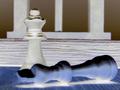
Winner Takes Allby RefocusedComment: The focus seems a little off to me, but that may be my monitor. I like the contrast of the colors on the blue background. The hand looks "staged" to me, not a natural position, but I understand that it may jsut be the perspective. karmat |
| 10/16/2002 02:41:00 PM |
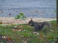
Got Milk?by inspzilComment: Hehe. If you set him up to do this, I bet he thought he was the luckiest little guy in the world! karmat |
Home -
Challenges -
Community -
League -
Photos -
Cameras -
Lenses -
Learn -
Help -
Terms of Use -
Privacy -
Top ^
DPChallenge, and website content and design, Copyright © 2001-2026 Challenging Technologies, LLC.
All digital photo copyrights belong to the photographers and may not be used without permission.
Current Server Time: 06/25/2026 02:13:57 PM EDT.