| Image |
Comment |
| 11/26/2002 02:43:00 PM |
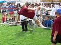
Player throws himself into the gameby artemis8Comment: The focus being off makes this picture a little less effective than it could be, I think. It looks like it is a bright day there, plenty of light, so could you ahve used a faster shutter speed at all? karmat |
| 11/27/2002 01:11:00 PM |
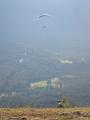
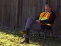
Hey, Come Back!by lamentComment: This is an awesome idea, and I like how the dog is watching the glider, it seems. If the rest of the picture had the detail as the bottom of the frame, it would simply rock. I know in the mountains around here, it is hazy regardless of the weather conditions. Sometimes a polarizer or neutral density filter will help eliminate some of that. karmat |
| 11/27/2002 12:27:00 PM |
King of Beersby biohazardixComment: The exposure on this is awsome considering that it is backlight with the sun. Nice work. I almost think the pose would seem more natural though if he were holding the bottle with one hand instead of two. Of course, you may not have wanted natural! Nice colors as well. karmat |
| 11/26/2002 02:13:00 PM |
Homeboy Brings Jobsby GotchaComment: that's an awesome piece of work, but as a picture it is coming up a little short in my opinion. I'm not sure, but maybe a different angle or perspective, rather than just straight on, or if you could have had someone in the picture to give it a little depth it would be more interesting to me. karmat |
 Photographer found comment helpful. Photographer found comment helpful. |
| 11/27/2002 01:55:00 PM |
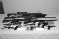
Drug Bustby hblakeComment: The composition of this shot, with all of "lines" of the barrels and blades creates a strong sense of power and movement. I think cropping out the thing on the left and angling the shot so that the outlet wasn't showing would have made this shot more powerful. Also, the colors to me seem drab. Can you work with the contrast any to try and give it a bit more "pop?" karmat |
| 11/27/2002 12:30:00 PM |
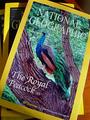
I Made the Cover! (Literally)by amonteforteComment: Obsession is right! I like the colors on this, and teh lighting works well. However, your crop leaves me feeling like it is a little flat. Maybe some kind of different perspective would give it more feeling of depth. karmat |
| 12/01/2002 05:59:00 PM |
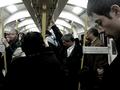
More Delays on the London Undergroundby KonadorComment: I love the coloring on this. You have done well capturing the mood. I do hope that one guy looking at you didn't take offense. I really like the effect the bars have on the mood of the picture. Kind of a captivating feeling, I think. Great lighting, and contrasts. 9 -- karmat |
| Photographer found comment helpful. |
| 11/26/2002 02:31:00 PM |
Baggage Check “Are You Safe?”by bobgaitherComment: I understand that this may have been teh only angle you were able to get (due ot security), but I am wondering if another angle showing more of the belt coming out, or something would be more effective. Maybe using a horizontal cropping instead of a vertical one so that the stuff at the top would be eliminated. The yellow does well to capture the viewer's attention. |
| 11/27/2002 12:24:00 PM |
|
| 11/26/2002 12:36:00 PM |
Flowerby Title9Comment: The colors in this are wonderful, and it looks like it would be a really good macro. However, it seems that it is extremely pixelated. It looks like you have cropped it out of a larger picture, then enlarged it or something. Of course, if this is deliberate, that is another story all together, and I would be most interested in hearing why. karmat |
Home -
Challenges -
Community -
League -
Photos -
Cameras -
Lenses -
Learn -
Help -
Terms of Use -
Privacy -
Top ^
DPChallenge, and website content and design, Copyright © 2001-2026 Challenging Technologies, LLC.
All digital photo copyrights belong to the photographers and may not be used without permission.
Current Server Time: 06/26/2026 11:20:19 PM EDT.