|
|
|
Showing 7311 - 7320 of ~9205 |
| Image |
Comment |
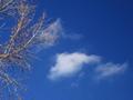
| 12/11/2002 03:40:25 PM | Blue and Whiteby jbolingComment: CRITIQUE CLUB CRITIQUE
by Karmat
Composition -- I personally like the subject you chose for this challenge. Of course, I may be biased because I almost submitted something similar! I think the tree and clouds form a nice triangle, whether intentional or not. I also like the simplicity of it and the contrast of the white and blue.
Technique -- The focus does seem a little off on the tree, probably because trees and leaves are a bear to photograph with digi cams! I am not familiar with your camera, so i don't know if the lack of focus came from it or post processing. You have used available light well, and nothing seems blown out. I do see some noise in the sky, which is distracting. Something I have just found that helps this situation (and is dpc legal) is NeatImage. You can get a free download, and it eliminates noisy that I had in my pics that I didn't know I had. Also, did you try boosting the contrast slightly, just to make the tree have a little more pop? Not sure how much it would help, but it might help some.
Overall Effect -- I'm like you in that I like pictures of skies and clouds. Unfortunately for us, that is not the most popular choice of subjects on dpc, but don't stop! This picture has a very peaceful, serene feeling to it.
Karma |
| 12/11/2002 02:42:45 PM | Cool Refreshmentby KarenBComment: CRITIQUE CLUB CRITIQUE
by Karmat
Composition -- I really like the composition of this shot. The three bottles form a triangle of sorts which makes for a strong, balanced shot I think. The ice in the foreground helps to compliment the "cool" feeling blue has.
Technique -- Though I scored this a 9, I can see how others may be bothered with the seemingly lack of focus on the two bottles. Maybe if the two front bottles were both crisply focused and the back one was not, it would have appeared more intentional. Also, you mentioned in your notes that you decreased the red and green as you boosted teh blue. I am wondering what effect that had on the ice. At first glance, it looks ok, but as I look at it more closely now, there are spots that are washed/blown out, or an odd sort of gray color. Also, it would have really toppped it off if the bottles had looked "wetter," if that makes any sense at all.
Overall Effect -- As mentioned before, this was one of my favorite photographs. It met the challenge, I feel, both physically (the color blue) and "metaphorically" (feeling cool). As a matter of fact, it has made me decide to take a break, and go get a bottle of water. How is that for effectiveness!?! |  Photographer found comment helpful. Photographer found comment helpful. |
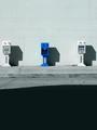
| 12/11/2002 02:32:38 PM | Monopolizingby WesComment: CRITIQUE CLUB CRITIQUE
by Karmat
Composition -- I think the composition of this picture is very strong. It is balanced and fills the frame nicely. The choice of subject was well done, as well. I like the angle or perspective on this. It is much stronger this way than straight on. A very effective use of simplicity.
Technique -- You have done a remarkable job at not blowing the whites out. Anytime I try to do such, I end up with these really bright patches that blind my viewers! The focus is good in that the viewer can read all fo the words on the cards, though there are a couple of spots that are slightly fuzzy (that may be my monitor though). It is a very clean and crisp picture. Good use of contrasting colors and diagonal lines. The only suggestion I can make would be to try to shoot it with absolutely NO shadow, or a shadow completely around the cards, as if they were suspended or floating.
Overall Effect -- I like the simplicity of this shot. you have done well at meeeting the challenge in an effective and creative way. Good work.
Karma
| | Photographer found comment helpful. |
| 12/11/2002 02:12:48 PM | Outstandingby crabappl3Comment: CRITIQUE CLUB CRITIQUE
by Karmat
Composition -- I feel that you have chosen an excellent subject for the challenge. The blue box stands out nicely in contrast with the white ones and white wall. In my opinion, I think the overall picture would be stronger if the boxes filled more of the frame. I am assuming you may have been constrained by accessibility, but if not, a couple of things may have helped. Getting closer to them, either physically or with zoom would have helped to eliminate the dark shadow in the foreground and the white space at the top. I enjoy negative space in photographs, but there is not enough of either to really scream ns to me. I am assuming also that there is something you did not want us to see on either side of the boxes. Otherwise, a landscape instead of portrait would work to give it a more balanced feeling. Something else to consider, would it have been possible to take it from a different angle? Maybe one where you are standing at the end of the row and taking a picture of them in the straight line?
Technique -- You have used the available light well. I like the way it makes the crisp shadows from the boxes. It makes it look very interesting. Unfortunately, the same light makes the foreground shadow large and imposing. I would suggest returning at a different time of day to reshoot, or cropping the shadow out. However, if you were trying to give the impression that teh boxes were being overtaken by the shadow, that works, I suppose. the focus looks a touch off to me, which may be because the camera was focusing on the pavement just in front of the boxes, or it could be this monitor at work.
Overall effect -- Overall, I felt that this was a fair picture. You have done well at capturing a subject that meets the challenge, and the picture is well done. However, I think it needs something else to make it a bit more interesting, at least for me.
Karma Message edited by author 2002-12-11 14:23:14. | | Photographer found comment helpful. |
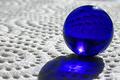
| 12/11/2002 02:04:38 PM | Blue Sphereby LanSnakeComment: CRITIQUE CLUB CRITIQUE
by Karmat
(Note -- One of my favorites for the challenge!)
Composition -- I feel that you have effectively used the composition of this subject to create a balanced shot. The marble placed in the right third allows the "shadow" to go to the center, thus directing the viewer's eyes into the picture. I think cropping it the way that you have is also effective in that you didn't try to fit the whole shadow in, which may have made it seem "top heavy." Excellent choice of subject, and it fits the challenge very well. The "background" material is also interesting. If possible, it may have been interesting to let the little "holes" lead the eyes to the marble.
Technique -- To me, the focus works well in this shot. I know having a blurry foreground can be distracting to alot of people, but here I think it really makes the marble "pop." The reflection in the marble is interesting, but I found myself trying to see what was above the horizon in the reflection (or below it, I guess). Would it have been possible to "curve" the background material up so that only that would be reflected. That is obviously a personal preference, because I can see how the reflections add some interest.
Overall Effect -- I felt that this was an awesome photograph, and a creative idea. The simple colors and composition are eye-catching, and the whole pic works well, I think. Sorry I can't offer more "constructive criticism" but this is a good picture, that does not need a lot of work, I think! | | Photographer found comment helpful. |
| 12/09/2002 02:06:00 AM | Lovesongby Brenna KimiComment: I found your picture to be interesting. I think the composition works well, and i suspected that the thing showing on the pillow was an album or something. However, it was not identifiable, and I think that is what hurt your score. After reading your description, the picture is obvious. It was a great idea, and I look forward to seeing some of your other work.
|
| 11/27/2002 12:58:00 PM | Faithful Flock to Flag Footballby spidermanComment: In my opinion, cropping out the top part of the picture so that the lights didn't show would be more effective. Also (and I don't know if this would be possible at all), if you could have focused on just one or two players instead of so much of the field. Good focus for an obviously low light situation! karmat |
| 11/27/2002 01:09:00 PM | |
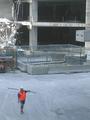
| 11/26/2002 02:27:00 PM | Lonesome Urban Cowboyby 'PongComment: This shot seems to have a story to tell. I find it almost ironic that he would wear a hard hat, and work boots and leave his legs exposed. ouch. The orange vest does well at pulling attention to him. that said, I think it might work better if it were possible to crop it so that the man was up and to the right a little, placing him more in the picture and not so close to the edge. Overall, the focus is a little fuzzy, which also makes it difficult to see well. karmat | | Photographer found comment helpful. |
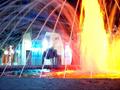
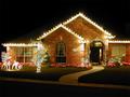
| 12/03/2002 04:38:00 PM | It's that time againby Frank BeckmanComment: My first impression is that this is a nice photograph. I absolutely love Christmas lights, and though some may question the "photojournalism" side of it, I can see how this would make the news in small towns or seasonal magazines. I think the initial impact of the picture could be greatly increased, though, if you would choose one smaller piece, instead of trying to capture the whole thing. For example, the illuminated reindeer shot with a low camera angle, would make a nice picture as well. If you wanted to include the whole house, I would try to crop it so that the street doesn't show as much. The sidewalk leads the eyes up through the picture which is nice, but the street gives kinda slanted feeling to it. A 640 X 427 crop does some of this for you. Also, though I think I know why you did it, cropping the house on the right, and not on the left makes it feel unbalanced to me. Technically, I think a larger aperture and slower shutter, if possible would make the focus sharper. If you can only control one, go for the larger aperture to make sure you have as great a dof as possible. I am assuming you were using a tripod, but if not, they are well worth it. If you do not have one, and do not want to buy one, resting the camera on top of a car or open mailbox door sometimes works well, if you can get the angle right. Overall, I liked this picture, and it made me want to go out and look at lights in our community! Nice work. |
|
Showing 7311 - 7320 of ~9205 |
Home -
Challenges -
Community -
League -
Photos -
Cameras -
Lenses -
Learn -
Help -
Terms of Use -
Privacy -
Top ^
DPChallenge, and website content and design, Copyright © 2001-2026 Challenging Technologies, LLC.
All digital photo copyrights belong to the photographers and may not be used without permission.
Current Server Time: 07/16/2026 04:10:59 PM EDT.
|