|
|
|
Showing 7281 - 7290 of ~9205 |
| Image |
Comment |
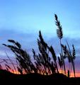
| 12/23/2002 01:07:18 AM | Prairie Sunset by SonifoComment: WoooooHOoooooo to you Sonya!!!! I am assuming Mike is your husband? :-) I love the colors on this adn the silhouette of the plants. One of my 10's. Great work!!!!! |  Photographer found comment helpful. Photographer found comment helpful. |
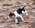
| 12/21/2002 04:41:22 PM | Flying Dogby rogerspaulComment: CRITIQUE CLUB CRITIQUE
by Karmat
(This one did not appear to be assigned to anyone, so since I have a few minutes, I figured I could do it! Hope it is helpful)
Composition -- This subject works well for the challenge, and you have done an excellent job panning the shot so that dog is primarily in focus and the surrounding background is not. This makes the dog look like he is running very quickly, indeed. The angle of the dog in the frame (running diagonally from right to left) is okay, but I think if there could have been more "empty space" in front of him, it would have given him more room to run "into."
Technique -- You have done an excellent job with the lighting here, as it looks exposed correctly to me. The focus is also good, though for my personal taste, I think a sharper focus on his nose (right now it seems to be on his front 'shoulders') or head would have made it more powerful. The colors are good, as it is obviously outside, and i like the way his collar gives just a hint of red.
Overall effect -- I think you chose a subject that many people can relate to, and I think you photographed it well. In reading your other comments, the picture size seemed too small for some of the viewers. Was this done intentionally? Be sure to take advantage of the size requirements, and unless done to "salvage" (cropping the highway just in front of him, or the cat chasing him [my cat used to terrify my beagle]), it seems to be better to use a larger photo. Technically, and compositionally, it is a good picture, it just seems to lack that little extra "umph" that would have most people give you a 6 or more instead of a 5. Just some things to think about -- when you get ready to shot a picture, take one from where you are, then change your position. Always try to get a different angle than the viewer is expecting. Obviously, with a running dog it is difficult, if not impossible, but that fact would have really helped the picture with its mass appeal. Good work, overall, and I look forward to seeing more of it.
Karmat |
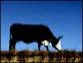
| 12/20/2002 11:09:13 PM | Grazeby FrooberComment: Wow, an admin note. I am sooooo impressed! You could have called it "Eat more chik'n" and sold it to chick-fil-a for an advertisement!!! Hahahhahahh (I crack myself up!) :-) |
| 12/18/2002 05:25:14 PM | Under the Christmas Treeby YomiComment: CRITIQUE CLUB COMMENT
by karmat
Composition -- The composition of this is really strong, I think because you stayed away from the center of the frame. The green "tree" things all lead to one point effectively guiding the eyes to the one focal point from anywhere in the frame. For some reason, though, I feel like it is almost too close to the top and right of the frame. Maybe if the focal point was moved in and down just a touch. But, then again, that is so minimal, it may just be me. I really like the way the straightness of the poles/supports contrasts with the "roundness" of the tree as well.
Technique -- The focus is wonderful as you can make out details all the way up and into the tree. Also the exposure is right on because the whites are bright, yet not blown out. Nothing I can suggest to make this better. It is a very well done picture. The simplicity of the colors is also very captivating.
Overall effect -- Though it is a very good picture, without the title, I would have been lost as to what I was looking at. Not that it matters, obviously, but I think sometimes if we choose subjects that our audience relate to immediately, they respond better. Having said that, the title is very appropriate, both for the picture and the season. This is one of those shots that makes me want to visit places and see the thing in person. (Just noticed you had nothing below 4, way to go. that has got to be a dpc record or something!) |
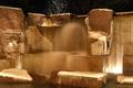
| 12/18/2002 04:58:24 PM | Fluid and Frozenby d95vetteComment: CRITIQUE CLUB CRITIQUE
by karmat
Composition -- I think the contrast between the vertical lines and horizontal lines really sets up the shot to be full of strength. The only nit-pick I have about the composition is that I find myself wanting to see more of the sky above and water below, or absolutely none of it. Did you experiment with any vertical crops to see what effect that would have? I almost think a vertical crop of the center third would allow the viewer (at least this viewer) to feel like there was "something" that the eyes could rest on.
Technique -- Personally, I think the exposure is right on here. Only one spot on the right is blown out a little, and I suspect there was a light there. ??? You have captured some marvelous details in the water and snow, as well as the actual stones that it is built of. The coloring is very unique, I think, as it looks so warm, yet the subject is so cold. Your focus is great--very crisp and clear.
Overall effect -- This was one of my favorites of the challenge. I felt that it was a well taken photograph, that attracted the audience and made them want to look at it more. That said, it did seem that it didn't have any one place for the eyes/viewer to focus on, but that may have been your intent. As far as widespread appeal, many may not have know what this was, and as a result couldn't relate to it in any other way than, "a fountain," so it may not have carried the emotional appeal that some pictures may carry.
Again, I really like the shot, and I hope this has been a little helpful.
karmat |
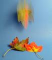
| 12/18/2002 01:21:54 PM | Fall in Motionby TurbotechComment: CRITIQUE CLUB CRITIQUE
by karmat
Composition -- Your choice of subject matter is excellent as the bright reds/orange/yellow sets up a nice contrast with the blue background. Also, the three leaves make a triangle, which I always feel makes a picture seem balanced and strong. For some reason, my eyes are feeling like the bottom right leaf stem needs to be pointed further to the right; it is so very close to the bottom of the frame. And I don't know if it would have been possible or not, but showing the whole leaf at the top would have also been nice, but those are just my opinions.
Technique -- I don't know that you really wanted a longer shutter exposure. As it is, the leaf on the right is almost blown out, losing some detail, and making it look slightly out of focus. Also, your background is reflecting in a couple of spots (primarily the middle right) and I think a longer exposure would have really made that noticeable, unless you really cut back you light source. You have captured the motion well, and I like the blur of the colors.
Overall Effecti -- You have chosen a subject that most people can relate to, and/or identify with. I had two thought when I first viewed this. 1)Why did you do it with a blue background? Though I know many shots are "set up," I think the ideal is to set a shot up without it looking contrived. The leaves are so beautiful, yet they look so out of place. 2) I have never seen a leaf fall stem down like that, and to me that made it look even more unnatural. Granted, this may have been the effect you were going for, it is just my opinion that taking the leaves out of their context really detracted from an otherwise awesome shot. Maybe if they had been falling in front of a tree or onto grass or something. I think it made a potentially 8 or 9 image into a 5 or 6 one.
I hope this helps, at least a little bit.
karmat |
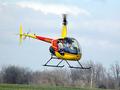
| 12/18/2002 01:06:26 PM | Roto-motionby fsieradzkiComment: CRITIQUE CLUB CRITIQUE
by karmat
Composition -- Great choice of subject for a motion challenge, and I like the placement of the bird in the near center of the frame as this allows the full thing to show and still give it room to travel in the front of it. "Maybe" a touch more to the left would have been even better, though. Also, I think cropping it so that none of the ground was showing would have been more effective (my opinion) as it would then look like the 'copter was higher in the air.
Technique -- The contrast of the yellow and red is nice with the otherwise seasonally bland background. It causes the subject to really "snap" out from the sky. I think a slightly slower shutter speed (not much) to show more of the propellors' motion would have made this shot much more effective. To totally stop them in would have been a neat effect too, but since the idea was to show motion, showing more would have been better. Good focus and good use of available lighting.
Overall effect -- Maybe I'm biased because I really like these things (never ridden in one, don't plan to either because I terrified of heights, but i like to watch them), but I think you have chosen a subject that lends itself to the challenge well, and is appealing or at least identifiable to the audience. Good work.
I hope this has helped at least a little bit.
karmat |
| 12/18/2002 12:55:04 PM | Blue Streakby inspzilComment: CRITIQUE CLUB CRITIQUE
by karmat
Composition -- What better subject for a motion shot than a young child! If he (assuming it is a he) is anything like my son and nephews, most cameras/film don't have shutter speeds or iso fast enough to capture them without motion! I like the placement of the subject in the frame, as it gives the child somewhere to go before he runs out of frame. I also think the blue footy pajamas work well to identify the subject as a young child. The perspective of the camera works well because it is more on the child's level, and doesn't distort any of his features by making him look really small or really tall.
Technique -- Though I think the "total" blur meets the challenge, and it is an accurate rendition of you subject, I think having part of him in focus (hand, face, chest) would have made this picture more appealing to the audience. I can see, though, that not only was he moving forward, but all parts of him were moving as well, so it may not have been possible to do this. Also, there seems to be a large amount of grain in the background (well, throughout the picture, but especially noticeable in the background), and I am assuming that this is due to the ISO of 400. If possible, bumping the iso down may have eliminated some of the grain.
Overall Effect -- I think you have chosen a subject most people can identify with. Everyone with children knows how energetic they are most of the time, and how difficult it is to get a clearly focused shot of them! It also helps take me back to my own childhood of footy pajamas and running around the house like a banshee! As a result, you picture is one most people can readily relate to in some manner. I think the issue of the focus addressed above caused some folks to dismiss it before fully understanding it because there didn't seem to be anything in the frame to grab the viewer.
I hope this has been of some help!
karmat | | Photographer found comment helpful. |
| 12/18/2002 12:40:11 PM | DISCO FEVERby babymaderoComment: CRITIQUE CLUB CRITIQUE
by karmat
Composition -- You have chosen an excellent subject for the motion challenge. I think the centered placement works very well for this subject, as it gives a balanced feeling to it. It does show motion, and for that meets the challenge.
Technique -- I really like the black background, and the simplicity of the colors here (or lack thereof). If this were not a motion challenge, though, I would have a tendancy to thing it was just a blurry image I think. Perhaps if you could have caught some of the reflections bouncing around, or if there had been somethiing behind/above/near the ball that was stationary and was in crisp focus, it would seem more "motiony." Also, I think I see a little noise in the black which can be caused by many things, but can be fixed easily with NEATIMAGE (dpc legal). Another thing that might have helped is a slightly faster shutter speed. It would have still shown the motion trails, but maybe without so much blur.
Overall Effect -- I think you had a good idea here. You have chosen an object that most people can identify with (whether they admit it or not!), and you have captured it in a way as to meet the challenge. As images go, though, it didn't have the punch it needed to really grab the viewer. As a result, it comes across as an average picture to me. Maybe showing more of the context that the ball was in would have helped give it that extra punch.
I look forward to seeing more of your work, and I hope that I have helped some.
karmat |
| 12/13/2002 03:36:19 PM | | | Photographer found comment helpful. |
|
Showing 7281 - 7290 of ~9205 |
Home -
Challenges -
Community -
League -
Photos -
Cameras -
Lenses -
Learn -
Help -
Terms of Use -
Privacy -
Top ^
DPChallenge, and website content and design, Copyright © 2001-2026 Challenging Technologies, LLC.
All digital photo copyrights belong to the photographers and may not be used without permission.
Current Server Time: 07/16/2026 11:36:13 PM EDT.
|