|
|
|
Showing 7261 - 7270 of ~9205 |
| Image |
Comment |
| 01/08/2003 11:52:45 PM | Who let the dogs out? Who?by justineComment: Technically, this is a great shot -- lighting, focus, etc. Compositionally, it is also strong to me. But the biggest thing is that it is hilarious!!!!!!!!!!!!!! I think your front, bottm dog lost an eye though! Awesome work! |  Photographer found comment helpful. Photographer found comment helpful. |
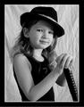
| 01/08/2003 11:34:16 PM | Bluesy Revolutionby RavenComment: I think a vertical crop that showed more of her head and less of her shoulders would have been more effective at showing her eyes. Otherwise a nice shot, and I like that she has a natural expression on her face! |
| 01/08/2003 11:30:56 PM | Love Potion #9by CreativeFlyPhotoComment: I really like this shot. I think the composition could have been strengthened dramatically though by moving the entire thing to the right. It is static right now, and with the exception of the shadow, is empty on the right, giving it an unbalanced feeling. Still and awesome shot. | | Photographer found comment helpful. |
| 01/08/2003 04:02:06 PM | Ready for the Outbackby alanfreedComment: CRITIQUE CLUB CRITIQUE
by karmat
Composition
I find that overall the composition of this works well. It fills the frame nicely (maybe a touch too tight, even), and the boomerang helps to serve to pull the eyes down and in. Her location in the frame is good, an effective use of the rule of thirds. My only complaint is that her pose looks a little stiff. Maybe changing the pose so that it looked like she was just holding the boomerang and not pretending to throw it.
Technique
It is very well focused, and the lighting works well in that it is bright and "illuminates" her features well. However, the brightness of it bothers me somehow because of the plain backdrop. The lighting says, "Outside, sunlight" while the backdrop says "Indoor, studio." Does that make sense? If not, contact me, and I will try to explain further. It would have been awesome if she could have been standing in front of an outback looking scene (but I understand that there are some things that are not possible), or at least out side somewhere.
Overall Effect
I live under a rock and have never watched this show, so I didn't know if it was an actual contestant or not. That is cool that it was. I don't think it hurt you to have her in both challenges, I think it was a good idea. Though I thought it met the challenge, I wonder if some of the lower voters questioned it. It does seem to show more the result of travel than actually travelling, and though that works for me, there are some for whom it doesn't!
Good work, and good luck in the future!
| | Photographer found comment helpful. |
| 01/06/2003 10:13:23 PM | To an Unknown Adventureby jitamsComment: CRITIQUE CLUB COMMENTS
by karmat
Composition
You have used the elements here to work very well together. The curve in the road gives 'motion' to the picture, and the simplicity of the shot makes it easy for the eyes to rest on the car. The placement of the car in the lower third of the frame allows for some negative space that helps to add to the tension.
Technique
I like the "fuzziness" of this shot. I think this is an example where something is in focus, but looks soft or blurry. the light bouncing off the top of the car gives the impression of a sunny day, and the presence of fog/mist makes it appear early in the morning. I suspect this was difficult to expose correctly, but you have done a nice job. I think the only suggestion I can give you is that if it had a bit more contrast, it may have had a little more punch or "omph" to it.
Overall Effect
I really liked this shot. It evoked emotion in the viewer (or at least me) by giving a tense feeling. though it is not something I would necessarily display, I can see how it would make a nice shot for a travel brochure or advertisement.
Good work.
| | Photographer found comment helpful. |
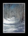
| 01/05/2003 04:21:29 PM | A path less traveled by psychephylaxComment: I really like this shot; framing, composition, etc. The border, though it didn't effect your score, seems a little wide. It almost "swallows" the whole picture and it is difficult to discern how awesome it truly is. |
| 01/05/2003 04:19:58 PM | |
| 01/05/2003 04:05:26 PM | | | Photographer found comment helpful. |
| 01/05/2003 04:04:20 PM | sea of loveby lmhrComment: this is a great image photographically. I like the composition and expression you have captured on the models face. On a side note, I find the border is a little wide, but that did not effect the score. |
| 01/05/2003 04:00:44 PM | |
|
Showing 7261 - 7270 of ~9205 |
Home -
Challenges -
Community -
League -
Photos -
Cameras -
Lenses -
Learn -
Help -
Terms of Use -
Privacy -
Top ^
DPChallenge, and website content and design, Copyright © 2001-2026 Challenging Technologies, LLC.
All digital photo copyrights belong to the photographers and may not be used without permission.
Current Server Time: 07/16/2026 04:40:11 PM EDT.
|