|
|
|
Showing 7211 - 7220 of ~9205 |
| Image |
Comment |
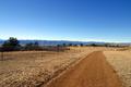
| 01/15/2003 11:37:54 PM | Walk of Beautyby kathleenmComment: Wonderful colors and good capture of the textures. I like how the road leads from the bottom of the frame, giving an "entry" point. Maybe if it was framed so that the road curved into the picture instead of out of it, it may be more effective, at least to me. |  Photographer found comment helpful. Photographer found comment helpful. |
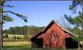
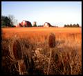
| 01/15/2003 11:34:17 PM | Farmscapeby KrazyKatComment: Good placement of the objects (trees, barn, etc) in the frame. Also, I like how the green trees and red barn contrast. I think there needs to be just a touch more space in the foreground if possible. It kinda feels like the barn is sitting on the bottom of the frame, and it seems off balanced to me. | | Photographer found comment helpful. |
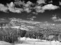
| 01/15/2003 11:29:44 PM | Mohonkby davisspragueComment: I htink the black and white gives this picture a feeling of desolation and loneliness. Is that what you were after? Also, it seems that the focus is a bit off, it just seems kinda soft. Maybe if there was an object or road in the foreground to focus on, it wouldn't be so noticeable. | | Photographer found comment helpful. |
| 01/15/2003 03:37:46 PM | Johnny Cash's Ring of Fireby RefraxComment: CRITIQUE CLUB COMMENT
by karmat
Composition -- Overall, I think the composition works well because it is off-center. If it had been centered, I think it would have needed to be completely round, otherwise it may have felt off-balanced. I do think, however, that the ring needs to be more to the right third of the picture instead of the left. On the left, it doesn't seem "to have room" to burn, whereas it on the right it would. I like the angle of the "ring," that also adds to the strong composition and prevents the picture from being "static."
Technique -- I almost think you need a higher aperture number so that you could slow the shutter down even more (I do not know a lot about your pictures, so that may not be possible, forgive me if it's not). IThe problem with that approach is that the fire may be blown out. Fire is a difficult subject to shoot, but you have done it fairly well. I also think this is a good use of negative space because it forces the eye to the fire.
Overall effect -- It met the challenge well, and technically, I think you have done a good job, as fire is so hard to photograph. For me, personally, this lacks a little in its interest. maybe a little more context of the shot, or more fire, even some smoke around. not sure. Sorry i can't be more specific. |
| 01/14/2003 12:13:37 AM | blueby niwedimagesComment: Very nice colors, but I think if the dark section at the bottom had been sharper, it would have been more effective, and if there was more of it. Also, was the small size intentional? |
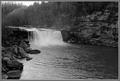
| 01/14/2003 12:10:42 AM | Cumberland Fallsby RLSComment: Excellent composition, can't think of a thing I would change except to suggest going back in Spring or Summer and reshooting to get a color version! | | Photographer found comment helpful. |
| 01/14/2003 12:08:48 AM | A Fresh Startby mpredigerComment: Very effective use of shadows! I like the tree on the right, but I found myself wanting ot see more of it. | | Photographer found comment helpful. |
| 01/14/2003 12:07:17 AM | Prominent Thornsby smellyfish1002Comment: The blur in the background really helps to bring out the detail of the plants. I like the coloring as well, very warm. |
| 01/14/2003 12:04:38 AM | Sunset on Lake Ontarioby firstduchessComment: Beautiful shot. I think you have composed it well in that you have the picture divided in thirds, horizontally, which really adds to the interest level of the shot. | | Photographer found comment helpful. |
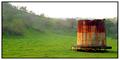
| 01/14/2003 12:03:11 AM | Forgottenby spidermanComment: Good composition, and I like the colors, though I think the green might be a touch oversaturated. | | Photographer found comment helpful. |
|
Showing 7211 - 7220 of ~9205 |
Home -
Challenges -
Community -
League -
Photos -
Cameras -
Lenses -
Learn -
Help -
Terms of Use -
Privacy -
Top ^
DPChallenge, and website content and design, Copyright © 2001-2026 Challenging Technologies, LLC.
All digital photo copyrights belong to the photographers and may not be used without permission.
Current Server Time: 07/16/2026 09:50:15 PM EDT.
|