| Image |
Comment |
| 12/26/2008 02:17:20 PM |
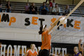
Crazy Goodby LadyKComment: The composition on this is a bit "right heavy" if that makes sense. I would suggest cropping it so that the empty space on the left is not htere. |
 Photographer found comment helpful. Photographer found comment helpful. |
| 12/26/2008 02:10:06 PM |
|
| Photographer found comment helpful. |
| 12/26/2008 02:08:13 PM |
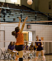
Set!!by LadyKComment: Good lighting and stopped motion. Shooting in a gym is never easy! |
| Photographer found comment helpful. |
| 12/19/2008 09:30:52 PM |
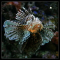
"When you wish upon a star..."by NordlysComment: Wow, I was so busy studying the fish and trying to find something "starry" about it, and thus had the picture "scrolled" so I could see all of the fish, I completely missed the starfish the first time around. Now, it looks so obvious, I'm wondering how I missed it to begin with! |
| Photographer found comment helpful. |
| 12/17/2008 03:39:27 PM |
|
| Photographer found comment helpful. |
| 12/12/2008 12:37:45 PM |
|
| 12/12/2008 12:35:01 PM |
|
| Photographer found comment helpful. |
| 12/11/2008 11:23:55 AM |
Southern Comfortby LonniComment: CRITIQUE CLUB CRITIQUE
by karmat
Very nicely done. This shot reminds me of one that would be found in a cooking magazine.
Compositionally, the main dish is centered, but because of the salad in the background, it doesn't feel as static as it would if it were "alone.' The background elements help to balance the composition. The crop you have used also works well. I tried to imagine it with more of the plate, but that would make the food smaller in the frame, and I think it would have less of an impact. If you tried to crop it more, it would start to feel a bit tight. You could use a round plate, but then I think you would lose that nice combination of tradition (the food) and the modern (chic plates). All that to say that I think it all works well. The only thing you may have been able to do, was photograph it more from an angle setting the composition on more of a diagonal between the corners of the plate and the salad in the background.
Technically, this is spot on, I think. The lighting is great. It gives the natural appearance of a plate on the table with light spilling in from the side. It has enough shadows to really show the textures and depth, but it is not so harsh to make it unappealing. The carrots and other greenery help to add some color contrast to a shot that would otherwise be kinda flat. Focus is good and the dof that is exhibited gives a good sense of depth to the shot.
Overall, very well done. I think I shall go fix me something to eat now. :)
Karma |
| Photographer found comment helpful. |
| 12/09/2008 02:19:50 PM |
Whatever 05by KenComment: that makes me kinda dizzy. i like the minimalism of the oclors though |
| Photographer found comment helpful. |
| 12/09/2008 02:19:01 PM |
Joy of Healthby colorcarnivalComment: I saw a cartoon once that had a man standing with "his equipment" in a machine similar to the ones used for a mammogram. The caption was something along the lines of "What it will take to get the process changed." or something like that.
My "first" is a couple of years away, and I'm already dreading it. . . |
| Photographer found comment helpful. |
Home -
Challenges -
Community -
League -
Photos -
Cameras -
Lenses -
Learn -
Help -
Terms of Use -
Privacy -
Top ^
DPChallenge, and website content and design, Copyright © 2001-2026 Challenging Technologies, LLC.
All digital photo copyrights belong to the photographers and may not be used without permission.
Current Server Time: 06/20/2026 06:26:38 AM EDT.