| Image |
Comment |
| 01/24/2003 12:31:05 AM |
DUH!by MustbelostComment: You reckon???? Good use of depth of field -- the sign is sharp and is accentuated by the background being just slightly blurry. The road entering at the bottom adn curving upwards is also effective. I think if you could have shot/cropped it so that it wasn't so tight on the left, it might have been a little more effective for me. Still an awesome shot. |
 Photographer found comment helpful. Photographer found comment helpful. |
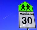
| 01/23/2003 06:24:42 PM |
maximum thirty studentsby ParentxComment: I love the contrast and simplicity of the colors in this shot. My only suggestion would be to try NEAT IMAGE or somethng like that as I can see some "noise" in the sky (other than teh plane and contrail). |
| Photographer found comment helpful. |
| 01/22/2003 05:39:38 PM |
Loading Onlyby GotchaComment: Normally, I do not care for shots with this much "contrast" (for lack of a more accurate word), but this one appeals to me somehow. The depth of field works well as the sign is focused, bu the truck is just a bit soft. I like the coloring as well. |
| Photographer found comment helpful. |
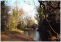
| 01/22/2003 05:36:07 PM |
River Lagan: Frozenby gerardComment: CRITIQUE CLUB CRITIQUE
by karmat
COMPOSITION
I think the strength of this composition is due to the placement of the water and the division of the frame. The water enters at the bottom, and gives the eyes a "guide" to follow up and into the frame. This gives the picture some "movement." Also, it is interesting how the river dwindles to a point, then the picture "opens up" again with the sky. The division of the frame in thirds (horizontally -- trees/path, water, trees) makes it interesting to look at, and keeps it from having a focal point. The limb in front helps to add some interest, but I suspect it is liked by some and not by others.
TECHNIQUE
The lighting in this shot is very dramatic and effective. I think, though, the bottom right of the frame is a bit dark, as all details seems to be lost. I think the softer focus on this probably hurt your score. This is a shot that the more it is looked at, the better it is, but many people simply do not have that much time to study the pictures and vote with gut reactions. The gut reaction on this one, for many people, was, "it is out of focus." If you wanted a sharper focus, I would strongly recommend a tripod if you don't have/weren't using one If you were, maybe try a remote control or timer device to activate the shutter. I have found that even the slight movement from pushing the shutter button can cause camera shake blur. If you don't want to carry a tripod, a small bag of sand or flour/sugar can provide a relatively secure and still base on which the camera can set.
OVERALL EFFECT
This is a very relaxing and peaceful photo. It is the kind of place I would like to rest and read a book or have a picnic.
Again, I think the soft focus probably hurts a picture in a contest like this, though it is a very good shot. I have enjoyed studying it, and look forward to seeing more of your work. |
| Photographer found comment helpful. |
| 01/22/2003 05:28:11 PM |
|
| Photographer found comment helpful. |
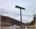
| 01/21/2003 11:39:05 PM |
No Crime Zoneby DianaComment: Here in my area, we would say that "shot gun holler." A neat sign, but it seems that the focus is a bit off, and I am seeing some noise in the sky. You might want to try NEATIMAGE (free download is available) if you have not. It does wonders on pictures. |
| Photographer found comment helpful. |
| 01/21/2003 11:04:49 PM |
Duck Crossingby Wheeler1992Comment: Okay, I chuckled, I admit it. It seems a little crooked to me, and a little blown out, but you did a great job of making a common thing funny. |
| Photographer found comment helpful. |
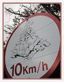
| 01/20/2003 11:51:49 PM |
Nailedby jmsetzlerComment: Ouch!! I like the close crop of this, and the colors are really attention grabbers. |
| 01/20/2003 11:43:22 PM |
|
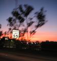
| 01/20/2003 11:07:24 PM |
Drive 55?by r_sandlerComment: Nicely done. I like the colors, and you have a great effect here. I think rotating/tilting it slightly to the left, to even the sign up, would have helped some. |
| Photographer found comment helpful. |
Home -
Challenges -
Community -
League -
Photos -
Cameras -
Lenses -
Learn -
Help -
Terms of Use -
Privacy -
Top ^
DPChallenge, and website content and design, Copyright © 2001-2026 Challenging Technologies, LLC.
All digital photo copyrights belong to the photographers and may not be used without permission.
Current Server Time: 07/17/2026 01:39:01 AM EDT.