|
|
|
Showing 7161 - 7170 of ~9205 |
| Image |
Comment |
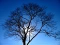
| 01/26/2003 08:48:22 PM | Silhouetteby cnobreComment: CRITIQUE CLUB CRITIQUE
by karmat
COMPOSITION
I think you have done an effective job of filling the frame nicely with the tree. Also, the placement of the sun is good because it allows the eyes to see both the tree and bright spot at one time. I agree with some of the others that this may not have been the best choice for a "landscape" shot, as it doesn't show any land, and only one tree, but I tried to keep a fairly broad interpretation in mind.
TECHNIQUE
You have done a very good job of getting the detail of the tree to show. I think many times on a digi cam, trees end up being very soft and fuzzy around the edges (yours is a little, but not bad). The blue sky is awesome -- were you using a polarizer? The complete silhouette of the tree is nice as well because it makes the shot very simple and pleasing to look at. As others have mentioned, I think cropping some at the bottom would eliminate the power line, and that would be good because the lines look so out of place. Also, since the tree "spills" out of the frame on the right, a closer crop on the left might be good too. Finally, there is some noise/grain in the sky. I have found that the free download of "neatimage" works wonders on this. It may, however, soften parts of your tree.
OVERALL EFFECT
The simplicity of this shot is perhaps its strongest feature. The simple composition and contrasting colors are pleasant to look at. Not including more of the surrounding countryside may have hurt the score some because some people specifically wanted land in the landscape.
Nice work and I look forward to seeing more of yours.
|
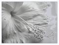
| 01/25/2003 01:17:49 AM | Milky Bathby JeanComment: A very elegant picture. One of my favorites this week. The focus is a bit soft in places, but the grace of the rest of the picture makes that inconsequential. |
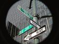
| 01/24/2003 05:01:05 PM | Start Spreadin' the News by magnetic9999Comment: I simply love this shot. The black and white gives it an elegant look, and I love how the stop light and building draw the eyes up into the frame. |  Photographer found comment helpful. Photographer found comment helpful. |
| 01/24/2003 01:33:06 AM | at the end of the tunnelby BeeGeeComment: Creative use of vignetting, I think. Also, good focus, colors and lighting. The details are very sharp thoughout the picture. | | Photographer found comment helpful. |
| 01/24/2003 01:24:07 AM | Slight Turn Aheadby xertionComment: I think the composition of this shot would be improved dramatically if the sign were further on the left, so that the arrow was pointing into the frame. Awesome colors and capture of details. | | Photographer found comment helpful. |
| 01/24/2003 01:11:52 AM | Directions To My Houseby bamasterComment: I like the simple colors and the contrasts they yield. Strong composition as well. The sign gives the eye somewhere comfortable to rest. |
| 01/24/2003 01:09:56 AM | Stopby rj324Comment: I think for this sign, the center placement in the frame works well. It freezes any motion or dynamics the picture may have. The blurriness of the trees should make the sign sharper, but it still seems a bit soft to me. I like the color contrasts as well.
As a side note, and not effecting your score, the border is a bit bright, I think. It almost clashes with the red of the sign, and detracts from the overall picture. I think a dark gray might have worked better. Or a darker gray with a tiny red line in it. But that is just my opinion. | | Photographer found comment helpful. |
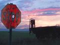
| 01/24/2003 01:06:42 AM | Drew's Stop Sign Revisited by autoolComment: I really like the colors in the sky, and how the details of the sign shows, bu the thing (a railroad car or something) is almost silhouetted. It sets up a nice contrast. Good humor, as well. | | Photographer found comment helpful. |
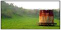
| 01/24/2003 01:02:00 AM | Forgottenby spidermanComment: CRITIQUE CLUB CRITIQUE
by karmat
COMPOSITION
I absolutely love the composition of this shot. The placement of the "thing" is in such a position that the rolling hill leads the eyes straight towards it, and then there is a solid place to rest. No jumping here and there seeing what all there is to see.
TECHNIQUE
Your focus here is powerful, I think. The "thing" is razor sharp, and the trees add a sense of softness (not that they are out of focus, just not as detailed as the "thing"). The green of the grass (which I stil think is a bit much, but maybe because that is because I haven't seen green grass in several months; everyone else seems to like it!) contrasts nicely with the rusty side, again drawing attention to the subject. Ironically, though I didn't care for the green grass, I did like the white sky. To me, it looked like fog rolling in, and gave it a mysterious look.
OVERALL EFFECT
I think technically this is an awesome shot. What I suspect happened is that it didn't have a lot of "quick" emotional appeal to the viewers. Unfortunately, this shot, like a couple of others I have seen, takes a close look to be truly appreciated to the fullest extent. On DPC, many do not (and indeed some cannot) take the time to truly appreciate the finer points of the picture. Though that is neither the fault of the photographer or viewer, it is something to consider when choosing your shot. Nice work, and I look forward to seeing future submissions.
karmat | | Photographer found comment helpful. |
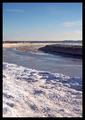
| 01/24/2003 12:48:29 AM | Frozen Riverby RefractedComment: CRITIQUE CLUB CRITIQUE
by karmat
COMPOSITION
I think the strongest part of this composition is the different "layers" of the picture that are so distinct. In the foreground is the snow, then the river then the sky. Also, because they are not straight horizontal or vertical, it gives a sense of "motion" the picture. My only wish is wanting to actually see the bend of the river. I think it would have been an exceptionally strong picture with a horizontal crop/framing that showed the "elbow" that is just out of the frame in this shot. Of course, I don't know what may have been there, etc. but the current framing leaves me trying to lean to the left and right and see more, kind of like looking out of a small window.
TECHNIQUE
The focus and lighting are right on. Exposure is good. You have captured good detail without causing dark spots with no detail, or blowing out the bright parts. I also like the gradiant-like blue sky. It looks natural, and not overly blue.
OVERALL EFFECT
I think that though the portrait perspective adds some interest to this shot, it also leaves the viewer feeling a bit edgy or left out of something. Of course, if this is response you were after, then you did it well. It is an awesome shot, and though you say there is not much interesting there, I think this river was an exellent choice for the challenge. Good work, and I look forward to see more of your stuff.
| | Photographer found comment helpful. |
|
Showing 7161 - 7170 of ~9205 |
Home -
Challenges -
Community -
League -
Photos -
Cameras -
Lenses -
Learn -
Help -
Terms of Use -
Privacy -
Top ^
DPChallenge, and website content and design, Copyright © 2001-2026 Challenging Technologies, LLC.
All digital photo copyrights belong to the photographers and may not be used without permission.
Current Server Time: 07/17/2026 11:09:16 AM EDT.
|