|
|
|
Showing 7071 - 7080 of ~9205 |
| Image |
Comment |
| 02/12/2003 02:18:19 PM | |  Photographer found comment helpful. Photographer found comment helpful. |
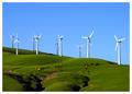
| 02/12/2003 01:24:34 PM | Windswept Pasturesby TarbiniComment: Beautiful colors and wonderful composition. I like how the cows help to give some idea how big the windmills really are. Nice work. | | Photographer found comment helpful. |
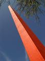
| 02/12/2003 12:59:52 PM | Commerce Beaconby jenaromComment: Good use of perspective. I really like the simplicity and contrast of the colors. | | Photographer found comment helpful. |
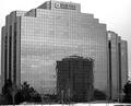
| 02/11/2003 01:48:16 PM | Windows and Mirrorsby MorganComment: CRITIQUE CLUB COMMENT
by karmat
COMPOSITION
Though you have filled the frame well, it seems a little tight at the top. I think allowing more room at the very upmost point of the building would have given it a roomier feeling without compromising the amount of frame that was filled. I think hte fact that the name of the sign is so close to the top of hte building, and thus, so close to the top of the frame emphasizes that tightness.
Also, would it have been possible to crop out the very bottom, so that the car and snow was not showing? There is just enough there to notice, but not enough to be able to tell if anything is significant to the picture. Maybe if you could have found an angle that didn't include quite so much othe building, it would have more immediate visual appeal.
TECHNIQUE
The black and white works very well with this shot, I think. I am noticing some gray noise in the sky, which makes me tend to think you may have overprocessed or oversharpened. I can either assume that you meant to do it that way, or didn't. :-) If you meant to do it that way, it gives a certain edginess to the picture. If you didn't, you can use a downloadable filter such as NEATIMAGE to clean it up. The focus seems pretty right on, though the noise does make me think that maybe it was slightly out of focus and you used postprocessing to mask that (if that is no the case, I apologize, but others may have thought the same thing).
OVERALL EFFECT
I, like several others, below, wondered how this fit in the challenge, but I gave you the benefit of the doubt, based on reasoning similar to lisae's. A word of caution though, subtle doesn't score well, unfortuntely, especially in an instance like this one where the picture would fit really well in a previous or concurrent challenge.
Like I said the graininess and noise does add a bit of edge to the photo, but it is still difficult to tell if it was intentional or not.
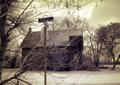
|
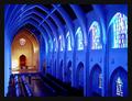
| 02/09/2003 04:16:18 PM | The Sanctuary by RackatComment: CRITIQUE CLUB CRITIQUE
by karmat
(One of my favorites this week!)
COMPOSITION
The composition of this really works to attract the viewer's eyes and draw them towards the altar. I think it is particulary effective that you can see almost all of the far wall, and very little of hte near one. The nice arch shape, that repeats with each of the trusses also adds to the drawing power of this shot. I know part of it is an "illusion" but it feels just tilted a bit to the left. Not enough to detract a lot, unless you sit and stare at it for awhile (which is what I have done to decide what to write), but once you notice it, it really is kinda weird.
TECHNIQUE
Simply awesome colors. Not just the blue, but also the different colors of the windows. Then, the front part really adds a nice contrast, and gives some warmth to the shot. There are a couple of spots that are almost blown out (up at the altar, and some spots in the window) BUT I don't think it necessarily detracts from the overall effect of the picture. He/She is not really noticeable, but if you could have shot this without the person, it would have given it an even more powerful/untouchable feeling to it.
OVERALL EFFECT
The blues to me make this shot feel really cool and isolated. Then the altar colors warm it up a bit, and become a focal point. Together, the colors and angle give this a very "holy" feel to it. Perhaps that is why the person kinda feels out of place to me. It looks almost untouchable, even. Of course, if you were wanting to depict that "sanctuaries" were touchable, the person is very necessary. Any way. A wonderful picture, and an awesome job!!! congrats on another ribbon!
|
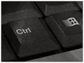
| 02/09/2003 04:05:06 PM | Controlby welcherComment: CRITIQUE CLUB CRITIQUE
by karmat
(Just for the record, I haven't seen the commercial you are referring to!)
COMPOSITION
I think you have placed the subject(s) in the frame well. You have avoided "centering" them, and have set them at a dramatic angle. I do think, that cropping the control key similarily to the microsoft key would make it seem more balanced, maybe. Perhaps including a bit more of the bottom of the keyboard would be more effective as well.
TECHNIQUE
I think the lighting and focus work well here. There does seem to be a bit of glare, so maybe diffusing the light with a thin cloth or tissue, if you don't have a diffuser, might work. Otherwise, there is not a lot you can do. It seems a small thing, and nit-picky, but the hair/lint does detract a little. Noticing details like that can really help, especially on sites like this.
OVERALL EFFECT
Personally, though the technique and composition make this a relatively strong picture, it doesn't pull a lot of emotional appeal, I think. It met the challenge well, and it was something that was familiar to all of us, maybe too familiar. I think you needed something "extra" to set yours above the rest. You also suffered from the fact that there were other keyboard pictures, and that, unfortunately, is not your fault. Maybe if you could have added something to make yours even more unique, more viewers would have liked it more. Again, it is a well taken photograph, and meets the challenge well.
| | Photographer found comment helpful. |
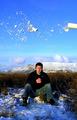
| 02/02/2003 01:48:42 PM | Got Milk?by arnitComment: CRITIQUE CLUB CRITIQUE
by karmat
COMPOSITION
I think the vertical framing of this works very well. I like the different "bands" of color and texture from the top to bottom, and having the subject sitting in the lower part really anchors the scene.
TECHNIQUE
Great capture of the milk and the colors are astounding. Not knowing how many attempts you made at this, and because the subject looks really cold, having the thing on the upper right is a bit distracting. The shadows are also a bit much, but with my limited understanding of geography, you really don't have a lot of time to play with, do you?
OVERALL EFFECT
I chuckled when I saw this, and thought, "He strikes again!" I like the suggestion below of doing a whole series. You could throw a chicken and some eggs, a box of cereal and a bowl, etc. Once again, awesome work; I've enjoyed looking at it, adn this was the most difficult picture to critique, so take it for what it is worth. |
| 02/02/2003 01:34:07 PM | NOHEL(L)?by GekkerComment: CRITIQUE CLUB CRITIQUE
by karmat
COMPOSITION
Normally, a centered composition like this feels static and uninteresting. However, I think your inclusion of the tree on the left, countered with a more open sitiuation on the right, helped to add some interest. I think the foreground branches give it a neat effect (discussed later) and help to add interest to an otherwise potentially simple "sign" picture. You have chosen your subject well, and have met the challenge in an interesting way.
TECHNIQUE
It seems to be slightly fuzzy/grainy, but in one respect that adds to the overall effect of the picture. The colors, too, are odd, but again add to the overall feeling the picture conveys. I do seem to see some noise in the sky, and think that the overall picture could have been more effective without it. Someone below mentioned despeckle, I would suggest NEATIMAGE.
OVERALL EFFECT
I think the strongest part of your picture is that it almost tells a story. It has a spooky/creepy quality about it that is enhanced by the grainy focus adn the wild colors. The foreground branches make it feel like the viewer is a spy, or uninvited/unwelcomed guest to the scene. Good work.
| | Photographer found comment helpful. |
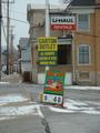
| 02/01/2003 11:33:42 PM | Loading Onlyby GotchaComment: CRITIQUE CLUB CRITIQUE
by karmat
Awesome shot!!
COMPOSITION
The positioning of the sign and truck is very near perfect, I think. It has an interestng angle that gives it some dynamics, its not just another straight on shot. The sign is in a very strong position in the frame, and the truck leads the eyes back to the left and out.
TECHNIQUE
There is very little I can comment on negatively about this. It does fill just a touch unbalanced with more of the back of the truck showing htan the front, but that is a small detail. Like someone else pointed out, the upper right of the frame is almost blown out. Maybe changing the camera angle slightly would have prevented this, or cropping it so that the top of the frame was at the top of the truck. Given those options though (assuming you can't/won't reshoot), I would leave the bright spot in and keep the crop like it is.
The tight focus on the sign, with the truck just barely being soft is awesome. You nailed that!!
OVERALL EFFECT
When I look at this, it makes me think I am looking at an old truck from a small rural community. Specifically, though I don't know the model, it seems like this picture could be from the 50s or so. Part is the truck itself, the other is the coloring, which is awesome! The sign (which looks very modern) provides a wonderful contrast.
Again, great shot, and sorry I couldn't offer a lot in the way of suggestions. You have already done a lot right! | | Photographer found comment helpful. |
| 02/01/2003 10:49:02 PM | They Got Everything at the Corner Storeby OneSweetSinComment: CRITIQUE CLUB CRITIQUE
by karmat
COMPOSITION
I believe the shot could be made stronger, as a whole, if you moved in and let the signs fill the frame a little more, maybe even "spilling" out. Also, maybe move the framing so that the signs are either on the left, and the poles are cropped out, OR the signs are on the right and the building is cropped out. This would move the signs out of the center of the frame, and keep it from seeming so "static." It would also keep the different elements from vying for the viewer's attention.
TECHNIQUE
The focus seems a little soft to me. I am assuming from the N/A on shutter speed etc, that you have little or no control of that. In that case, there might be a couple of things you can do to "hide" the slight blurriness. One would be to convert to black and white, then adjust the contrast so that the blacks are black, and the whites really pop out. I think doing that would help the eye to keep from trying to focus on the different colors as much as well. Another thing I would suggest would be to use a make shift tripod, if you do not have/do not want to carry one. Fill (about 2/3) a ziploc bag with sand, flour or sugar (the latter two do look suspicious from a distance), and use it as a "bean bag" to steady the camera. You can then use the top of your car, a tree limb, picnic table etc. and not have to worry about camera shake.
OVERALL EFFECT
I like the humor in this shot, and how the sign in the background looks like a church which is an interesting contrast with the other signs. Good luck in the future challenges. |
|
Showing 7071 - 7080 of ~9205 |
Home -
Challenges -
Community -
League -
Photos -
Cameras -
Lenses -
Learn -
Help -
Terms of Use -
Privacy -
Top ^
DPChallenge, and website content and design, Copyright © 2001-2026 Challenging Technologies, LLC.
All digital photo copyrights belong to the photographers and may not be used without permission.
Current Server Time: 07/18/2026 03:49:10 PM EDT.
|