| Image |
Comment |
| 02/20/2003 11:29:11 PM |
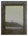
Window Revisitedby MartinComment: CRITIQUE CLUB CRITIQUE
by karmat
COMPOSITION
Framing the shot with the "frame" really adds to the composition of this shot I think. It draws the viewer's attention and focuses it on the subject of the picture. It feels a little off to me, maybe if the camera perspective was a little more to the left. Inside the frame, the rolling hill makes for some nice motion.
TECHNIQUE
The focus seems a little grainy, but I think that may add to the shot (more on this later). The grays, which would normally make for a drab shot, really add to the effect of this shot, as well, I think. I'm thinking I see some noise in the sky area, I don't know what your shutter speed, etc was, so I can't suggest anything in that area, but if you haven't ever tried NEATIMAGE or other noise reduction filters, they can really clean it up.
OVERALL EFFECT
A bit more fog, and your subject would be hidden completely! When I saw this shot, I immediately thought of the book "Wuthering Heights." It just has that dismal, gloomy, somber, mysterious aire about it. Nice work. |
| 02/20/2003 11:19:39 PM |
Supportby OneSweetSinComment: CRITIQUE CLUB CRITIQUE
by karmat
COMPOSITION
The strong vertical motion really pulls the viewer into this one. The foremost pillars frame the shot nicely, and it works being symmetrical. (Sometimes shots that seem to be intended to be symmetrical, are just a touch off adn it is difficult to tell if it was intentional or not.)
TECHNIQUE
You have done well to have the front pillars focused, and having focus throughout the picture, though the grass does seem a little fuzzy. Maybe you could have used a slightly larger aperture number, slowed down the shutter a touch, and gotten more focus and detail shown. Also, itis a little "drab" in that the pillars are all the same color (I know, that's out of your control) and the grass as well. I would suggest boosting the contrast and converting it to black and white. If you really wanted color, maybe saturating the grass (not a lot you can do with Carolina grass in February!)
OVERALL EFFECT
Great subject for the challenge. I think the picture would have had a little more oomph if the colors were a little more bold, or if there were some more contrast. Too bad there wasn't a bright red sign at the end or something to really be a focus spot. |
 Photographer found comment helpful. Photographer found comment helpful. |
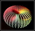
| 02/20/2003 10:55:23 PM |
Circlesby JackoComment: Great shot. I like the colors and teh patterns created. Did you try it with sections of it cropped? Wouldn't necessarily make it better, just different, I think. |
| Photographer found comment helpful. |
| 02/20/2003 10:54:04 PM |
Rhythm 'n Bluesby mariomelComment: The lines really help to draw the eyes up into the picture, and I like how there is a strip that gives some contrast without them. |
| Photographer found comment helpful. |
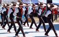
| 02/20/2003 10:53:09 PM |
Mariachi Rythmby JEMComment: Great capture. At first I thought it might have been a neat effect to show just their legs, but I think the repetition of the ties, shirts and hats all add to the effect. |
| Photographer found comment helpful. |
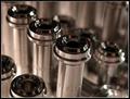
| 02/20/2003 10:52:08 PM |
Spiraling by mcmurmaComment: I love the contrast of the straight background and the graceful curves of the glass. Awesome. |
| Photographer found comment helpful. |
| 02/20/2003 10:50:39 PM |
|
| Photographer found comment helpful. |
| 02/20/2003 10:49:42 PM |
Snow on Roof Tilesby DennisFComment: I really like the depth of field on this, and the counter movement of the roof. Nice work. |
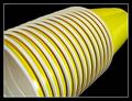
| 02/20/2003 10:43:49 PM |
DixieLandby RLSComment: I love this shot. I like how the cups start in one corner and draw the eyes up to the other. Also, the white edges really set up a nice pattern there. Good work. |
| Photographer found comment helpful. |
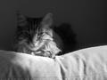
| 02/19/2003 11:12:56 PM |
UNCONDITIONALby AntithesisComment: They love you in their own special way. Good composition. I wish the top left of the cat had been as in focus as the foreground. I almost feel like the pillow (?) vies for attention because of that. I like this in bw. |
| Photographer found comment helpful. |
Home -
Challenges -
Community -
League -
Photos -
Cameras -
Lenses -
Learn -
Help -
Terms of Use -
Privacy -
Top ^
DPChallenge, and website content and design, Copyright © 2001-2026 Challenging Technologies, LLC.
All digital photo copyrights belong to the photographers and may not be used without permission.
Current Server Time: 07/17/2026 10:05:19 PM EDT.