|
|
|
Showing 6901 - 6910 of ~9205 |
| Image |
Comment |
| 03/25/2003 05:08:26 PM | The Pearby WILDBLUEComment: CRITIQUE CLUB CRITIQUE
by karmat
COMPOSITION
The mirror really adds to the interest of this shot. I think, though, that being straight up and down, in the center, almost makes it too static. The eyes rest on the pears, then just stop. Maybe if you had tilted it, or used negative space to really emphasize it, it would have been more dynamic.
TECHNIQUE
The focus and colors are excellent on this. I also applaud you at getting the mirrored image also well focused. There are a couple of bright spots on the pears, though, that look blown out. Perhaps if you don't have a diffuser, you could put tissue or a thin cloth over your light source. If you were using a diffuser, I really have no idea how to get rid of it, unless you set your lights more on the sides (left and right) in stead of shining on the front.
OVERALL EFFECT
The mirror, as stated previously, really adds a lot of interest to this shot. I think someone else mentioned the state of the pear, and I would have to agree. I have found that when photographing food, it helps to find a "speciman" that is nearly perfect, which is difficult to do. Pears, as I have found, are hard to find to do that with, so maybe an apple or strawberry would have been more aesthetic.
Good work and best to you in future challenges.
karmat
|  Photographer found comment helpful. Photographer found comment helpful. |
| 03/24/2003 01:35:40 PM | Pauseby gerardComment: Ugg, so useful, yet so annoying. Nice shot. I like the shadow | | Photographer found comment helpful. |
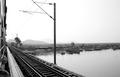
| 03/23/2003 05:12:20 PM | Crossing the Bridge...by snowleopard10101Comment: CRITIQUE CLUB CRITIQUE
by karmat
COMPOSITION
A very interesting composition. I think it is good how you have the tracks, poles, adn wires leading into the upper left corner of the frame, while the landscape provides contrast and leads the eyes towards the right of the frame. The empty space on the right is a little distracting in that it is not truly negative space, because there is still "stuff" there, so it doesn't point entirely to the tracks and train. Perhaps a vertical cropping eliminating the right side and showing more of the top of the train would have added impact.
TECHNIQUE
The stark bw of this shot is effective at giving an "empty" feeling to the landscape. It almost looks desolate. I like how the mountains in the background fade into what looks like fog or mist and it seems very sharp to me.
OVERALL EFFECT
Again, I think your coloring, framing, etc. combine to give this pic a less than hopeful feeling. It is a very good picture in that it is technically well done, adn evokes emotion.
Best to you in future challenges.
karmat
| | Photographer found comment helpful. |
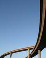
| 03/23/2003 11:19:39 AM | A Few of LA's Arteriesby takethatComment: CRITIQUE CLUB CRITIQUE
by karmat
COMPOSITION
I like how you have taken a picture of something "ordinary," or at least common, and used made it interesting by making it into an abstract. It is composed really well, I think, because the eye follows the ramp down the right and across the frame at the bottom, then loops back. excellent. Did you try flipping so that it would be a left to right flow? I don't know that it would have been necessarily better, just different.
The sky also produces negative space which is very effective in this shot to emphasize the bridges.
TECHNIQUE
The blue sky really makes this shot, though it almost seems a touch blown out at the bottom. Not enough to really detract though. I, personally, do not see the artifacts others are mentioning, but then again, maybe I need glasses or something. To me, it looks focused and clear. I like the way hte shadows help accentuate the motion. I do see some the moire pattern or banding in the sky. Perhaps NEATIMAGE, or another similar filter could help smooth that out
OVERALL EFFECT
This shot seems to serve to show the vastness of the road system. Though it is but a small part, and is a simple picture, it speaks of the massive confusion that sometimes comes when trying to navigate such things (especially for me!)
Good work and best to you in future challenges |
| 03/22/2003 11:01:46 PM | Spoon Starby nathaliedooComment: I like the simple arrangement, adn the coloring you have used. Also, having the star slightly off-center really gives it a dynamic effect | | Photographer found comment helpful. |
| 03/22/2003 11:01:08 PM | | | Photographer found comment helpful. |
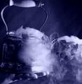
| 03/22/2003 10:58:09 PM | Tea Timeby tcherringComment: Great coloring and capture of the steam. I like the irony of a bare hand holding a "steaming" tea kettle | | Photographer found comment helpful. |
| 03/22/2003 10:56:08 PM | | | Photographer found comment helpful. |
| 03/22/2003 10:48:02 PM | | | Photographer found comment helpful. |
| 03/22/2003 10:47:41 PM | | | Photographer found comment helpful. |
|
Showing 6901 - 6910 of ~9205 |
Home -
Challenges -
Community -
League -
Photos -
Cameras -
Lenses -
Learn -
Help -
Terms of Use -
Privacy -
Top ^
DPChallenge, and website content and design, Copyright © 2001-2026 Challenging Technologies, LLC.
All digital photo copyrights belong to the photographers and may not be used without permission.
Current Server Time: 07/18/2026 06:48:03 AM EDT.
|