| Image |
Comment |
| 04/16/2003 06:39:51 PM |
|
| 04/16/2003 06:39:38 PM |
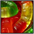
Find the Intruderby JackoComment: Great work. Took me a second to find it. The lighting is just a touch harsh,but the colors and focus are wonderful. |
 Photographer found comment helpful. Photographer found comment helpful. |
| 04/16/2003 06:38:59 PM |
|
| 04/16/2003 06:38:38 PM |
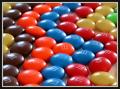
Licorice Candyby SwashbucklerComment: Great colors. The lighting seems to be a little harsh, making the white ones almost blow out, but otherwise nicely done. |
| Photographer found comment helpful. |
| 04/16/2003 06:38:03 PM |
Licorice L'Amore by dsidwellComment: Great effect, and a good idea. I find myself wanting to slide the plate to the left just a touch though. |
| Photographer found comment helpful. |
| 04/16/2003 06:37:27 PM |
|
| Photographer found comment helpful. |
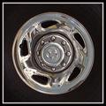
| 04/13/2003 11:43:24 PM |
Symmetry In Silverby IsaacComment: Isaac,
You have chosen a very good subject for "symmetry." It is not a typical symmetrical shot, and that helps to add interest. Also, I like the way it is in the center of a square frame. I think that helps to emphasize the the shape of the tire. I also like that the rubber part is almost completely invisible, making it look like the rim part is suspended or floating in air.
I think something that would have made this better, though, would have been to maybe find a car sitting still so that you could have gotten really close to it. That way you wouldn't have to sample up and it would be a lot clearer. Your exposure and stuff is right on. Good work. |
| 04/11/2003 10:19:07 PM |
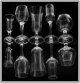
Odds & Endsby FranziskaLangComment: CRITIQUE CLUB CRITIQUE
by karmat
(This is the third time I have typed this comment, for various reasons, it keeps getting lost, so if it appears short and choppy, that is why. If you have any questions or comments, please feel free to contact me, and I will elaborate.)
This is simply an awesome shot. The staggering of the two sizes of glasses adds interest, I think, and the different "types" or shapes of glasses really adds a sense of randomness that adds context to the shot for me. It's almost like they are sitting on a bar or counter, waitign to be used. The off-levelness of it is a bit disconcerting, but i see in you comments why that is done that way.
Very well done focus and lighting. I am very impressed that hte reflections are as well focused as the "originals." Also, the light reflections are okay with me. They are glasses. Glasses reflect. If you could have prevented that, I think it would have looked unnatural. Better reflections than fingerprints and smudges.
This is a very elegant shot. I think the black and white works very well, though I think color (either by lights or in post processing) could be used to sit various moods effectively. Nicely done.
karmat |
| Photographer found comment helpful. |
| 04/07/2003 02:22:22 PM |
WTCby lionelmComment: CRITIQUE CLUB CRITIQUE
by karmat
COMPOSITION
The composition here is strong with the two towers of quarters being the primary item of focus and them being located on the left third. The small stacks also adds to the effect.
TECHNIQUE
While I find the green strip at the bottom a little distracting, I don't think eliminating would serve to help. The focus is fine, but the picture does look a little dark to me. I think some colored lights (blue, etc) shining onto the tower at various points would have made this shot a lot more interesting.
OVERALL EFFECT
I think this is a neat idea, it just needs a little more light to be truly effective. Good work.
Best to you in future challenges.
karmat
|
| Photographer found comment helpful. |
| 04/07/2003 12:51:57 PM |
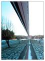
Suburban Reflectionby greenem2Comment: CRITIQUE CLUB CRITIQUE
by karmat
COMPOSITION
You have definitely met the challenge. I think that it is effective how the lines start on the upper and lower left and proceed down and through the frames. It really gives the eyes a nice path to follow.
TECHNIQUE
The picture seems to be a bit hazy to me. Not from lack of focus or anything, just not real clear and distinct. Perhaps it was the time of day that you were shooting?? Also, I think the overexposed parts in at the end of the reflection are a little distracting. Could you have shot from the other end, or at another time of day?
OVERALL EFFECT
You have definitely achieved a symmetrical shot, and one that is very interesting. I found myself looking at both halves to see which was "real" and which was the reflection. Good work.
best to you in future challenges.
karmat |
| Photographer found comment helpful. |
Home -
Challenges -
Community -
League -
Photos -
Cameras -
Lenses -
Learn -
Help -
Terms of Use -
Privacy -
Top ^
DPChallenge, and website content and design, Copyright © 2001-2026 Challenging Technologies, LLC.
All digital photo copyrights belong to the photographers and may not be used without permission.
Current Server Time: 07/18/2026 08:25:31 PM EDT.