|
|
|
Showing 6761 - 6770 of ~9205 |
| Image |
Comment |
| 05/07/2003 12:19:42 AM | Reflection of Fordby juseyhotaComment: At least we can count it as a learning experience.
I find it interesting that it does seem that you are the focus of the picture, when in reality that was not even realized until you saw it on the lcd!
I agree about the crop, and that it needs to have the symbol and you more off-center, and you could correct that if we had the ability to crop. Until then, try to compose carefully in the viewfinder!
I'm not sure about the oversharpened comment, as no sharpening was done to it, but the dirt may give that impression somewhat. Antialiasing is when a rounded edge looks square, basically. There's not a lot we can do with that, given our current circumstances. Maybe someday when you are rich and famous and can use something other than school material!! Hey, look on the bright side, you can always blame your photography teacher! :-) I on the other hand, have no excuse! |
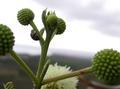
| 05/06/2003 11:23:24 PM | LadyHeartby WarpComment: CRITIQUE CLUB CRITIQUE
by karmat
My very first impression of this shot was, "Not bad, but I though flora was over." Then, I saw the ladybug. So, on with the critique.
I think the depth of fied used here is awesome!! I like how the foreground is out of focus, the background is out of focus, but the middle buds and bug are in focus. Very nicely done, and effective, I think. The location of the stem with the ladybug on it also gives it a well-balanced feeling by not being directly in the middle, and the vertical "shoot" of the stem helps to lead the eyes from the bottom towards the top of the frame.
The colors here are simple, but fairly nice. The white sky, normally, would be detracting, but with the nice green of the plants it works okay, I think. (A blue sky would be nice too, though.) I do think, like many of your commenters, that the picture would be much more effective if the bug was colorful. He/she (whatever it is) looks muted gray to me, so it does blend into the background and doesn't seem to be the main focus of your shot, but rather a subsidiary part of it. If the thing had any color at all, it may have helped to desaturate everything but it in post processing. Since it isn't immediately noticeable, many voters don't or can't take a lot of time to vote, and they may not have seen it, and just assumed it didn't meet the challenge. That is unfortunate because it really is a nice shot.
Best to you in future challenges. |
| 05/06/2003 11:06:53 PM | My companionby xertionComment: CRITIQUE CLUB CRITIQUE
I think you have done an excellent job at composing and executing this shot. The cat fills the frame nicely, while at the same time it doesn't feel cramped or tight to me. Mr. Burns has done an excellent job of "posing" and his position really forces the viewers to engage in eye contact with him.
While part of him feels like it is slightly "soft" (no pun intended) the eyes are sharp and crystal clear, which causes the viewer to focus even more on them. Also, the shallow depth of field works well here to eliminate any distractions from the background. To make it initially more engaging, it might be helpful to "catch" him in a situation where the context could also add to the "story" of the picture. For example, perhaps crouched waiting for a mouse, etc.
Technically, this picture is very well done. While I did not have a problem with "domesticates" in this challenge (like you pointed out, in a city environment, this would be the fauna) if you read some of the threads, you can see that I am in the minority, I think. This shot is very well done, and in a challenge specifically for pets would do rather well. |  Photographer found comment helpful. Photographer found comment helpful. |
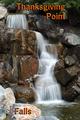
| 05/05/2003 01:25:20 PM | Thanksgiving Point Fallsby YomiComment: This is an awesome shot. My only suggestion would be for the text to be together. Either all at the top, or all at the bottom. Otherwise, very nicely done! | | Photographer found comment helpful. |
| 05/04/2003 11:31:32 PM | Flowers Squaredby wdebeau1Comment: CRITIQUE CLUB CRITIQUE
by karmat
Though I like the contrast of the different colors here, I think a couple of things would have really made this shot dynamic and stand out from the rest. First, I would play with the camera angle while shooting. Maybe try it from near the ground so that just a few of the flowers become the focal point, and others are in the background. Or, try to get far enough back so that the entire thing is shown, and doesn't look accidentally cut off. I think the purple and yellow flowers could be used to set up a nice picture of leading lines so that hte eyes are drawn into a picture and controlled by the actual subject. As it is, I just look at it and there is no real center of focus.
Secondly, I would have either used a faster shutter speed, or a tripod and gotten the focus crystal clear. It appears to have a bit of hand/camera shake to it. This may have helped the picture have more pop. If none of these things were possible, maybe you could have played with brightness/contrast or saturation to enhance the natural beauty you have chosen.
It is an interesting picture and a great idea. best to you in future challenges!!
| | Photographer found comment helpful. |
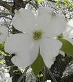
| 05/02/2003 10:18:23 PM | Dogwoodby draney4Comment: CRITIQUE CLUB CRITIQUE
by karmat
Dogwoods are a favorite of mine as well, and I have heard that "explanation" of them, too. Don't know if it is true or not, but it is a nice story. :-)
I have studied and looked at this picture a lot over the past couple of days. Though it is a fairly nice shot, and a great subject, I think a couple of adjustments could really give it some "wow" factor. I think the first thing that I notice is that the crop is a bit tight. Though you want the subject ot fill the frame, this feels crowded to me. Maybe if you pull the crop back some, and allow the main subject to be in the left or right third it wouldn't feel static, but would give the eyes somewhere else to "roam" and come back to.
The next thing I noticed is that teh exposure is great. The whites are nice and bright without blowing out, and the greens are shiny or bright, but a nice deep color. I think a slightly larger picture would show the defintion or details of the petals nicely.
The focus is okay for me, but the actually flower seems less sharp than some of the stuff in the background. I have found that it helps to make sure what I want in focus is in the very middle of my viewfinder or lcd, push the "shutter" halfway, let it focus, then reframe to get the framing I want. I don't know if your Nikon works the same way or not though.
Lastly, don't be afraid to play with the angle of shots. This looks head on, but it kinda gives me the impression that the flower was above your head. For some reason, it makes me feel like I am reaching to it. If this is so, try to find one closer to eye level or lower, then play with taking the picture from all different angles. Below, above, behind, to the sides, etc.
I do think this shot has a lot of potential, and I enjoyed looking at it. I hope this "critique" didn't sound over negative. If you have any questions or comments, please feel free to PM me and we can discuss it!
karmat |
| 05/01/2003 12:52:52 AM | |
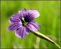
| 04/30/2003 10:42:44 PM | Anthesisby TarbiniComment: CRITIQUE CLUB CRITIQUE
by karmat
Another excellent creation, Tarbini.
The first thing I noticed was the wonderful contrast between the purple flower and the green background. The green really accentuates the deep rich color of the petals, I think. I think it is also effective how the stem leads into the picture so that the flower is not centered, exactly. I do wonder what it would look like to be mirrored so that the stem leads left to right, instead of focusing on the flower then being led right, in effect taking the eyes down and out of the frame. The shallow depth of field also works wonderfully here. The background is obscured as to not be a distracting element, and provides a nice, natural looking "backdrop" for the flower.
The edge of the flowers is a bit soft, but I think that may just help make the center sharpness even more distinct.
You have done great work, and I can think of little else I would change. karmat
| | Photographer found comment helpful. |
| 04/30/2003 10:33:21 PM | A Study in Shadowsby ClubJuggleComment: CRITIQUE CLUB CRITIQUE
by karmat
Club,
What I first noticed about this picture was the lovely contrast between the yellow building and the blue frame of the door. That is a great color contrast, and a real attention grabber. I also like how the "verticleness" of the tree and the "verticalness" of the door lead the eyes up through the frame. The vertical shape is also contrasted nicely by the diagonal "motion" of the shadows. I like how neither the door or the tree is in the center, but each is working together in the photograph.
Though the details in the sidewalk, and other shaded areas are good, it seems a bit blown out on the right, especially the trunk of the tree. The positive of this is that it gives it a "strong" look, but the negative is that it can be distracting and even painful if you look at it too long. :-)
As far as meeting the challenge, it has a tree and some shrubbery, so it does meet the challenge as far as I am concerned, even if the tree doesn't seem to be the main focus.
| | Photographer found comment helpful. |
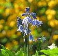
| 04/30/2003 02:39:13 PM | Bluebellsby mbardeenComment: CRITIQUE CLUB CRITIQUE
by karmat
COMPOSITION
I think the shallow depth of field works well on this, especially since the background becomes a muted yellow. Though I understand, I think, why you framed it this way, it seems a little static to me because the flowers are in the exact middle, and there is a fair amount of space on either side of them. As a result, the eyes tend to rest on the flowers (which is fine) but then there is no where else to go (except what I assume is a white flower). Maybe a portrait framing would have helped to emphasize the flowers more without detracting from the background.
TECHNIQUE
Again, the shallow depth of field really adds to the impact of this shot. Also, I think you have done well by waiting until the sun was just how you wanted it -- it has a nice dramatic effect. The contrast of the yellow and the purplish blues is very nice. The overall quality of the picture is outstanding. Very well done.
| | Photographer found comment helpful. |
|
Showing 6761 - 6770 of ~9205 |
Home -
Challenges -
Community -
League -
Photos -
Cameras -
Lenses -
Learn -
Help -
Terms of Use -
Privacy -
Top ^
DPChallenge, and website content and design, Copyright © 2001-2026 Challenging Technologies, LLC.
All digital photo copyrights belong to the photographers and may not be used without permission.
Current Server Time: 07/21/2026 01:06:06 PM EDT.
|