|
|
|
Showing 6551 - 6560 of ~9205 |
| Image |
Comment |
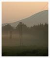
| 06/10/2003 11:25:48 PM | The Sound of Peace, Silence & Tranquillityby agwrightComment: CRITIQUE CLUB CRITIQUE
by karmat
Judging by your score and some of the comments, some people do not see silence, or quietness, as sound. Perhaps they should live with a toddler. hahahaha. Anyway, I do feel that it met the challenge, as I commented earlier, though not in a typical way.
I really like the tranquility of this shot. The muted colors, the fog, the gentle slope of the mountains, and even the isolation of the power lines and poles really set up a nice mood of solitude here.
I like the vertical crop, but I also would like to see it cropped/framed horizontally. Maybe that is because the diagonal of the mountain, and the powerline, give it a very strong lift to the edge of the picture, and I would just like to keep looking that way, instead of running out of the frame.
I commend you on your exposure. Shooting fog/mist can be difficult, because it can make parts of your picture look out of focus. You have avoided this pitfall. Also, you have some nice detail showing in the foreground.
Like indigo, I am curious as to what the dots are in the sky. I didn't notice them at first, but now that I've seem them, they are obvious to me. Almost looks like spots on my monitor.
Nice shot and best wishes in future challenges.
karmat |  Photographer found comment helpful. Photographer found comment helpful. |
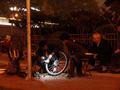
| 06/10/2003 11:14:42 PM | A repair joint where cyclists' wheels call homeby donpramComment: CRITIQUE CLUB CRITIQUE
by karmat
I really like how the light shining on the tire grabs the viewers attention, and then, looking around, the viewer sees that everyone in the picture is looking at the same spot. I like the "slice of life' that you have captured in this.
I know that there wasn't a lot you could control in this shot, so considering the attempt, I think you did very well. I will try to comment/suggest things that are independent of your shooting situation. It is a bit noisy, which is probably due to the high ISO. NEATIMAGE, used very carefully, might take some of that out. Also, I find myself looking at the pole. Perhaps a crop or framing so that it is not included would help the attention rest on the people more. Such a crop would also eliminate the bright lights on the left.
As far as meeting the challenge, I could see how it met, but judging from some of your comments, several of the voters must have thought it too much a stretch. Sorry about that. Frankly, I don't think it is just a "jump up and grab my attention and make me stare at it for ages" photo, but it is a neat "this is what happens here day to day" kind of shot.
Best to you in future challenges.
karmat
| | Photographer found comment helpful. |
| 06/09/2003 03:13:19 PM | cosinessby marcoComment: CRITIQUE CLUB CRITIQUE
by karmat
This shot definitely shows home.
It is well focused and you have used the existing light to your benefit. This shot is effective in showing a "slice of life" that many photographers strive for.
I think it would have been made more interesting or effective by doing one or more simple things. A lower perspective or angle (perhaps that of a small child looking in) may have added some interest. Also, it may have been interesting to focus on one particular aspect of the interior, because as it is, it is busy, and the eye doesn't have any particular thing to focus on. Finally, the tight vertical crop leaves me feeling rather cramped and longing for space. If that is the impression you were after, you succeeded.
Best to you in future challenges.
karmat | | Photographer found comment helpful. |
| 06/09/2003 03:05:15 PM | Blossom Time Ballon Festivalby STEINRComment: CRITIQUE CLUB CRITIQUE
by karmat
It is a shame that this scored so low, as it is an excellent picture. I guess I can understand why people may have thought it a stretch for HSH, but knowing how communities take pride in festivals of this sort, I can see it. Here in my town, Folkmoot, and international festival is held every year, and now Waynesville, NC and Folkmoot are almost synonomous. I assumed the same was true of your picture. However, many people seem to have interpreted the topic as a physical dwelling, and shots like yours would have been voted down.
Technically, this is a very well done shot. I really like how you have cropped/framed it as the larger balloon on the left balances the one higher and on the right. The focus is good, and you have used the available lighting to your benefit, I believe.
Like someone below mentioned, these colors beg to scream. Maybe if you could boost the saturation, ever so slightly, to make them really stand out, it would really be effective. Nevertheless, this is an awesome shot, and any balloon enthusiast would probably enjoy having it as a print.
Good work, and best to you in future challenges.
karmat | | Photographer found comment helpful. |
| 06/09/2003 01:18:03 PM | whispers and giggles by ursulaComment: CRITIQUE CLUB CRITIQUE
by karmat
What can I say??? I can not offer anything that would make this shot better, or identify anything that you did wrong, so I guess I will just identify some of the elements that I like, and why I think they work.
The little girl's expression is so genuine; it is almost impossible not to smile while looking at her. It does not look staged at all, or posed, so good work on the naturalness of the shot. Also, your crop is particularly effective, I think, because it focuses the attention on the little girl's eyes. By eliminating the "outside" of their heads, it gives a more intimate feeling.
The coloring you have chosen really adds to the emotion of the shot and helps to control skin tones, which can look red or blotchy in color if the lighting is not exaclty right. Great focus.
Very well done, and a definitely a deserving winner. Good work and best to you in future challenges.
karmat | | Photographer found comment helpful. |
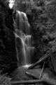
| 06/08/2003 10:41:37 PM | Berry Creek Fallsby afalconComment: CRITIQUE CLUB CRITIQUE
by karmat
Simply an awesome shot. You have used exactly the right settings, I think, to get a very nice, almost "heavenly" look to your photo. The water looks so peaceful and inviting, a person could just sit and look at this shot, I think.
I like the wood at the bottom, as well, as this seems to add a hint of reality to the picture.
The only criticism I have is that it seems a bit dark on either side of the falls. Of course, in order to properly expose the falls, that may be necessary, but it does almost lose some details.
I also think this would be a great shot in color.
Best to you in future challenges.
karmat | | Photographer found comment helpful. |
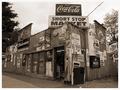
| 06/08/2003 10:31:58 PM | Signs of the Timesby timj351Comment: CRITIQUE CLUB CRITIQUE
by karmat
As I mentioned before, I think this works very well in the "duotone mode." Though I acknowledge the other comments about how colorful the signs would be, I still think shooting this in color would lose a lot of character and depth. I think it would make it raucous and busy.
By using the tones as you have, it does give it a vintage feeling. Looking at this picture makes it seem as if I have stepped back in time somehow, and am looking at the corner store for a small town near here.
My only complaint (and I had to look a while to figure this out) is that the cropping feels unbalanced to me. I think that since the end of the building, per se, can be seen on the left, it may give more of a sense of balance (at least for me) if it wasn't "chopped' on the right. Or conversely, crop it slightly tighter on the right.
Again, I think this is a very well done shot, and I apologize for not being able to offer more "help" with it. I enjoy your work.
karmat |
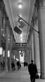
| 06/07/2003 11:15:31 PM | Modern Colonnadeby eloiseComment: CRITIQUE CLUB CRITIQUE
by karmat
I think this was an excellent choice for duotones. The bw gives it an impersonal feeling to me, and helps to convey emotion. I also like that you have captured people "unaware" of you, as this gives it a "slice of life" feeling. It has a good perspective that draws you into the shot.
The flag doesn't stand out to me that much, but the sign does for some reason. It also feels very tight with the narrow vertical framing. Perhaps a wider framing would have opened it up some, and helped to eliminate the "leaning" effect of the pillars on the right side. The lack of symmetry is probably the weakest element of the shot, and it can be difficult to achieve unless you line up parts of the shot while you shoot. Even then, it can be tricky. emorgan49 has given much better "advice' than I could on this topic.
Good work, and best to you in future challenges.
karmat | | Photographer found comment helpful. |
| 06/04/2003 03:14:21 PM | | | Photographer found comment helpful. |
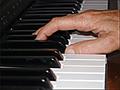
| 06/04/2003 03:13:50 PM | East Indian Drum Stringsby sunflowerComment: The composition is a little too centered for me. A different angle or perspective, or even someone playing it would have really added to this shot. | | Photographer found comment helpful. |
|
Showing 6551 - 6560 of ~9205 |
Home -
Challenges -
Community -
League -
Photos -
Cameras -
Lenses -
Learn -
Help -
Terms of Use -
Privacy -
Top ^
DPChallenge, and website content and design, Copyright © 2001-2026 Challenging Technologies, LLC.
All digital photo copyrights belong to the photographers and may not be used without permission.
Current Server Time: 07/23/2026 01:41:41 AM EDT.
|