|
|
|
Showing 5851 - 5860 of ~9205 |
| Image |
Comment |
| 09/18/2005 11:44:28 PM | Branching Out From Under The Coversby cloverstarComment: CRITIQUE CLUB CRITIQUE
by karmat
As a picture -- The composition of this is absolutely wonderful. I love how the cat is peeking out at you, and looks very intent on staying there. The bw is a bit "muted" in that it is all kind of a flat gray with the exception of the eye. Maybe adjusting the contrast some could help that. Grain being added typically doesn't bother me, if it helps a shot, but in this one, I can't see what it particularly adds. It may have been a bit too much.
For this challenge -- In a cats or pets challenge, this shot, as is would probably net you around a mid-5 (voters typically don't like grain). With proper exposure, so that it is "clear," this shot probably could net you a solid "6" score, I would think. For the shot to "branch" this far off the challenge , you did well to score as well as you did with your stretch.
Good work. You've obviously got a good eye for composition, and that will go a long way. Welcome to the trenches of dpc, and best wishes on your future entries!!
karmat |
| 09/18/2005 11:34:18 PM | Boring Branch, Beautiful Backgroundby swm4lfe_2001Comment: CRITIQUE CLUB CRITIQUE
by karmat
Technique
You have used the dramatic lighting to your advantage in this shot by capturing the "rays" and using a form of backlighting to silhoette the branches. That sets up a nice contrast, and makes the sky look even brighter. Looking at your settings, I wonder if you could have used a lower aperture value and faster shutter speed. I think that might have made the branches appear more in focus simply because the slight blur they have looks as if the wind was blowing or something.
'
Compositionally, I think there might be a bit too much "dark" on the left of the shot. I think cropping a bit on the right and left, would make the composition seem more balanced, and complete.
You don't mention any post-processing, but it looks to me like you upped the contrast a bit, and it may have affected the clouds a bit too much -- there are spots on them that are a bit overblown, it seems.
My first impression is that this shot is a bit out of focus. Unfortunately, when viewing hundreds of shots, the first impression is usually what gets to determine the vote. The composition seems a bit accidental, and the clouds are a bit blown out in areas. Had a voted in this challenge, I probably would have given you a 4 (for the aforementioned reasons), and maybe a 5 because you did an excellent job of capturing the "rays" which is not always easy.
Best to you in future challenges.
karmat |  Photographer found comment helpful. Photographer found comment helpful. |
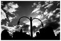
| 09/18/2005 11:07:59 PM | Sky Anchorby BeagleboyComment: CRITIQUE CLUB CRITIQUE
by karmat
First of all, let me say -- I LIKE IT>
The sky is very dramatic, and the angle you chose to shoot at really adds some *oompf* to the shot. The blacks are very clean and it sets up a nice contrast (thus, meeting the challenge very well).
Compositionally, after studying this for a couple of days, I think you might be right about the centered composition. I tried imagining it in the lower left and right corners, but it just doesn't feel balanced that way.
Now, when I look at this, had I voted in this challenge, I think I would have given it a 7 or higher. Technically, it is executed to perfection (or as close as we can be), but perhaps the lack of "emotion" in the shot hurt it some. There is not much there that the viewer can connect on, especially in a global market. If a person if familiar with this area, it may evoke emotions. Or if they happen to have an affinity for lampposts, but for the average viewer, it is technically well-done shot of an inanimate object.
Good work, and best to you in future challenges.
karmat | | Photographer found comment helpful. |
| 09/16/2005 09:49:22 AM | Sea Breezeby howardjComment: CRITIQUE CLUB CRITIQUE
by karmat
First off, I just want to note that I did not vote in this challenge (or enter), and that I really like this picture (I probably would have given it a 7 or higher).
COMPOSITION
I really like how you have chosen to have her in the right side of the frame looking back into the picture. To me, it creates a strong dynamic sense in that the eyes have some where to go, but they don't just wonder around the picture aimlessly. Also, the dof works well here because if the background was in focus, it would be way too busy and cluttered.
TECHNIQUE
The focus, lighting, postprocessing work is all fine. There is a slight grain to the picture, expecially in the sky, but nothing that detracts or distracts majorly.
MEETING THE CHALLENGE
To me, it is high contrast, and you have a good range of black and white (though most of the shot is varying degrees of gray).
INSIDE THE HEAD OF THE DPC VOTER
I really have no idea why this only scored a 5.2ish. In my experience, a lot of voters tend to like "portraits" where subject is looking at the camera, and perhaps her standoffish expression wasn't appealing. Maybe, if the background could have been a bit darker, adn the contrast adjusted a bit more on the model, it would have been even more contrasty.
Overall, it is a nice shot, and I'm sorry it didn't score higher. Good luck in future challenges.
karmat | | Photographer found comment helpful. |
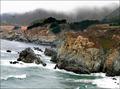
| 09/13/2005 12:16:16 AM | Pacificby NitinComment: CRITIQUE CLUB CRITIQUE
by karmat
Nice landscape shot. I like the contrast between the sky/land/and sea. It might be interesting to reshoot on a day when it is not quite so stormy looking, just to get further contrast between the rugged terrain and less stormy looking water.
The thing I notice immediately about this shot is how it feels like it is tilted to the right. I understand it is the perspective of the shot, but it is not diagonal enough to act as a pseudo-leading line, but not straight enough to feel on level. You could try rotating it some to the left, but I am afraid that would make the upper half of the horizon feel kiltered. Perhaps if there were "more" on the left and right, and the viewer could get a definite feeling of an "s" curve of the shore line it would feel more level.
The mist adds a mystical feel to the shot, and adds to the overall mood. The rocks look a little "off" focus (not really out of focus, but not clear, either) which makes the shot lack a bit of depth that it could possibly have.
Overall, I think it is a pretty good shot with some interesting details and stormy mood. Good capture.
karmat | | Photographer found comment helpful. |
| 09/13/2005 12:00:32 AM | Sole Foodby totaldisComment: CRITIQUE CLUB CRITIQUE
by karmat
Technically, this shot is okay. The lighting is good; there are no blown out areas and there is still details in the darks. The focus is good in that the subject is still identifiable, and any areas not in focus don't detract. The colors are a bit too uniform for my taste. I think a different color of plate or peas with carrots would have added a dash of flavor to the shot (pun, though bad as it is, was intended).
Compositionally, the long narrow crop you have chosen makes this picture feel flat. It is cramped and tight, and while that in and of itself is not a bad thing, in this shot, it doesn't give the viewer a chance to fully "feel" the shot. The placement of the items in the picture place the focus (at least for me) on the knife and onion slice rather than the shoe.
It does meet the challenge and is a creative and imaginative take on it. I think a couple of things executed differently would have really made this shot stand out.
Best wishes in future challenges.
karmat | | Photographer found comment helpful. |
| 09/11/2005 11:35:18 PM | Herringbone with Pinkby JutildaComment: CRITIQUE CLUB CRITIQUE
by karmat
Technically, I think this shot is pretty much right on. The exposure seems good as the details are visible in both the lights and darks. The background is clean without being overblown, and the bw with a splash (or stripe in this case) of pink is a nice touch.
Compositionally, the shoes look very "natural," as if you had just dropped them on the floor and that is how they landed. I think that is a good thing as it keeps it from looking too contrived. The placement in the left side of the frame is interesting, but i think it throws the whole feeling of the picture off balance. This may have been a neat shot to do with the shoes in the lower right and lots of white negative space around them. Regardless, I don't think placing them on the left side of the frame works well. It looks like the shoes are "walking" out of the frame.
It does indeed meet the challenge -- those are shoes, and cool ones at that. (In middle school I begged for a pair of orange/red/purple/green converse, but never got them. Now, I want a pair of pink ones!) This may have suffered because of the bizillion entries. I think the top pictures had a context that made them really stand out (no pun intended). While i like the clean white background, it may have been helpful to give the viewer a bit more context to form a story around, just to add interest.
Best to you in future challenges.
karmat |
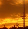
| 09/11/2005 05:41:22 PM | Day & Lightby cowcollectComment: CRITIQUE CLUB CRITIQUE
by karmat
Compositionally, this shot is interesting because the power lines lead the lines out of the shot. I think having a little less sky and more "ground" would have given a more stable feeling and a better balanced composition, though.
There is an orangish cast to the whole picture. While this makes for an interesting sky, it makes the dark parts not as effective. If it were possible to up the contrast without ruining the orange sky, that might make it a bit more dramatic.
Finally, I am seeing some noise, especially in the sky, that I am assuming is from either a) adjusting the brightness of the overall shot or b) a long exposure. A noise filter or plug-in may help. NeatImage, when used judiciously can be helpful.
Hope this helps.
Best wishes in future challenges. | | Photographer found comment helpful. |
| 09/11/2005 01:16:41 AM | Doing Linesby esdarbyComment: CRITIQUE CLUB CRITIQUE
by karmat
Technical
The tonal range on this is awesome. It is a good deep black, and a stark white without being too contrasty or overblown. The exposure is good in that the details are still visible, and the shallow depth of field makes it possible to understand the subject without being too cluttered or confused. The leading lines are effective at taking the eyes "through" the picture. Also, the skewed perspective is effective in helping to show the "speed" of the shot.
Technically, not a lot to improve, so why didn't it break 5?
I imagine you could blame prudes and stuff, but that won't get us anywhere. I find that effective photography arouses some emotion in us -- whether good or bad, and this shot is one that would do it. As a non-drug user, it doesn't appeal to me, subject-wise, even though it is a well-done shot. I suspect there are others like me. (BTW, I didn't vote in this challenge). On the other extreme would be people who really like the "shock" value of it, and the fact htat it goes against conventional "wisdom." For this picture, in this challenge, people have two ways to express their opinion of the picture -- a score and a comment. I think the score is telling you that the subject matter is more effective at sparking an emotion than the obviously well done technical side of it.
Hope this helps a little.
| | Photographer found comment helpful. |
| 08/30/2005 04:40:02 PM | | | Photographer found comment helpful. |
|
Showing 5851 - 5860 of ~9205 |
Home -
Challenges -
Community -
League -
Photos -
Cameras -
Lenses -
Learn -
Help -
Terms of Use -
Privacy -
Top ^
DPChallenge, and website content and design, Copyright © 2001-2026 Challenging Technologies, LLC.
All digital photo copyrights belong to the photographers and may not be used without permission.
Current Server Time: 07/26/2026 03:39:17 PM EDT.
|