|
|
|
Showing 5831 - 5840 of ~9205 |
| Image |
Comment |
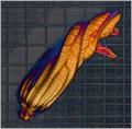
| 10/04/2005 02:49:53 PM | A Momentary Existenceby LongComment: CRITIQUE CLUB CRITIQUE
by karmat
I don't know that I can add anything to what lucidlotus said, but I'll try.
Compositionally, I think it might have been stronger if the bubble had been more in the corner. I think this kind of shot lends itself well to negative space and makes the surrounding "texture" even more ominous to the future life of the bubble. The color of the background is a bit distracting, though I like the texture.
Technically, while the uneven light can add drama to the shot, in this one it serves more to pull the eye from the bubble to the light spot. (If my understanding is correct, we will subconsciously "drift" towards light and "ignore" other details. That said, the shadow of the bubble is very intersting, but perhaps too subtle. Bubble are boogers to photograph, and I think had you used a lower ISO and slower shutter speed, that may have "darkened" the background and given some nice color trails as the bubble floated and met its eventual, though unavoidable, demise.
Best to you in your future challenges.
karmat |
| 10/04/2005 02:41:11 PM | The Sentinelby TheresaAComment: CRITIQUE CLUB CRITIQUE
by karmat
Compositionally, you have nailed the challenge. The head is right on the left third looking into the frame and that helps to give the shot stability and balance. Also, I like the angle you chose to shoot this from. It makes him feel towering and intimidating.
Technically, the focus is good, and the colors are okay. The whites are white, and there are dark areas giving it a range of color. I think, though, that the slight sepia tone just doesn't work. Perhaps a straight black and white would be better. The angle of the shot, the expression on his face, and the sepia just doesn't "jive" together. And it may just be that the hat kinda fades into the sky.
The shadows on his face don't bother me. I think enough detail is visible, and it kinda gives it some "atmosphere" or allows the viewer to have a bit more insight into the context of the shot.
Overall, a technically fairly-well done shot. I think, based on my past experiences with dpc, that the subject just didn't identify with the viewers (or vice versa). It is basically a shot of a young man standing on what appears to be a bright sunny day. Other than the title, there is nothing to truly engage the viewer and make them want to stay and look.
Best to you in future challenges.
Karma |
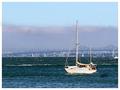
| 10/04/2005 02:26:47 PM | Sailing Awayby RikkiComment: CRITIQUE CLUB CRITIQUE
by karmat
Compositionally, you have nailed this shot. The boat is on the third making it a stable and balanced picture. You have included enough background to make it have the proper context, and thus interest, but it is at such a distant that it does not distract. Also, the boat is isolated, so there is no "competition" of subjects for the viewer.
Technically, the picture has the appearance of being out of focus. It could be one of several different things. It as underexposed and you had to adjust the brightness too much. It was too much of a crop. Or, it could just be oversharpened. Regardless, it has got a "grainy" feeling to it, though "noise" isn't an issue. (I am referring to how the photo "feels" more than the technical aspect of "grain" and "noise.")
Overall, it is a shot that meets the challenge well, but suffers from some technical issues that keep it from being a "wow" shot. The peacefulness and serenity that comes from looking at the boat cannot be surpassed.
This is definitely something that you might want to shoot again (in concept, I know you can't get this exact boat in this exact spot again . . .), but it has the potential of being a dynamite shot.
Best wishes to you in future challenges.
karmat |  Photographer found comment helpful. Photographer found comment helpful. |
| 10/03/2005 11:24:51 PM | Nigella damascenaby BBBastetComment: CRITIQUE CLUB CRITIQUE
by karmat
Technically, this shot is an awesome shot. The exposure is right on -- details are present throughout the flower and there aren't blown highlights, etc. The lighting is good and even without being harsh. The shallow depth of field works well to isolate your subject and make it look even cleaner and keeps the background from competing with the main subject.
Compositionally, it feels balanced and "natural." The flower is sitting roughly on the third, so while I am not a stickler that it be exact (but I didn't vote), since this challenge was the rule of thirds, I suspect many voters may have wanted it exact. Even so, I think it would have also been a nice shot. To put the "things" that are sticking up (I am so botanically challenged, sorry) on the right vertical third and the petals on the lower horizontal third would have caused some of the flower to be out of frame, but I think that might have been okay.
Overall, this shot is a very good one for the likes of a botany or flower magazine, or one of those books similar to a trail guide that helps you to identify various plants and things. Emotionally, unless a viewer just has a passion for flowers, it may not elicit a great response, and that could explain the 5.5 rather than a 6 or higher.
Again, this is an awesome shot, and one you can be proud of!
Best to you in future challenges.
Karma | | Photographer found comment helpful. |
| 10/01/2005 05:26:28 PM | destination: skyby redpandaComment: Critique Club Critique
by karmat
This is a very interesting, clean, colorful photo, that really pulls the viewer in.
Technically, I couldn't offer any thing to change. The focus seems to be pretty clear, the colors are awesome, and the light is perfect for me. I really like the bright red against the blue sky.
Compositionally, I like how the eyes (and viewer) are "pulled" toward the sky with the coaster. (Just as an aside, the passengers look so relaxed, it almost seems surreal). My only suggestion would be to have a bit more space at the top. The bulk of the picture and the "weight" of it seems to be in the bottom right third, but the eye is lead to the top, and out of the frame. This leads to a slightly unbalanced feeling, I think (which in some ways is effective for your subject).
It is an interesting take on the challenge, and I look forward to seeing some of your other entries!
Best wishes in the future.
Karma | | Photographer found comment helpful. |
| 09/27/2005 05:15:43 PM | Site Council: Let the Truth Be Toldby RikkiComment: The biggest problem with this (and why I couldn't vote on it or leave a comment originally), is that you have portrayed the SC as humans. And, well, it just ain't so. :)
I really did want to comment on this one before the challenge ran out, but ran out of time (imagine that) | | Photographer found comment helpful. |
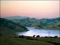
| 09/27/2005 12:36:59 PM | Dream Retirement Locationby NitinComment: CRITIQUE CLUB CRITIQUE
by karmat
So, I have studied and looked, and looked and studied this shot. It is absolutely fabulous. The composition is great in that the lake leads the eyes into the shot, but not out of it. There are enough "layers" that it is interesting (land, water, mountains, sky), and they are not all strictly horizontal, so that makes it even stronger and interesting to me.
I, for one, like the power line in it because it adds a touch of "reality" to the scene.
Just a couple of little things that "might" make the shot stronger (I can state with certainty, because I didn't try it).
There is a slight halo on the hills in the background. Perhaps from your selection, or perhaps from the usm. It is neither bad nor good, imo, just noticeable.
The sky is still a little pale. I don't know if you could have darkened it more or not, but while it adds a nice contrast to the green, it is still a bit light. Maybe cropping the top 1/8 off or so would help?
And maybe if the foreground was bit lighter so the details were a bit more visible. On my monitor at work (horrendous) the foreground was almost black, and here at home, the monitor (pretty good) still shows it as being just a tad dark.
Overall, this is an awesome shot, and a very peaceful, serene one at that. Wish I was there at times!!!
karmat
| | Photographer found comment helpful. |
| 09/23/2005 06:32:11 PM | Dustyby militarygirl10Comment: CRITIQUE CLUB CRITIQUE
by karmat
Disclaimor -- I am in no sense of the word an "expert" or even authority on portraits. Sometimes I get one to look really good, and sometimes I don't. With that in mind, I will simply tell you what works in this for me, and what doesn't. Unfortunately, I can't tell you the *trick* to make this a winning portrait (though I think you are well on your way).
What I think works well here --
Her facial expression is very good, I think. It is somber but reflective, giving the impression that she is a little sad about something. I like how her hair falls naturally and frames the face, without being too distracting, and I think having the flowers out of focus in the front works well because they help to add some color and context to the shot, as well as give it some depth.
What I think is working agains you --
I can only really identify two possibles. To me, there is a yellowish cast on the picture. Perhaps it is an illusion from the flowers, but maybe you could try adjusting the white balance or color balance to see if you could "cool" it down some. Her eyes look like they are a beautiful shade of green, but it is hard to tell with the yellow cast.
Secondly, I think it is cropped just a touch too tight, especially left to right. She feels almost squeezed into the frame.
That said, you have a beautiful model, and have done well here. Oh yeah, I like how the flower and her necklace compliment each other as well.
Good work and best wishes in future challenges.
karmat | | Photographer found comment helpful. |
| 09/21/2005 03:35:23 PM | | | Photographer found comment helpful. |
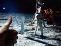
| 09/21/2005 03:32:01 PM | Nice Work, Buzz!by markmulkerinComment: I think a bit more light on the camera side of the hand would help this look like it had a bit more depth. The almost-sihouette makes it look kinda flat. | | Photographer found comment helpful. |
|
Showing 5831 - 5840 of ~9205 |
Home -
Challenges -
Community -
League -
Photos -
Cameras -
Lenses -
Learn -
Help -
Terms of Use -
Privacy -
Top ^
DPChallenge, and website content and design, Copyright © 2001-2026 Challenging Technologies, LLC.
All digital photo copyrights belong to the photographers and may not be used without permission.
Current Server Time: 07/26/2026 03:39:32 PM EDT.
|