|
|
|
Showing 5821 - 5830 of ~9205 |
| Image |
Comment |
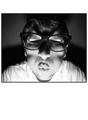
| 11/02/2005 10:29:40 PM | Loving meatby lastefComment: CRITIQUE CLUB CRITIQUE
by karmat
Hmmm, judging by your comments, either people loved the shot, or they didn't.
To me, this shot is a paradox in ways. So many of the elements just don't "go" together. This can be a negative as well as a positive. On the one hand, the juxtaposition of the grain, the person's smile, and the background makes the whole scene rather surreal, and possibly even uneasy feeling. His look is a natural smile, but not one that you would expect to see hanging in front of sides of meat. The grain gives it that "editorial--must see--important" feeling, but nothing in the shot supports that.
On the other hand, if you were trying to make the viewer go, "Something is definitely weird here" you did that well.
In my own opinion, I don't think the grain adds to the shot here, but then I don't think it detracts from it either. It is one of those subjects that by adding grain, you met the challenge qualifications.
A very interesting shot.
karmat |
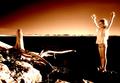
| 11/02/2005 05:53:27 PM | To Call The Angelsby JudiComment: CRITIQUE CLUB CRITIQUE
by karmat
Very emotive shot. The colors, the stark contrast, the grain. All of this adds up to a shot that is not "easy" or "fun" emotionally, but one that is almost haunting. The only suggestion I would make would be to have the horizon a bit higher in the background. It isn't on the 1/2 line, but it is closer to that than the 1/3, I think, and that gives it a slightly unbalanced feeling (to me), and almost seems to be cutting the gril in half.
(I do this when I personally like a shot, and can't find anything that I would change, but obviously does not meet the criteria for a ribbon from the voters.)
I suspect the girls lack of focus (on the hands) made this seem a bit out of focus. Also, to get the high contrast, some of the lighter areas are almost blown out.
This is obviously not a shot that most people would hang on the living room wall, but I do think it is one that would go well in a fine art portfolio.
Nice shot, and best wishes to you in future challenges.
karmat |  Photographer found comment helpful. Photographer found comment helpful. |
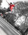
| 10/11/2005 03:14:09 PM | Kick Flipby MPRPROComment: CRITIQUE CLUB CRITIQUE
by karmat
I think what works in this shot is the unusual angle of composition you have chosen. It fits with the attitudes and abilities of these guys (who amaze me to no end!).
In my opinion, the desaturation doesn't really add anything to this shot. It helps somewhat to focus the attention on the skater, but his read shirt may have done that anyway. Also, and this is just a small nitpick, there is a red dot that is seen in the middle of the picture, and to me, it helps to pull the attention away from the boy.
The "negative" space at the bottom of the frame helps to give the impression of the boy soaring through the air, but to me, that freedom of soaring is countered by him being so far in the corner -- kinda like he is squashed in there.
Interesting idea and great capture.
karmat |
| 10/10/2005 02:51:18 PM | | | Photographer found comment helpful. |
| 10/10/2005 02:49:44 PM | |
| 10/09/2005 05:07:51 PM | Birthdayby arlanbartComment: CRITIQUE CLUB CRITIQUE
by karmat
This is too freakin' hilarious. It's scary, in a funny kinda way, and definitely looks like a good birthday card.
I really like the bw you have chosen to use, and the shadows help to add to the comical/scary effect. The expression on the face (especially with the big "X" shadow across the eyes/nose is priceless) the exposure is good and the focus works for me.
The only thing I think that may detract from the overall effect is what you have chosen to use as a border. Obviously, it *should* not effect the picture, but in this case, it makes the actual picture smaller than it could have been. Also, all the "white" around the picture draws the eyes (and thus viewer's attention) away from the shot. While I assume that you are going for the "card" look, it may have been helpful to "drive" the viewers' eyes to the picture not away from it.
Good work, and best to you in future challenges.
karmat | | Photographer found comment helpful. |
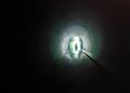
| 10/07/2005 03:41:19 PM | Welcome Back! (Get Well Soon!)by abdrainComment: CRITIQUE CLUB CRITIQUE
by karmat
My first impression was, "Huh?" After looking at it, my later responses are, "Huh?" Guess you could say I just don't get it -- not your fault of course, this is just not my cup of tea, so to speak. Therefore, I cannot comment at all on the "technical" side of it, but I can tell you my "feelings" for it.
This is a dark eerie photo. It really does seem like the light at the end of the tunnel, especially since the figure at the end looks almost like the silhouette of a person.
The other thing it reminds me of is an eye. Sort of an all-seeing kinda thing.
JPR is surprised at the low score it got. After being at dpc for over three years, you did remarkably well for such a far-out abstract -- almost five. Most of the time, they don't get out of the 3's. :( This indicates to me that you "hit a nerve" somewhere. Good work.
Best to you in future challenges.
karmat | | Photographer found comment helpful. |
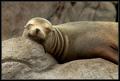
| 10/05/2005 04:45:36 PM | No Worries (Sympathy)by APComment: CRITIQUE CLUB CRITIQUE
by karmat
Normally, I can stretch and find at least one or two things that I would improve in a shot, OR what the voters wanted, but I can honestly say that in this shot, I don't know that I can.
What works well is the uniform color, and contrasting textures. Of course, the adorable expression helps as well.
My only thought would be that maybe it would make a better Encouragement card rather than a sympathy one (not that it would have changed the score).
Great work, and congrats on the awesome shot. | | Photographer found comment helpful. |
| 10/04/2005 03:07:11 PM | Pure bubblesby chozmaComment: CRITIQUE CLUB CRITIQUE
by karmat
Compositionally, I love the crop of this. The offset angle adds interest and dynamics to the shot and draws the viewer in. It is also infinitely more interesting than just a straight shot of a wine glass with a bubbly beverage in it.
Technically, this shot screams for sharp focus throughout. At first glance, I thought the bubbles were also out of focus, but upon closer looks, it may just be a reflection of sorts that keeps them from looking "clear." In a shot like this, where there is simply light and dark, the eye is going to be drawn to the light area, and I think that is why it needs a stronger focus on the stem and bottom of the glass. If you wanted more emphasis on the beverage, perhaps a bit more space around the top would help to pull the eyes back up.
Overall, I think this is an interesting image. I also think playing with the colors and hues to make this a straight black and white image (it seems to have a slight blue cast to it right now) would also be interesting.
best wishes in future challenges.
karmat | | Photographer found comment helpful. |
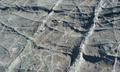
| 10/04/2005 02:58:27 PM | The Naturalby GeneralEComment: CRITIQUE CLUB CRITIQUE
by karmat
I also had one of yours in the last batch, but didn't get to it before the rollover. Sorry 'bout that. I am starting to feel like your personal "critiquer." :)
Compositionally, I can see the rule of thirds though it is probably a bit subtle for the voters. I also thought it fairly interesting, though did wonder what it was. The texture adds some dynamics to the shot.
Technically, I think the slightly out of focus section on the bottom right is a bit distracting, but the rest is pretty much right on.
Overall, I think once again, you have entered a challenge with a shot that met the challenge, and held a deep story, if people were willing to stop and think for a minute. Though I must confess, a bright red rose or some other "not related" object thrown on there would have given it a splash of color and another element of mystery.
It would make an awesome background.
karmat | | Photographer found comment helpful. |
|
Showing 5821 - 5830 of ~9205 |
Home -
Challenges -
Community -
League -
Photos -
Cameras -
Lenses -
Learn -
Help -
Terms of Use -
Privacy -
Top ^
DPChallenge, and website content and design, Copyright © 2001-2026 Challenging Technologies, LLC.
All digital photo copyrights belong to the photographers and may not be used without permission.
Current Server Time: 07/27/2026 02:28:22 AM EDT.
|