| Image |
Comment |
| 12/10/2005 03:57:20 PM |
Industrial Sunsetby shirokkoComment: CRITIQUE CLUB CRITIQUE
by karmat
I really like the contrast between the deep orange and the silhouetted blacks. It is very pleasant to look at.
Compositionally, there is a little interest generated by the stacks but beyond that, there is little to hold the viewer's eyes for long. You have done well in having the sky occupy the top 2/3 of the frame and the refinery the lower 1/3. This helps it to feel balanced and "complete." As other commenters mentioned, perhaps composing the shot more to the right so that the tallest stack is on the right third would help. It would "anchor" the picture in that spot, and it would help to eliminate the bright spot of the sun, as it tends to dominate the picture and distract the viewer.
As far as camera settings, I am wondering if having a higher aperture number and a slower shutter speed would help the edges of the building appear sharper.
As far as dpc voters go, I suspect that many of them viewed this as a fairly good picture technically, but without that added *oomph* that drives pictures to the 6s and higher.
Nice shot, and best wishes in future challenges.
karmat |
 Photographer found comment helpful. Photographer found comment helpful. |
| 12/09/2005 10:36:53 AM |
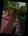
Drunk in the gardenby GinaRothfelsComment: CRITIQUE CLUB CRITIQUE
First impressions -- My first impression is that the cock-eyed framing of this picture really fits with the title. Kinda like it is just falling over -- it is off-balance, but again it fits.
Composition -- I like how you use the bottle and the glass to lead to the chair via the path. That seems to be an effective use of leading lines, and it gives the picture some dynamics that would not be there if they wer aligned straight, I think. It also helps to balance the picture between the foreground and background.
Technically, the focus is okay, and I like the contrast of the red and green in this shot. However, it feels as if it was too dark and you brightened/lightened it in postprocessing adding a grainy feeling to it. If you were using a tripod, maybe using a slower shutter speed would have helped, but I imagine exposure was a bit of a problem because it looks like a slower shutter may have blown out the sky.
Your picture and dpc voters. I suspect what "hurt" your shot is the oddity of the frame/composition, even though many did appreciate it and see the relevance, there were probably those that did not. Also, as mentione, the focus seems okay, but it seems to have a bit of "grain" (not like traditional film grain/digital noise -- more of a "roughness").
Interesting approach, and best wishes in future challenges.
karmat |
| Photographer found comment helpful. |
| 12/07/2005 04:02:32 PM |
Sunrise on Hummel Lakeby sailracer_98Comment: Beautiful. Evokes feelings of peacefulness and serenity. I love the color tones in this, and the almost hidden boat. Great work. |
| Photographer found comment helpful. |
| 12/07/2005 04:01:57 PM |
Down On The Farmby rexComment: nice sky. wish the color could have been more uniform across the top (not that I expect you to control the weather or anything. ;)) |
| Photographer found comment helpful. |
| 12/07/2005 04:01:21 PM |
|
| Photographer found comment helpful. |
| 12/07/2005 04:01:02 PM |
Flag Artby woodseyComment: Good capture, but to me, personally, I think the compostition would be stronger if the lines lead from the lower left to the upper right. Just a personal opinion. (and as a side note -- while many feel this is "over done" here on dpc, I have found that my shot of this is a popular crowd pleaser when I go to shows and stuff. Good luck). |
| Photographer found comment helpful. |
| 11/22/2005 03:47:38 PM |
|
| Photographer found comment helpful. |
| 11/22/2005 03:09:35 PM |
life on good drugsby pix-areComment: Neat idea, but I think a tighter crop so that the whole frame was filled would be more effective. |
| Photographer found comment helpful. |
| 11/15/2005 03:56:08 PM |
Bad Santaby beautyqn25Comment: OMG -- I am loving this!!! Great expressions, and a selective desaturation that truly adds to the shot, I think. I do hope that at least one of these (if not all) are your family Christmas pics this year (if it is your kid. if not, better not use it -- hahaha).
Great work. 10 |
| Photographer found comment helpful. |
| 11/04/2005 03:41:11 PM |
Unkeptby KonadorComment: Ben,
I think what makes this shot the most interesting is the juxtaposition between the light elements and the dark ones and the splashes of color. This was also an excellent example of when grain "works' in a picture.
For me, personally, this shot isn't real "moving." I tend to think that they appear flat and lack a distinctive purpose or subject. THAT said, the more I look at this, it starts to be more appealing. The colors really stand out, and it whispers, ever so quietly, "I have a story, but you have to listen carefully to hear it."
:)
karmat |
| Photographer found comment helpful. |
Home -
Challenges -
Community -
League -
Photos -
Cameras -
Lenses -
Learn -
Help -
Terms of Use -
Privacy -
Top ^
DPChallenge, and website content and design, Copyright © 2001-2026 Challenging Technologies, LLC.
All digital photo copyrights belong to the photographers and may not be used without permission.
Current Server Time: 07/26/2026 07:16:30 PM EDT.