|
|
|
Showing 5751 - 5760 of ~9205 |
| Image |
Comment |
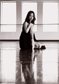
| 05/20/2006 02:03:58 PM | Out Ridin' Fencesby eqsiteComment: I love the close crop. You include enough background to provide context, but not too much so that it become distracting. Nicely done. |  Photographer found comment helpful. Photographer found comment helpful. |
| 05/20/2006 02:01:11 PM | Reflectiveby pidgeComment: I really like the color tones of this, and nice use of reflections . .. | | Photographer found comment helpful. |
| 05/20/2006 01:59:15 PM | Want some orange?by BrinComment: The face is in focus, which is good in a portrait. However, the orange really draws attention to the hand which is slight soft. That is a bit distracting. | | Photographer found comment helpful. |
| 05/20/2006 01:58:02 PM | | | Photographer found comment helpful. |
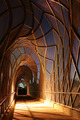
| 05/20/2006 01:53:54 PM | Modern Designby lectrolComment: CRITIQUE CLUB CRITIQUE
by karmat
My first impression is "Cool." I really like the contrast of the orange supports and the blue sky. This is begging to be photographed again. . .
Compositionally, it seems a bit random to me, without a definite area for the eyes to "rest" on. The eyes are torn from looking to the "end of the tunnel" and the awesome randomness at top. That can be good in that it really sets a "mood" for the picture, and the puzzlement at teh top adds to the confusion the composition sets up.
Technically, the blown out spot on the left really spoils an otherwise great effect. Couldn't you ahve shot the light out with a bb gun, or sling shot or soemthing. (I AM JUST KIDDING). that being said, while the handrails make for some interesting leading lines, cropping the bottom half out sets up for a neat abstract.
Good work!
karmat |
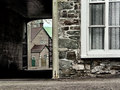
| 05/20/2006 01:44:24 PM | Dante's Poetic Conversionsby LouisonComment: CRITIQUE CLUB CRITIQUE
by karmat
My first impression fo this shot is that I really like the muted-ness of most of the colors, but the bright green beyond the covered area.
Compositionally speaking, I think it works well to have the contrast between the two buildings, joined by a walkway. This speaks metaphorically, if you will, about conversion, even if you have to think about it for a minute or two. Also, I like how it "peeks" into what is to come through the covered area. The only thing that doesn't work for me is the white corner "post" looking thing cutting the picture in half. I find it distracting and wonder if would have been possible to compose the shot without having it quite so centered.
Technically, again, I love the colors in this. The focus and exposure seem right on.
For this challenge, I wonder if others thought about Dante's writings and were trying to reconcile the picture to that, instead of the book you alluded to in your comments? It doesnt' seem contrived, and the picture does well to establish what could be a setting of the movie.
Well done, and best wishes in future challenges.
karmat | | Photographer found comment helpful. |
| 05/20/2006 11:27:47 AM | Double Petunia Caperby collie65Comment: CRITIQUE CLUB CRITIQUE
by karmat
Greetings and congrats on entering! I looked at your profile and see that you are still relatively new to dpc, so welcome, and I hope it meets your every expectation. Also, I saw that your name was Carma. Way cool. I spell mine (name) Karma. I've met several Carmens, but I don't think I've ever "met" another C/Karma. :)
oK, on to your picture.
My first impression was that this was a straight on, slightly underexposed shot of a pretty white flower.Typically, those do not fare so well in challenges, unless you do something really dramatic with the lighting, composition, context or all three.
First, I'm going to take a stab at what you might have been able to do with this particular shot to give it a bit more punch, but I'm fairly weak myself at post processing, so take it for what it is worth, then, I'm going to make some suggestions about what you can do if you ever want to reshoot this, or something similar to it.
When you adjusted the brightness up 2 notches, that caused the foremost and most obvious, petal to become blown out. Also, when you adjusted the contrast, it probably made it more so. Rather than doing a brightness/contrast adjustment, it may have helped to see if your software had "levels" (PaintShop Pro, and Photoshop both do) and using that to make your adjustments. Or, use curves to bring the midtones up (the middle of the "curve) and possibly the dark end (the bottom of the curve) without blowing the hightlights.
Compositionally, if you had room, setting this on an angle is a personal favorite trick I like to use. It gives a bit of "movement" through the frame and makes it a little more interesting than just straight horizontal or vertical. If you didn't have room to rotate it, maybe crop further in so that the center of the flowers looked like eyes or something.
If you want to reshoot, I would set my aperture to a bigger number, if possible, to allow a greater depth of field. This will help the focus issue by allowing more of the flower to be in focus, and not just a couple of edges. Or, I would slow the shutter speed down a bit to allow more light, and thus fix the exposure thing.
Something that might be neat would be to set the camera on a tripod, or steady surface. Make the surrounding area as dark as possible (if outside, shoot at night, or if inside, cut the lights off). It looks like these two flowers are still growing, so I am kinda working around the assumption that you don't want them moved.
Get a small, pen-sized flashlight. Set the timer on your camera, focus, cut the lights off, then "paint" the leaves with the flashlight. Use a long exposure to be sure to get good coverage. This gives it a soft look and a kind of glow that can add interest.
OR, using the tripod, timer, and long exposure, backlight the flowers by placing the flashlight under/behind them. Most petals will allow enough light through to give a really cool effect. Again, I am making some assumptions about the capability of your camera, but I think most of the powershots will allow at least shutter or aperture priority modes, so you could use that to force the shutter "open."
Compositionally, while the head on approach is good to "document" flowers, try playing with different angles to find some that are really fun. Ursula has some absolutely AWESOME flower shots, so if you like this branch of photography, be sure to look at her portfolion. She seems to make flower sing in her pictures.
I hope this helps and has not been to presumptious. You're off to a good start at dpc, and I look forward to seeing your future entries!
karmat | | Photographer found comment helpful. |
| 05/20/2006 10:30:32 AM | Deep Penetration Comet - (1956., Disaster, B&W, Director unknown)by gocComment: CRITIQUE CLUB CRITIQUE
by karmat
My first impression of this shot is that it is one of a handful that doesn't look contrived (with the title) to fit the challenge, and could have easily been a poster for a 50's sci-fi movie.
Compositionally, I rarely envision comets going straight up or down, though I suppose they probably do. Therefore, I think rotating this 30 - 40 degrees to the right so that the comet is going up and right or the other way and down and left, would have given the shot a bit more dynamicism (if that is a word). It wouldn't have seemed quite so static-y then. Also, I don't know that the letters add anything and it may have been better just to leave them off.
Technically, I like the black and white for this. Also, the texture of the wall gives it a sky-like feeling in a weird kind of way. The bw is perfect.
This is one of those shots that when you first see it go "gah. what was s/he thinking," but after looking at it for a minute or two, it is really kinda clever with a lot of potential.
Good luck in the future. | | Photographer found comment helpful. |
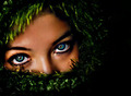
| 05/20/2006 10:21:06 AM | Deceitful Passion of Captivityby librodoComment: CRITIQUE CLUB CRITIQUE
by karmat
Another wonderful exotic shot.
Those eyes are absolutely riveting, and I think the green around her face really helps to bring that out. I don't know that I can add anything that has already been said, but I will echo the sentiment that the focus is a touch "off," but not much. It just seems that her left eye is more focused than her right.
And for me, I would like to see the "stuff" framing her face illuminated a bit more.
Otherwise, nicely done.
karmat
|
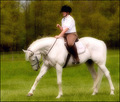
| 05/20/2006 10:14:16 AM | Daughter's Proud Chargerby docurrieComment: CRITIQUE CLUB CRITIQUE
by karmat
My first impression of this shot is that it is a dreamy, ethereal kinda of shot. It kinda seems like it should be a romance or something.
Compositionally, I really can nitpick anything about it, except to say that I almost wish there were more space at the left and top. I think that would make it have a bit more "motion" as the horse would have somewhere to "go," and I can't really express why I think it needs more at the top other than I just think it does. :/ sorry.
The colors on this really appeal to me. Her earthtone colors and the stark white of the horse really set up a nice contrast with the green in the background.
The SD looks a bit tentative, but that wouldn't necessarily add/subtract to the score of your shot other than affecting the overall effect of it. Being her first competition, a bit of tentativeness is to be expected. With a bit of confidence gained, make sure you reshoot this so she can see the difference that it makes when she is riding (and I'm sure the judges notice.) :)
That is an absolutely beautiful horse.
Why only 5.3ish? I'm not sure. Had I voted, I probably would have given it a 7 or so. The shot is technically well done, and has a nice effect to it. I know it sounds cheesy, but had the daughter been looking confidentally at the camera and showing her pride (and consequently mirroring the horse's pride)I think that would have added to the effectiveness of the shot. As it is, it feels like a "grab shot." Obviously, that is an entirely different picture, but I think you have the beginnings of it here.
It IS a good picture, and one that you and your SD can be very proud of. Best to you in future challenges?
karmat |
|
Showing 5751 - 5760 of ~9205 |
Home -
Challenges -
Community -
League -
Photos -
Cameras -
Lenses -
Learn -
Help -
Terms of Use -
Privacy -
Top ^
DPChallenge, and website content and design, Copyright © 2001-2026 Challenging Technologies, LLC.
All digital photo copyrights belong to the photographers and may not be used without permission.
Current Server Time: 07/27/2026 06:03:42 AM EDT.
|