|
|
|
Showing 5731 - 5740 of ~9205 |
| Image |
Comment |
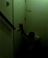
| 06/09/2006 11:39:20 PM | Please Mister Postmanby iamutopiaComment: CRITIQUE CLUB CRITIQUE
by karmat
You definitely have a good idea here.
Compositionally, this works well because the main subject is at the bottom right of the frame, but the the handrail leads the eye through and down the frame to him. That is a very effective technique, I believe and makes the composition stronger. The switch and the little round thing are a bit distracting. Since this was advanced editing, you could have cloned those out, or you could crop it lower and still maintain your basic overall composition. I would probably recommend the former more because having a vertical crop gives it a "deeper" feeling.
Technically, the low exposure kinda of hurts. I have a super bright (almost too bright) monitor, and the bottom details are all but obscured for me. I can see his heads and arm, and that is almost all. I see your aperture is 22. I would think you could get by with a much lower number. This would help the exposure, and even help you use a faster shutter speed as well, so your subject would have to be as still.
The green has an interesting effect on me. It is a cool color, and would normally be calming, but in this shot it is having the opposite effect. Perhaps because it is a little on the yellow side, or because the bottom is darker.
Again, I think you had a really good, powerful idea. Unfortunately, it gets lost in the darkness.
karma |  Photographer found comment helpful. Photographer found comment helpful. |
| 06/09/2006 11:27:04 PM | ...I've been working like a dog.by arrowsmithComment: CRITIQUE CLUB CRITIQUE
by karmat
What a cute little dog. He looks like he would be a real character.
Compositionally, this shot is lacking a bit. He is just kinda lying there (as dog's do), and the eyes tend to go back and forth from the eyes to the feet, back to the eyes, to the feet, etc. I'm not sure exactly what could fix it, except perhaps shooting from another angle. The low perspective works well to give us the "eye view" but other than that, there isn't much in the composition to hold the viewer's attention.
Technically, the large shaded area across his hind section hurts. The dog just sorta blends in, and the harsh shadows on his face obscure some details there. Maybe using fill flash or waiting until later in the day would help prevent that. Also, my first impression was that the focus was off, but the more I look at it, I think it is just his furry nature. Still, he doesn't look as sharp as the ground around him.
Overall, I think it is a fairly decent shot, and one that will definitely help you to remember Max..
karma | | Photographer found comment helpful. |
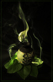
| 06/09/2006 01:03:03 AM | Elixir of Jealousyby JasComment: CRITIQUE CLUB CRITIQUE
by karmat
Very "rich" and appealing image. Also, great smoke capture.
Compositionally, this is one of those shots where a "centered" subject works well. Perhaps this is because the smoke drifts up to one side leaving some negative space that offers some balance to the composition. Also, the division of leaves on the bottom, vase, and smoke, gives it that division into thirds that makes it into a stable picture. The only suggestion I would make is to lower the angle of perspective if possible. Right now, the viewer is looking down on the subject, and it loses some impact, I think.
Technically, I love the rich green colors. The lighting is spot on and illuminates enough to give it texture and character, but is "dark" enough to add some interesting shadows. Also, kudos on the capture of smoke. I tried this recently on a couple of occasions, and all I got was a near-traumatic experience with the smoke detectors. That capture in itself makes this shot technically well done.
Overall, I think you have a shot you can be proud of.
Great work.
karmat | | Photographer found comment helpful. |
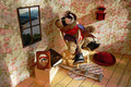
| 06/09/2006 12:55:09 AM | Doc said "Rocky, you met your match." Rocky said "Doc, it's only a scratch..."by cogeroxComment: CRITIQUE CLUB CRITIQUE
by karmat
This is just too cute. I love the *details* you have taken care of -- the picture, the Bible, the crutch. You have done a really good job of creating scale, or at least creating the illusion of this being a larger scale than it really is. (If that doesn't make sense, PM me and I'll try to explain better).
Compositionally, it feels like the camera should have been to the right just a bit more. When looking at the picture, I find myself almost "scooting" to do that. This angle/perspective shift, would have also moved the main subject out of the center of the frame and put it more on the right third. Also, while all the details are great, I think I would have arranged them more consciously so that a triangle or simple shape was formed. Right now, they look kinda haphazard and the eyes go from the animal to the picture, to the "window" to the thing on the wall, etc. A simple shape would give the eyes a path to follow.
Technically, I like the natural light. Focus and exposure are right on.
Overall, I think you have a very cute and humorous picture. The more I look at it, the more I laugh. Very nice work.
karmat | | Photographer found comment helpful. |
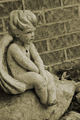
| 06/07/2006 04:43:07 PM | Like Dreamers Doby brookepiComment: CRITIQUE CLUB CRITIQUE
by karmat
My first impression was that you had scanned a picture. :) After reading your comments, I feel that you did indeed achieve an antique/vintage look, and yet it still looks "natural," and not contrived.
Compositionally, the little angel is the main focal point of the shot. You have allowed a good amount of room on the right to give him somewhere to "look" and this leads the eyes across the frame and "out." Whilst that may seem "bad," I think it helps to strengthen the picture. Also, the brick wall serves as a nice contrast.
Technically, again, comments about focus or exposure are not necessary, I don't think (though a poorly focused shot probably wouldn't have transposed into this well). The post processing is important on this one, and it would seem that it really does add to the shot.
In the mind of dpc voters
While I feel the grain and "noise" of the shot works well, there were probably many voters who it did not appeal to. Different strokes for different folks, obviously. Also, the angel looks more contemplative than dreamy, so the title may have made it seem that you were stretching to fit the challenge. Finally, there isn't a lot of context in which to place this, so it comes across as being a picture of a statue, and those typically (unless you do something dramatic with the composition, or lighting, etc) tend not to do as well.
Good work, and best wishes to you in future challenge.s | | Photographer found comment helpful. |
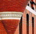
| 06/06/2006 04:47:58 PM | Bricksby xlr8tnComment: CRITIQUE CLUE CRITIQUE
by karmat
That, indeed, is some impressive brick masonry. Very nice capture.
Compositionally, I like how the "cone" anchors the shot on the left, and then the eye is drawn to the right through the picture. If possible, I think it might have been more effective to go wider and not cut the top part of the cone off, but still maintaining the progression on the right side of the frame. Not sure if that was possible, but that is what my eye "feels" like it should be seeing.
Technically, I love the read color of this, and the more shallow depth of field works well to isolate the cone from the rest of the building.
Overall, I think it is a good shot that meets the challenge. It does lack a certain amount of "punch" that reaches out and grabs the viewer and makes them sit and stare in awe at it. In other words, it is a strong brick structure, but it doesn't really have an appeal to the general masses of people. Does that make sense? Perhaps more context in the shot (again, if possible) would have given the shot that little extra edge to be more appealing.
Good work. |
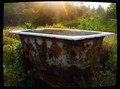
| 06/06/2006 04:38:39 PM | Ancient Bathby dabidejpnComment: CRITIQUE CLUB CRITIQUE
by karmat
Okay, I will admit, when I saw this one in the challenge, I wasn't sure how to make it connect to architecture. After reading your comments, I'm slightly more enlightened, but still feel like it may have been a reach. :)
Compositionally, this shot really works well. The tub fills the frame and is obviously the main focal point. Also, there is enough space around it to give it interest and context. What I really like is that you did not shoot "straight" and the tub is angled somewhat in the frame. This helps make it feel more balanced, I believe.
The greens contrast nicely with the sunshine, and this shot just oozes comfort to me.
Technically, the focus is good, and it looks like the exposure is pretty close (I am on my work computer, which seems to be a shade or two dark).
This is a well done shot, and had the challenge been "old" or "ancient inventions" or something like that, I have no doubt that your score would have been a full point or two higher. I suspect many voters did not make the connection between this object and "architecture." | | Photographer found comment helpful. |
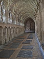
| 06/06/2006 04:29:49 PM | Medieval Cloisters, Gloucester Cathedralby obsidianComment: CRITIQUE CLUB CRITIQUE
by karmat
I love old buildings like this. I look at them and wonder, if the pillars could talk, what stories would they have to tell? What have they heard and see that no one else ever has?
Compositionally, I love the "off-side" feeling of this. So many times shots like this are taken staight on with exact symmetry, and while that is nice, this composition gives it a bit more "sophistication" I think. I wondered if it might have been stronger with less foreground and cropped horizontally, BUT, I like how the vertical crop keeps everything "close' and the floor leads into the shot.
Technically, it seems to be okay to me. I am on one of the crappy computers at work, so I can tell you what I see. If it is totally off base, pm me and that will remind me to look at home on a decent monitor (this is why I don't vote at work . . .)
The focus looks just a touch off, like perhaps some graininess was unintentionally achieved during post processing, then removed afterwards. As a result, some of the windows and arches look a little artifact-y. (Again,this may just be this monitor).
Overall, this is a great shot. I think if time had permitted (and weather), a more dramatic lighting would have really upped the wow factor of this one and pushed it into the upper 6's
Great work!
| | Photographer found comment helpful. |
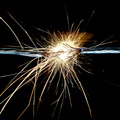
| 06/06/2006 09:55:41 AM | Failure To Connect by lectrolComment: CRITIQUE CLUB CRITIQUE
by karmat
Congrats on your ribbon and new personal best score!!
Obviously, while the title is "failure" to connect, you did connect with the viewers. It is a very good idea, and very well executed.
The *only* thing I can really say about what would have made it "better" is that to me it cuts the frame in almost half, and this leads to a composition that is static. The eyes go to the spark, and that is about it. If there had been a way to set it on a diagonal (either corner to corner, or just part of the way), I *think* that would have more motion through the frame.
technically, very well done.
Again, good work. Sorry I couldn't add more.
Karma | | Photographer found comment helpful. |
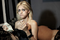
| 06/06/2006 09:49:43 AM | fallen woman (harlot)by noodleboyComment: CRITIQUE CLUB CRIITQUE
by karmat
Very powerful image. While not technically *perfect,* it delivers the message in a loud voice. In deed, technically perfect would detract from the realness of it.
Compositionally, it is very well done. The eye first goes to the girl and everything she is holding, then drifts back to the man in the background.
Technically, the light is a bit harsh on her. Again, this does add somewhat to the effect of the message, but it also causes some of the white areas to blow out. The shadow on the wall is distracting to me.
Overall, I think you delivered your message well. You had a good idea, and it does indeed say "failure." (The message, that is, not the picture.)
Best to you in future challenges. | | Photographer found comment helpful. |
|
Showing 5731 - 5740 of ~9205 |
Home -
Challenges -
Community -
League -
Photos -
Cameras -
Lenses -
Learn -
Help -
Terms of Use -
Privacy -
Top ^
DPChallenge, and website content and design, Copyright © 2001-2026 Challenging Technologies, LLC.
All digital photo copyrights belong to the photographers and may not be used without permission.
Current Server Time: 07/27/2026 12:23:46 PM EDT.
|