| Image |
Comment |
| 08/31/2006 12:29:37 AM |
THE VILLAGEby kwaniComment: I like this. I like the subtle *contrast* between the leaves in a soft focus on the right and the hint of red in focus on the left. |
 Photographer found comment helpful. Photographer found comment helpful. |
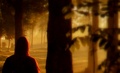
| 08/31/2006 12:26:56 AM |
The Shiningby NunniComment: Good use of shallow depth of field here, and the dark foreground really adds to the feeling of tension in the shot. |
| Photographer found comment helpful. |
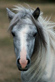
| 08/31/2006 12:24:28 AM |
'Merrylegs' from "Black Beauty"by JacquiDComment: Beautiful horse. The focus seems a bit off. It almost looks like you needed a bigger aperture number, or it was too dark and it was lightened in post processing. If it was a bit softer, it would have a nice "soft focus" feeling to it, but there is not quite enough in that direction. |
| Photographer found comment helpful. |
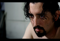
| 08/31/2006 12:21:20 AM |
|
| Photographer found comment helpful. |
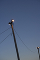
| 08/31/2006 12:20:40 AM |
light.by rethsComment: The lines leading through the shot give the photograph good *motion* and I like that you didn't overexpose the bulbs. Unfortunately, while I like minimalistic shots, this one is just not that interesting to me. |
| 08/31/2006 12:18:15 AM |
|
| Photographer found comment helpful. |
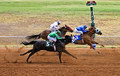
| 08/31/2006 12:17:05 AM |
Seabiscuitby PhantomEWOComment: Good action capture. It looks a bit oversharpened to me as there seems to be an odd grainy look in the sand of the track and the grass. Compositionally, maybe a tighter crop so that the horses weren't in the center of the frame would make it a bit stronger. That might make it feel like there was more room on the right for them to "run into." |
| Photographer found comment helpful. |
| 08/31/2006 12:13:08 AM |
The Waterboyby msdoubletroubleComment: Good action shot. The whites seem a bit overexposed. (I am so wanting to make a comment about needing to pull his pants up, but I am going to refrain this time).
I like the tight crop. Makes the action seem a bit more intense. |
| Photographer found comment helpful. |
| 08/18/2006 04:17:32 PM |
next?by iraklyComment: Very interesting shot. The little dangly things on the person on the right and the socks of the person on the left make this a humorous picture for me instead of macabre. Hope that is what you were going for. |
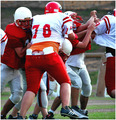
| 07/07/2006 11:30:27 PM |
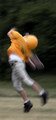
Incompleteby KronusComment: CRITIQUE CLUB CRITIQUE
by karmat (In honor of hbunch's 500th critique. :) )
Wow! Hard to believe another football season is approaching.
Compositionally, this shot feels a little too "skinny" for me. While I think the vertical crop works well to isolate and emphasize the player, and what looks to be a "jump," it feels choppy and leaves me thinking that I am missing something that is just outside of the frame. Also, it gives the feeling that he is falling out of the frame very quickly. If it had been possible, I think having more space in front of him would have made the picture feel a bit more stable and "complete."
Technically, the colors are okay, if a bit *drab* (That is not exactly the right word I want, because I don't think you need anymore saturation), and it appears flat to me. Would a touch more contrast help this? You've caught the motion blur well, and I fully suspect that some may have voted it down because it was all blurry.
Overall, you have an excellent subject and met the challenge well. From my experience with dpc, I would strongly suspect that your score "suffered" because there was nothing in the picture that was "in focus" and therefore, there was nothing for the eye to "rest" on.
|
| Photographer found comment helpful. |
Home -
Challenges -
Community -
League -
Photos -
Cameras -
Lenses -
Learn -
Help -
Terms of Use -
Privacy -
Top ^
DPChallenge, and website content and design, Copyright © 2001-2026 Challenging Technologies, LLC.
All digital photo copyrights belong to the photographers and may not be used without permission.
Current Server Time: 07/27/2026 08:36:04 AM EDT.