|
|
|
Showing 5081 - 5090 of ~9205 |
| Image |
Comment |
| 03/05/2007 06:31:20 PM | Il fumatoreby rinacComment: Awesome composition and I love the coloring you have used on this. |  Photographer found comment helpful. Photographer found comment helpful. |
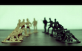
| 03/05/2007 06:31:04 PM | Learning To Hateby rinacComment: I'll admit. I didn't like it, but I don't like "toy shots." I try to be objective when voting, and I felt this one was masterfully done with regards to exposure, focus, etc. I also felt your choice of shallow dof was well chosen. To me, there is a greenish cast on it and it makes me feel like it should either be black or white. Oddly enough, I think the un-uniform top and bottom black frame is effective. | | Photographer found comment helpful. |
| 03/05/2007 06:28:18 PM | A I D Sby aimeethetooComment: To me, this shot is one of showing compassion. I know some people contract AIDS as a result of their lifestyle, but there are also innocents that get it, too. And, regardless of how they got it, they are still people who are hurting. In my life, I've known about AIDS since before it had a name. I remember my uncle (who now has AIDS), my mother, and my grandmother talking in hushed worried voices about another "friend" that had "that disease that they don't know what it is, what causes it, or how to cure it." It would be two or three years later before it had a name. Thirty years later, there is still no cure, but we should be willing to give a hand to help however we can. Great image.
| | Photographer found comment helpful. |
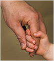
| 03/05/2007 06:24:26 PM | Daddy's Loveby aimeethetooComment: don't you love "cooperative models." I've got one of those, too. (I'll let you figure out if it is Bernard or the kids). I like the message in this. Did you try it in bw and see what would happen? Because there is not a lot of contrast between the background and hands, bw may (or may not) help. | | Photographer found comment helpful. |
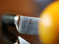
| 03/05/2007 06:23:03 PM | OOFby jfwolpertComment: I didn't get to vote on this one, but I remember seeing it and thinking, "what a cool idea." My only suggestion would be to tilt it at some absurd angle to give it a little more drama, but, then again, I like things kinda off kilter. | | Photographer found comment helpful. |
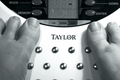
| 03/05/2007 06:21:55 PM | I Hate my Scaleby jfwolpertComment: I hate mine too. I like the use of bw here, though I think a bit more contrast would help it to *pop* more. |
| 03/05/2007 05:01:49 PM | 05/03/2007by taljComment: Awesome shot!! I love the focus and composition with this. You should really have some fun this month! | | Photographer found comment helpful. |
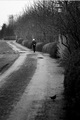
| 03/04/2007 12:50:35 AM | Path of lifeby BoltiComment: CRITIQUE CLUB CRITIQUE
by karmat
Compositionally, you have some things here that work really well. I like how the road starts in the bottom left and "meanders" up and through the frame. That sets the stage or mood for the man walking, as he also seems to just be meandering by. It feels a little tight, vertically, though, and I'm wondering what it would look like to open it up a bit and include more of the road/path on the left, OR shift the entire composition a touch to the left a bit more. The bird in the foreground gives the picture an almost comical feeling to me, for some reason. It just looks "right" to be there.
Technically, I like the dof you have chosen to use -- the blurry foreground helps to direct the eyes to the man. The bw works well here, but it seems a little flat to me, perhaps a bit to "gray." Maybe a bit more contrast or something to help boost it a bit.
Overall, I think it is an interesting shot, and gave a perspective of "street" that many may not think of.
If you have any questions, or if I need to clarify or explain myself, please feel free to contact me.
karmat | | Photographer found comment helpful. |
| 03/03/2007 12:34:41 PM | Whatta Day!by Blind_squirrelComment: CRITIQUE CLUB CRITIQUE
by karmat
Wow. I haven't seen many shots that had this much energy or life in them. It just jumps off the screen at you. The subjects are compelling, and you find yourself smiling just looking at them. In that respect, I feel you may have suffered from the quick voting. There are some technical issues on the picture, but they are overridden for me by the expressions. BUT, obviously there were some dpc voters that noticed them, so ---
Compositionally,the subjects and the sign help to set up a triangle of sorts. The viewer starts at the head, goes down the body to the sign, then up to the far subjects phone. This makes for strength and stability in the composition. However, since the eyes are drawn down the bodies to the sign, the tight crop at the bottom becomes a bit too tight. If there were a bit more room there, it would give it a more roomy feeling.
Technically, it feels a little overexposed. Your darks (shadows) are good, but I'm not seeing details in the brighter parts of the picture. Also, they tend to be distracting as the eye tends to gravitate towards bright spots. This is especially true in his white shirt. The brightness of his shirt competes with the exuberance of his expression.
Overall, I think you had an excellent capture here -- one that has a lot of emotion and energy.
If you have any questions, or if I need to further clarify or explain, please feel free to contact me.
karmat | | Photographer found comment helpful. |
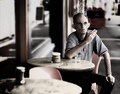
| 03/02/2007 05:31:45 PM | Street Performerby RACostaComment: CRITIQUE CLUB CRITIQUE
by karmat
Welcome to dpc. I hope you enjoy the site and learn a lot here.
Compositionally, I think there are a couple of small things you could do to really help this. I don't know if this is cropped from a larger picture, or not, but I'm going to assume it is. If I am assuming incorrectly, maybe it wll help the next time you compose your shot. The musician is in the center of the shot, and the girl watching is in the right third. As a result, it almost feels like the girl becomes the point of interest. Because she is slightly blurry, this emphasis becomes even stronger. Also, there is a division of some kind between teh right third of the picture and the rest of it. This makes the right third become extraneous and a bit distracting. So, possibly cropping it so that the girl is not in the shot, along where there seems to already be a division, and then allowing more space on the left would shift the composition and make it more balanced and dynamic, I think.
Technically, the exposure, tonal dynamics, focus, etc. are right on. You have done well with the details and it lends itself to a great shot.
Overall, the image is packed with interest. The expression of his face, along with the "exotic-ness" of his instrument make the viewer stop and really be drawn into the picture.
If you have any questions, or if I can further explain or clarify anything, please feel free to contact me.
karmat | | Photographer found comment helpful. |
|
Showing 5081 - 5090 of ~9205 |
Home -
Challenges -
Community -
League -
Photos -
Cameras -
Lenses -
Learn -
Help -
Terms of Use -
Privacy -
Top ^
DPChallenge, and website content and design, Copyright © 2001-2026 Challenging Technologies, LLC.
All digital photo copyrights belong to the photographers and may not be used without permission.
Current Server Time: 05/11/2026 10:07:37 PM EDT.
|