|
|
|
Showing 4981 - 4990 of ~9205 |
| Image |
Comment |
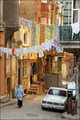
| 05/08/2007 09:13:26 PM | Afternoon in Istanbulby olbolComment: CRITIQUE CLUB CRITIQUE
by karmat
Compositionally, you have some interesting elements in this. The woman walking, the car and the clothesline all give the eye something to follow throughout the picture. In that sense, it is a well-composed shot. It feels like it is "leaning" slightly to the right though. I'm also wondering how a horizontal crop of this same scene would look? That would help give the viewer more of a context of the street, but I also think that it would help to lessen the distraction that the dark thing in the upper left corner is providing.
Technically, the bright colors really liven this up. There are a lot of yellow/gold/orange tones and I think a touch of contrast might help make those a bit more bold and ready to *pop.* OR a touch of overall contrast may help as well to help emphasize the boldness of the shot.
Overall, a very interesting shot.
If I need to further clarify or explain myself, please feel free to contact me.
karma |  Photographer found comment helpful. Photographer found comment helpful. |
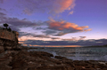
| 05/08/2007 08:50:40 PM | Painted by Natureby admajicComment: CRITIQUE CLUB CRITIQUE
by karmat
I can't believe that you didn't get any comments on this shot! I'm also surprised that it didn't break 6.
Compositionally, this is a strong shot, I think. There are three distinct "layers" visible -- the shore, the water and the sky. This gives the shot a sense of "movement" and balance. Also, there is a strong vanishing point created by the lines of the shore/water and water/horizon. This gives the eyes somewhere to "go" and keeps them from just sitting there.
Technically, I think you have done an awesome job of capturing the colors and "action" of the scene. The sky is absolutely gorgeous. The clouds add an extra element that is pleasing to look at, and the spray of the water is a good action capture. The focus seems good to me, as the details are visible largely throughout the image.
The only thing I would suggest is making it a bit brighter. The shot feels dark to me, especially in the foreground. I don't know how much post processing you did, or do as a rule in general, but I'm thinking dodging and burning (or something of the equivalent) could help bring out the interesting foreground so that the viewer didn't have to look at it quite so "hard" to get the full effect.
Overall, though, this is an awesome shot, and one that I think would make a rather nice print. Especially a large print.
If I need to further clarify or explain myself, please let me know.
Karma | | Photographer found comment helpful. |
| 05/08/2007 08:41:07 PM | Ghostly Imagesby suebenlouComment: CRITIQUE CLUB CRITIQUE
by karmat
It took me a minute to see what you are referring to, but after I saw it, that is just weird, in an interesting kind of way.
Compositionally, this shot feels tight to me. I understand that to get the profiles, it would be difficult to shoot at another angle, but I find myself wanting to see more on the left. There are some good leading lines in here, reinforced by not all being straight lines. The grass line, the "faces" and the shadows and other lights all help to direct the eyes back and into the picture. That may be why it feels cramped to me, the eyes are taken almost completely out of the image, so it doesn't seem to have any "completion."
Technically, there are no blaringly obvious *wrong* things in this. I can see details in the light and dark areas, so exposure seems to be good. Focus is good.
Overall, it is a good picture, but if a viewer didn't notice the silhouettes immediately, there isn't a lot here that makes this shot stand out in a pool of almost 600. It doesn't really compel the viewer to stop and linger and study it, if that makes sense.
If I need to further clarify or explain myself, please feel free to contact me.
Karma | | Photographer found comment helpful. |
| 05/07/2007 12:55:50 PM | Honeysuckle Bloomsby 777STANComment: CRITIQUE CLUB CRITIQUE
by karmat
Overall, this is a very interesting effect you have achieved here. I like the little parts of bright color and I think it really helps to bring out the orange tones of the flowers. My first though was to go completely black and white in the background, but the more I think of that, the less I think I would like it. What I do think is distracting is that the shot emphasized in color on the left and right are not in focus. In a "regular" shot, this would not be an issue, the eyes would simply seek out that which was focused. Here, though, they drift to the colored parts, and 2/3 of them are out of focus, so it kind of takes away from the rest of the shot.
I think the shot is a bit busy, as well. Perhaps if you could have isolated the blooms a bit more without so much in the background it might have helped to define your subject a bit more clearly.
Again, I like the shot, and I was actually one of the higher voters on it. I think you had a great idea, and it could be a truly effective eye pleasing shot if just a couple of minor things were different.
If I need to clarify or explain myself further, please feel free to contact me.
Karma | | Photographer found comment helpful. |
| 05/07/2007 12:35:31 PM | A Three Panel Affairby meneleComment: CRITIQUE CLUB CRITIQUE
by karmat
Very humorous progression you chose there. :)
Compositionally, each of the shots is strong on their own, individually, and they work together to tell an interesting story. Maybe the phone number should have been 867-5309 (though you may be too young to understand that). The undies in the bottom look too much like an advertisement and not like they just got dropped (though I'm glad you used apparently clean ones). Maybe if they were a bit more "ruffled" and on something besides a white backdrop it would seem a bit more real.
Technically, the focus is right on. There are no distracting oof spots (not that everything oof is distracting, but if there is enough of it, it can be) and the lighting is even throughout the series. They seem a bit drab to me, though, as if there could be a bit more brightness added to the colors to make them *pop*. A slight boost in contrast may do that as well.
Overall, good work, and thanks for the chuckle.
If I need to further clarify or explain myself, please feel free to contact me.
karma | | Photographer found comment helpful. |
| 05/07/2007 12:23:23 PM | "Head - Shoulders - Knees & Toes"by pipersdComment: CRITIQUE CLUB CRITIQUE
by karmat
Very nicely done, and one of the favorite songs at our house, I might add.
Compositionally, I like how you have used the white frame to emphasize the individual body parts. This adds an element of interest to the shot. Also, I like how that it is not obvious that it is three separate pictures, but rather he looks stacked "on top of himself"
Technically, it is also well done. There are details visible, no obvious 'blowouts,' and the lighting is nice and even. While it may not be incredibly dramatic, it is clean and helps to convey your message clearly. It does seem a bit flat to me though, even though you seem to have clear blacks and whites and tones in between. I'm not sure that bw works best for this shot (having not seen the color version, I definitely don't know) but I could see how this shot could be interesting with a bright background and complimentary colored shorts or something.
Nicely done, and a good showing.
If I need to further clarify or explain myself, please feel free to contact me.
karma | | Photographer found comment helpful. |
| 05/07/2007 11:46:19 AM | American Bald Eagleby sfmorrisComment: CRITIQUE CLUB CRITIQUE
by karmat
Compositionally, you have done well, I think, in all three pictures. The eagle's head fills the framely nicely, and "sits" in such a way as to give the viewer a "direction" to go once they've looked at the picture.
The series is also good as it seems to show a progression of the bird turning its head. Unfortunately, I think the smallness of the pictures is a bit of a detraction in that we can't see a lot of detail on the bird. Another possibility may have been to include different shots of the bird, instead of just the head, and arranged them in such a way that more detail could be shown. This may have also added to the "story" or interest of the shot as well.
Technically, the shots seem to have good exposure, focus, etc. There are enough shadows to give some depth to the shot, but they aren't harsh. The colors are subtle, but fitting.
Overall, I think it is a nice series of pictures, and really captures the intensity of the bird well.
If I need to further clarify or explain myself, please feel free to contact me.
Karma |
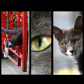
| 05/07/2007 12:32:55 AM | Portrait of a Catby BenComment: CRITIQUE CLUB CRITIQUE
by karmat
Hello Molly!
Compositionally, I think you have included some interesting shots on this one. They work together well, and give several different insights to this cat. The only picture I might suggest changing would be the one on the far left. I almost think it would better balance the shot if the cat were jumping the other way, and going out of the frame, so to speak. Likewise, the one on the right could be mirrored, as well, and it would be facing out of the frame as well. I *think* this would give a better impression of balance to the shot.
Technically, the focus, exposure, etc. is good. Nothing dramatic or earthshattering, but nothing that can be critically assessed, either. The red in the first picture really draws the attention, and it is interesting that each shot has something that seems out of focus. I didn't realize it when I was voting, but the first shot has motion blur, the second has a shallow dof around the eye, and the third has that oof "thing" in front of Molly. The overall effect, then, is that the compilation is out of focus, but in actuality, it is not.
Overall, good work, and definitely not a score to be ashamed of, especially considering how outspoken some forum-goers are about "pet shots."
If I need to further explain or clarify myself, please feel free to contact me.
Karma | | Photographer found comment helpful. |
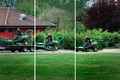
| 05/07/2007 12:26:14 AM | Loadingby GrandadComment: CRITIQUE CLUB CRITIQUE
by karmat
First impression -- My first impression was that it was "unloading" not loading, but I guess that is a result of being in the habit of "reading" left to right.
Compositionally, it is a good action series, but it seems a bit "cramped" on the left side of the image. Tractor #1 is right at the edge of the frame, whereas #3 still has a lot of space. As a result, it looks like the shot was framed too far to the left. Also, the mowers are cutting through the exact (well, visually, anyway) center of the shot. While this can sometimes be effective, in this shot it makes it seem a bit static. Perhaps varying the amount of foreground or "sky" would help throw it off center.
Technically, the colors are pretty good. The red building serves as a nice contrast to the green, and it also catches the eye and gives the viewer somewhere to "start" looking. It could need just a touch of contrast, BUT I'm on my laptop, so I suspect it is about right. Overall the lighting is a bit flat (overcast day, perhaps?) and the focus doesn't seem as sharp as it could be. It doesn't look out of focus, there is just not a lot of detail present in the tractor and driver. It could be because of your distance from him.
Overall, a good impression, but probably not one that would grab a viewer and compel him/her to give this a higher shot.
If I need to further clarify or explain myself, please feel free to contact me.
Karma | | Photographer found comment helpful. |
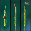
| 05/07/2007 12:11:14 AM | Oh...to Soar! by DrAchooComment: I trust that no ladybugs were harmed in the making of this shot. hahahahahaha | | Photographer found comment helpful. |
|
Showing 4981 - 4990 of ~9205 |
Home -
Challenges -
Community -
League -
Photos -
Cameras -
Lenses -
Learn -
Help -
Terms of Use -
Privacy -
Top ^
DPChallenge, and website content and design, Copyright © 2001-2026 Challenging Technologies, LLC.
All digital photo copyrights belong to the photographers and may not be used without permission.
Current Server Time: 05/12/2026 02:03:59 AM EDT.
|