|
|
|
Showing 4971 - 4980 of ~9205 |
| Image |
Comment |
| 05/09/2007 11:30:17 PM | Gulp!by Evil-ChihuahuaComment: CRITIQUE CLUB CRITIQUE
by karmat
Compositionally, I like the interplay between the elements here. They form a triangle which gives the image stability, yet has an easy "path" for the eye to follow. It is a bit disjointed at the bottom, so I am wondering if a looser crop showing the entire arm wouldn't have been better.
Technically, the shadow is killing this shot, I think. The focus is good, you have used selective desaturation in a manner that isn't as obnoxious as it typically is, but that shadow jumps out at the viewer and screams for attention. Looking at the settings you have chosen, I'm wondering if you could have done a couple of things to prevent it. A slower shutter speed would not have been a good thing, unless you (or your model) can hold *really* still, so I'm wondering if a lower aperture number would help, or even using ISO 800, though that may have introduced too much noise.
IF you were using a flash, using a slower shutter speed might allow more ambient light between the subject and backdrop, and the flash would "freeze" the subject so that the slower shutter speed didn't blur everything. OR you could try bouncing the flash off the ceiling or a piece of white paper to one side.
If you were intentionally trying to have a strong shadow, you succeeded, but I don't think it adds to the shot, at all. :)
Finally, the voters seem to like "in your face" challenge interpretations. I see the bubble, but it took me a minute. Free studies are bears to score well in, so welcome to dpc, and I look forward to seeing more of your work. Oh yea, your user name cracks me up.
If I need to further clarify or explain myself, please feel free to contact me.
karma |  Photographer found comment helpful. Photographer found comment helpful. |
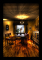
| 05/09/2007 11:19:22 PM | Simple Liveby SiggikalliComment: CRITIQUE CLUB CRITIQUE
by karmat
Very nicely shot. I like the warmth of the room, and how it contrasts with the coolness of the shot. In looking at the shot, upon first glance it appears as if everything is sitting at random, and this is a "slice of life" shot. But then, there is enough there to make the viewer wonder if everything was carefully placed, and if so, why?
The shot has an element of surrealism that is appealing in a odd sort of way. The picture "glows" if that makes sense.
nice work and congrats on the top ten.
karmat | | Photographer found comment helpful. |
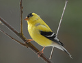
| 05/09/2007 11:10:47 PM | Goldfinchby DrakeComment: CRITIQUE CLUB CRITIQUE
by karmat
Impressive capture.
I like how you have filled the frame with the bird. Though the bird is "centered" there is enough diagonal movement with the branches to prevent it from feeling too stagnant. Also, having the head closer to the edge of the frame than the head keeps it from being too centered.
Technically, the exposure and focus of this is great. The details in the feathers shows nicely, and I like that the viewer can actually discern "facial features."
The only think I don't like is the background. While I understand that you didn't have control over that, per se, it is a bland color that doesn't emphasize the bird's color as well as others would. So, even though it is a natural looking background, and though it doesn't have details to be distracting, it is too bland. Also, there is a little white speck between the "V" of the branches that looks out of place; I don't know what it is, but since this was advanced editing, it could have easily been cloned out.
Nice work, and if I need to further clarify or explain myself, please feel free to contact me.
karma |
| 05/09/2007 12:32:56 AM | Escape From Alcatrazby EssAreDubyaComment: CRITIQUE CLUB CRITIQUE
by karmat
Compositionally, this shot is not bad, and has a couple of things that really help it. First, I like that it has basically three "levels" in it -- the water, the island, and the sky. This gives it a dynamic range and breaks the image into "smaller" parts so that the viewer is not overwhelmed. I also think that having the island sit lower in the frame like that gives it a sense of stability and balance. I think it may be an illusion, but it seems tilted ever so slightly to the right. Like I said, it may just be me. I didn't put a grid or anything on it to see for sure. The two birds also add a bit to the composition, the one on the right more than the one on the left, I think.
Technically, the shot is okay. There is nothing that I can point to that is "wrong," but I think it could really be processed a bit more to make it *pop* and thus draw the viewer in. One thing that might have made a difference would be to use a gradient instead of adjusting the saturation. Doing that may have allowed you to richen the sky colors without making them seem too bright. The clouds almost look unnatural, and I *think* it may be from the saturation of the blues. Likewise in the water, the waves look a bit odd in spots, and it may be from saturation.
Very interesting shot, and would make a nice postcard, oddly enough.
If I can further explain or clarify myself, please feel free to contact me.
karma |
| 05/09/2007 12:14:22 AM | shiny circumference over dark diameterby posthumousComment: CRITIQUE CLUB CRITIQUE
by karmat
Okay, normally, I offer what I think to be compositional and technical ideas to help a photographer do "better" with regards to dpc challenges. "Knowing" you though, I already know that you "know" the rules, you simply "apply" them in different ways. Also, unless I am sorely mistaken, you do not shoot for a score, but rather a reaction. So, I am going to give you my 'reaction' on a more emotional level than a technical reaction. If this is not satisfactory, please PM, and I will amend it. But, I have ot say, without the title, I would have been left scratching my head. :)
This shot reminds me of this year's transition from winter (the bare branches) to summer (the sunshine) without the wonderful season of spring (a few buds, but nothing substantial -- as if it doesn't even exist). It is a desolate feeling, but a shallow desolate feeling, if such a thing can exist, simply because the sunshine, be it a sunset or sunrise, seems to be a symbol of better things to come. Everything must come to an end, but in that, new things can begin. It is a photograph that portrays change, both with its hope of what is to come and reluctance to turn loose of what is. It is reaching to a new height, regardless of what might be holding you to the ground.
| | Photographer found comment helpful. |
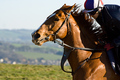
| 05/09/2007 12:02:33 AM | ...by a headby sidpixelComment: CRITIQUE CLUB CRITIQUE
by karmat
Nice action shot!
Compositionally, I think you have the right idea in placing the horse and rider in the right side of the frame so that it looks like they are riding "into" the picture. I think, though, that showing a bit more of the jockey would help the composition feel a bit more balanced. Right now his (her?) butt is stuck out of the frame, and the shot doesn't feel "complete." Also, movement is implied by the position of the jockey and the way the mane is "blowing," but it almost looks like the horse, if taken separately, is standing still, looking around anxiously.
Technically, there isn't a lot to suggest about. Perhaps learning how to dodge and burn, in its simplest forms would help to eliminate some of the darker areas where details are lost, and overall emphasize some of the beauty that is there. I like the contrast of the rich colors of the horse and riders compared to the "blandness" of the background. This, I think helps to isolate your subject, and make it even stronger.
Overall, I think you have a pretty good shot. If I need to further clarify or explain myself, please feel free to contact me.
karma | | Photographer found comment helpful. |
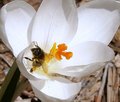
| 05/08/2007 11:35:02 PM | The Crocus & the Beeby annigComment: CRITIQUE CLUB CRITIQUE
by karmat
Compositionally, I think you have the potential for a very strong photo. You have cut the very tips of the petals off, though, and that, I think, weakens the composition somewhat. I think a tighter crop, eliminating much of the 'brown' would really cause the viewer to focus more on the bee and yellow parts of the flower. Obviously, you would not be able to eliminate all of the background, but letting some go, especially in the lower right hand corner, would be beneficial I think. You would also have to work it a bit to make sure the bee did not end up centered in the composition. Though that works sometimes, I think in a shot like this, it would be static feeling, and you would lose a lot of the "motion" that a picture of a bee implies.
Technically, the flower seems to be right on the edge of being blown out. Looking at your settings, I would recommend a slightly slower shutter speed. That would help to "richen" the colors present, and eliminate some of the brightness that is almost blown out. Also, it looks almost as if it were shot in direct sunlight. Obviously, you couldn't contract the bee to come back at a better time, so it might have been helpful to have someone hold something (even themselves) to cast a shadow over the flower. (You would also need to adjust aperture and shutter, if you were not shooting automatic).
Focus is okay. At first glance, it seems in focus, and that helps when you've got one shot in almost 600 competing. Upon closer glance it does seem a bit soft, perhaps from cropping, maybe from compressing for dpc.
The colors are good on this. The orangish/yellow really stands out on the white, and that is a nice attention getter and contrast. The green looks a bit dull, but it is in the background and almost secondary to the rest of the shot.
Good work and best to you in future. If I need to further clarify or explain myself, please feel free to contact me.
karma | | Photographer found comment helpful. |
| 05/08/2007 09:48:30 PM | Katieby fotomann_foreverComment: CRITIQUE CLUB CRITIQUE
by karmat
Compositionally, I really like this shot. I like how the "background" elements of the shots are "layered" in various colors and textures, going from the light colored textured rocks, to the solid bluish tones of the water, to the bluish tones of the sky to the lighter, textured clouds at the top. This sets up a nice "backdrop" for your subject. I also like how she is located in the left side of the frame and facing in. The only thing I don't like are the birds. At first I thought they were crows. While I'm sure that that is a natural environment for such a bird, it really doesn't look like they belong there, and makes it look like she has "bird stalkers" or something.
Technically, I love the colors in this. At first the yellowish of the uppermost clouds kinda of bothered me because they looked "dingy." But, the more I looked at the shot, the more it was okay because the yellow tones contrast nicely with the blues of the water and sky and the pink of her shirt. I think the bold colors really make this shot.
If I need to further clarify or explain myself, please feel free to contact me.
Karma
PS -- I see now that you mentioned the seagulls in your comments. If you added them, I really and truly think the shot would be better without them. :) If you didn't add them, I would recommend taking them out. :) | | Photographer found comment helpful. |
| 05/08/2007 09:27:47 PM | Taylarby angela_packardComment: CRITIQUE CLUB CRITIQUE
by karmat
NO!! No more snow or cold weather, please!!! :)
Compositionally, I love the angle of this shot. It is interesting and and pleasing as well. It also seems a natural pose for a young girl. I also like that she is not "straight" in the frame, but tilted just a bit. Again, I think this adds to the youthfulness and playfulness of the shot.
Technically, the colors are very pleasing. The green balls were a bit distracting at first, because I couldn't tell where they "originated" or why they were there. Otherwise, the pink really sits nicely against the snow. The focus is good and sharp, and I think you have done well to exposure her face and "front" as well as you have without blowing out the snow. My only nitpick is that her face is too smooth. There is little or no detail left there at all. Since this is a portrait, that is the main focal point, and it seems unnatural. My apologies if her skin is naturally that smooth, but it seems like a result of noise reduction.
Awesome shot, and if I need to further clarify or explain myself, please let me know.
karma
| | Photographer found comment helpful. |
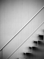
| 05/08/2007 09:20:08 PM | One Step At a Timeby danielstarrasonComment: CRITIQUE CLUB CRITIQUE
by karmat
Compositionally, I think this is a very strong picture. The diagonal lines help to "move" the picture and keep it from being static/stagnant. Also I like how the steps and railings initially contrast each other, but actually compliment eachother by emphasizing the upper diagonal.
Technically, this is also a well done shot. It is simply, yet pleasing -- very minimalistic. The focus is sharp and clean, and there isn't anything in it to distract the viewer or detract from the subject.
It seems to have a slightly bluish hue/tint to me, which could be my imagination, but it doesn't seem to be a "true" black and white to me. It's not that that lessens the value of the picture, it is just an observation. It makes the shot feel "cool" and sterile, which suits the subject, and the portrayal of that subject very well.
Nice work, and if I need to further clarify or explain myself, please let me know.
Karma | | Photographer found comment helpful. |
|
Showing 4971 - 4980 of ~9205 |
Home -
Challenges -
Community -
League -
Photos -
Cameras -
Lenses -
Learn -
Help -
Terms of Use -
Privacy -
Top ^
DPChallenge, and website content and design, Copyright © 2001-2026 Challenging Technologies, LLC.
All digital photo copyrights belong to the photographers and may not be used without permission.
Current Server Time: 05/12/2026 03:08:44 AM EDT.
|