CRITIQUE CLUB CRITIQUE
by karmat
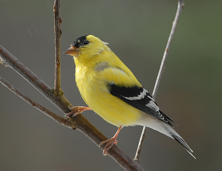
Impressive capture.
I like how you have filled the frame with the bird. Though the bird is "centered" there is enough diagonal movement with the branches to prevent it from feeling too stagnant. Also, having the head closer to the edge of the frame than the head keeps it from being too centered.
Technically, the exposure and focus of this is great. The details in the feathers shows nicely, and I like that the viewer can actually discern "facial features."
The only think I don't like is the background. While I understand that you didn't have control over that, per se, it is a bland color that doesn't emphasize the bird's color as well as others would. So, even though it is a natural looking background, and though it doesn't have details to be distracting, it is too bland. Also, there is a little white speck between the "V" of the branches that looks out of place; I don't know what it is, but since this was advanced editing, it could have easily been cloned out.
Nice work, and if I need to further clarify or explain myself, please feel free to contact me.
karma |