|
|
|
Showing 2591 - 2600 of ~9205 |
| Image |
Comment |
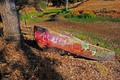
| 11/12/2007 10:59:53 AM | ark of joanby IndieapertureComment: CRITIQUE CLUB CRITIQUE
by karmat
Welcome to dpc!
Compositionally, your shot feels a bit static. I think this is probably due to the fact that it is the center, vertically, of the picture. Moving it up in the frame, or down (probably the better choice) would give it a more dynamic, balanced feeling.
Technically, the focus and exposure is good. The saturation is a bit high making the greens look almost unnatural. Maybe bringing the greens down just a bit would help.
Overall, it is an interesting shot. A boat tied to a tree when no water is around -- that is kinda funny. However, it looks like you were just walking around and saw it and snapped it. Different angles of perspective could really make this an interesting photograph. Getting down on the ground, shooting from the stern, and filling the frame with just the front of the boat are just some of the possibilities. Also, the peeling paint could make for some nice texture shots.
You picked a good subject, and it is technically okay, but there is a lot more that could be done to make it even more interesting.
Best wishes to you in future challenges and if I can further clarify or explain myself, please feel free to contact me.
karmat |  Photographer found comment helpful. Photographer found comment helpful. |
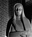
| 11/12/2007 10:39:26 AM | Ageless Beauty at Rest (1898 statue)by smellyfish1002Comment: CRITIQUE CLUB CRITIQUE
by karmat
Compositionally, this is a strong balanced photograph. The statue being on the right third works well.
Technically, the focus is good and shows the texture of the statue very well, as well as the wall. The bw conversion you have used is nice, and I like the dramatic shadows. I kinda like the brick wall in the background, but it gives more a "modern" feeling to the shot, somehow, and detracts from the "oldness" of the statue, I think. A profile with the tree might have been the better angle. Also, if you could have had a more shallow dof to slightly blur the bricks, it might have made a bit of a difference.
Overall, this is a technically well done photo. There are no obvious flaws in the execution. It meets the challenge. I suspect,though, that it didn't "connect" with the viewers on any level other an an emotional one.
If I need to further clarify or explain myself, please feel free to contact me. Thanks for your participation!
karmat |
| 11/12/2007 10:13:34 AM | | | Photographer found comment helpful. |
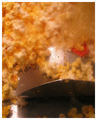
| 11/12/2007 10:10:40 AM | Getting Ready For A Movieby theyetifanclubComment: The bowl of popcorn being out of focus could be effective. However, the popcorn in front doesn't appear to be sharply focused, either, and that isn't really effective. | | Photographer found comment helpful. |
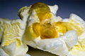
| 11/12/2007 10:09:23 AM | Too Much Popcornby mfzComment: A stronger focus and less of a yellowish cast would have made this a much more effective picture. | | Photographer found comment helpful. |
| 11/09/2007 04:16:12 PM | | | Photographer found comment helpful. |
| 11/09/2007 04:07:03 PM | | | Photographer found comment helpful. |
| 11/09/2007 04:05:52 PM | Can't eat just one!by lotalawtonsComment: If it weren't for the shadow in the upper right, the blownhighlights wouldn't bother me. It would almost give it a certain "tone" or mood. However, the shadow makes it look unintentional. |
| 11/09/2007 04:04:07 PM | It`s mine !by DandudeComment: I like the shallow dof in this. I think a tighter crop on the left and right, though, so that the sides of the popcorn "bowl" weren't visible would make it seem a bit more complete, though. | | Photographer found comment helpful. |
| 11/09/2007 10:07:44 AM | Palm Tree Hair by pjangelComment: At first I thought it was a person's hair and I couldn't help but think they needed a good moisturizer. :) GREAT work at capturing the texture. | | Photographer found comment helpful. |
|
Showing 2591 - 2600 of ~9205 |
Home -
Challenges -
Community -
League -
Photos -
Cameras -
Lenses -
Learn -
Help -
Terms of Use -
Privacy -
Top ^
DPChallenge, and website content and design, Copyright © 2001-2026 Challenging Technologies, LLC.
All digital photo copyrights belong to the photographers and may not be used without permission.
Current Server Time: 07/18/2026 10:21:40 PM EDT.
|