| Image |
Comment |
| 11/15/2007 04:31:40 PM |
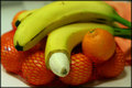
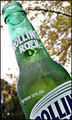
Circumcisionby gehausComment: hah. focus needs to be a bit sharper to be fully effective. also, why leave the oranges in the mesh bag? |
 Photographer found comment helpful. Photographer found comment helpful. |
| 11/15/2007 04:31:12 PM |
|
| Photographer found comment helpful. |
| 11/15/2007 04:31:02 PM |
|
| 11/15/2007 04:28:14 PM |
|
| Photographer found comment helpful. |
| 11/15/2007 04:27:57 PM |
|
| Photographer found comment helpful. |
| 11/15/2007 04:27:31 PM |
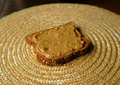
PB no Jby dwainasaurusComment: The composition is too centered, I think and the circular motion of the mat is a bit distracting. However, I think a closer crop of this would be much more effective because it looks like the details are really good. |
| Photographer found comment helpful. |
| 11/15/2007 04:24:18 PM |
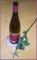
topless or is it to much drinkby ThaiComment: You are onto a good idea here, i think. using what you have i would make a couple of suggestions. first, get a lower perspective. this perspective makes the bottle feel small, and i feel as if i am simply standing and looking down on it. a lower perspective would help the bottle to fill the frame more and give it more "importance" or at least a feeling of more importance. Secondly, the lighting feels a bit off. It almost feels like a flash was used, but you are missing the shadows (which is a good thing). Covering your lights with a soft cloth may help you to diffuse them more. Also, this gives the feeling of being dramatic (not quite romantic) so don't perhaps a darker shot would be more effective. Lose the coaster, it looks completely out of place. The woodgrain of the surface gives it a casual look. Putting down a piece of fabric would give it a more uniform look, and would solve the problem of needing a coaster. Also, you could choose whatever color you want. The are of the shot isn't large, so you could even use a t-shirt or something. Again, you've got a good idea, and the topless theme is repeated throughout the shot, which is good, but the execution of the shot makes it leave a bit to be desire. |
| 11/15/2007 04:17:42 PM |
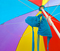
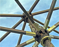
Under My Umbrellaby HipychikComment: i like the complexity of the structure and how it contrasts with the simplicity of the colors. |
| Photographer found comment helpful. |
| 11/15/2007 04:17:08 PM |
|
| Photographer found comment helpful. |
| 11/15/2007 04:16:20 PM |
The Naked Match-Stickby amateurboiComment: great composition and i like how the match almost has a personality. :) doesn't scream "topless" to me, but i can see where you are coming from -- hope others can as well. |
| Photographer found comment helpful. |
Home -
Challenges -
Community -
League -
Photos -
Cameras -
Lenses -
Learn -
Help -
Terms of Use -
Privacy -
Top ^
DPChallenge, and website content and design, Copyright © 2001-2026 Challenging Technologies, LLC.
All digital photo copyrights belong to the photographers and may not be used without permission.
Current Server Time: 07/17/2026 10:05:39 PM EDT.