| Image |
Comment |
| 01/02/2008 04:46:18 PM |
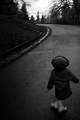
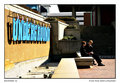
a twisted perspectiveby posthumousComment: CRITIQUE CLUB CRITIQUE
by karmat
For others looking in -- I think this is a strong picture, technically. It is a well-balanced composition and "moves" throughout the frame well. It appears to be a touch dark on my monitor (which is set too bright, by most standards), and that may have hurt with some of the darker monitored votes. Very interesting shot.
and for Don (I went scouring the Internet for a poem for this, 'cause I knew there had to be one, and I am a terrible poet):
The Waking World
Out of time’s windows
He gazed—into the heavens,
Into planets, unnamed galaxies
—Light-years away,
With sealed vistas
That opened wide
For the macabre-naked eye—to see.
And unto him appeared—
Wild streams of midnight tears
Glittering like unprotected fire:
And so spellbound was he,
With all he had seen,
He crossed into the dream world,
The lost world of the woken:
And was never again seen.
by Dennis Siluk
can be found here |
 Photographer found comment helpful. Photographer found comment helpful. |
| 01/02/2008 04:18:00 PM |
Winter's Graceby RulerZigzagComment: CRITIQUE CLUB CRITIQUE
by karmat
The composition in this is very strong. The fence leads the eyes up and into the frame and to the house -- that is very effective at getting "everything" in the frame viewed and it keeps the shot from feeling static. I also like that the fence doesn't divide the frame evenly. There is more on the right than on the left, and it causes just enough "unbalance" to be interesting, but not enough to throw the viewer off.
The focus seems to be off just a teeny tiny bit. It doesn't look soft, but it does have that "edge" to it that can happen from resizing, or from adjusting exposure. It is almost a "graininess," but not true grain. Also, my first impression was that you attended "DrAchoo's school of saturated green." (No insult to him; he is a far better photog than I, but he does seem to like bright green). The more I've looked at it, the less "shocking" that it is, but it still seems to be a bit much.
Overall, a pretty good shot that does meet the challenge, I think.
Please feel free to contact me if I need to further clarify or explain myself.
Karma |
| Photographer found comment helpful. |
| 01/02/2008 02:35:56 PM |
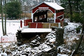
Twin Bridges - East Padenby bs-photosComment: I like the perspective you have chosen for this. It gives a good overview of the area, but still maintains the beauty of the covered bridge. It may be a bit too centered - it feels as if it should be just a hair further to the right in the frame, but the hint of the orange construction fence leads me to think there may have been a reason to crop it. The focus is okay, though it does seem to be just a bit off -- as evidenced by the words over the bridge opening. I'm wondering if this is an effect from resizing. Nicely shot, and I like the level of contrast in this one. |
| Photographer found comment helpful. |
| 01/02/2008 02:29:25 PM |
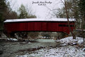
Josiah Hess Bridgeby bs-photosComment: Strangely enough, even though the bridge is in the middle, the composition still feels balanced. I like how the river leads up and through the frame. It seems a touch dark on my monitor, but any brighter, and the white in the snow may blow out. If not for the nice red of the bridge, I would recommend a high contrast bw for this. |
| Photographer found comment helpful. |
| 01/02/2008 02:12:28 PM |
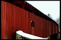
Stillwater Covered Bridgeby bs-photosComment: I really like how the bridge pulls the viewer's eyes through the frame. That is very effective, I think. The whites looks a touch on the bright side, but the red is a nice color and the icicles add a lot to the shot. |
| Photographer found comment helpful. |
| 12/10/2007 05:09:21 PM |
|
| Photographer found comment helpful. |
| 12/10/2007 04:46:20 PM |
|
| Photographer found comment helpful. |
| 12/10/2007 04:38:28 PM |
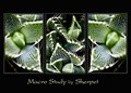
Macro Study - Day 10 by sherpetComment: Ma'am, I say that if we have another triptych challenge, you will surely be on the front page. VERY nice work, AGAIN! |
| Photographer found comment helpful. |
| 12/10/2007 04:37:45 PM |
December 9.jpgby codfishComment: i was wondering if that is where you were going with this shot. Hope you enjoyed the party! |
| Photographer found comment helpful. |
| 12/10/2007 04:37:17 PM |
|
| Photographer found comment helpful. |
Home -
Challenges -
Community -
League -
Photos -
Cameras -
Lenses -
Learn -
Help -
Terms of Use -
Privacy -
Top ^
DPChallenge, and website content and design, Copyright © 2001-2026 Challenging Technologies, LLC.
All digital photo copyrights belong to the photographers and may not be used without permission.
Current Server Time: 06/26/2026 11:20:12 PM EDT.