| Image |
Comment |
| 02/18/2008 09:18:42 PM |
|
 Photographer found comment helpful. Photographer found comment helpful. |
| 02/18/2008 05:23:48 PM |
|
| Photographer found comment helpful. |
| 02/18/2008 05:21:24 PM |
The Outcomeby WarbyComment: Good composition, and I like the fairly simple color scheme. I just cannot stand this effect on skin. Just me, I guess. |
| Photographer found comment helpful. |
| 02/15/2008 10:29:13 PM |
|
| Photographer found comment helpful. |
| 02/13/2008 02:53:32 PM |
|
| Photographer found comment helpful. |
| 02/13/2008 01:35:23 PM |
Forgotten storage shedby photom1946Comment: CRITIQUE CLUB CRITIQUE
by karmat
Compositionally, this is a strong, stable shot. It is a bit centered, which normally doesn't help, but in this case I think it documents the architecture of the building well. It has just enough of the background to give some context, but not so much as to clutter it up or be distracting.
Technically, your focus is very good. Also, your exposure shows a lot of the details, but I think that may be what makes the shot look a bit "flat." My very first impression of this shot was "Nice shot, but doesn't have a lot of depth). There are no definitive "blacks" in the shot, or none that really define the textures of the building. I think a bit more contrast would help, even if it meant burying some of the details in shadows.
The sepia is a nice touch. It helps to further communicate the age of the building.
If I need to further elaborate, or explain, please PM.
Karma |
| Photographer found comment helpful. |
| 02/11/2008 08:45:15 PM |
Poxby xianartComment: Not an early memory for me (I was twenty-one) but seeing this makes me remember. . . .ugh.
Now, I'm itching. |
| Photographer found comment helpful. |
| 02/09/2008 01:58:24 PM |
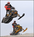
Choose Ski-Doo....If You Dare!by basssman7Comment: Good composition and clarity. Took a second to realize it said "ski-doo" and not "sea-doo" and I was really confused how they had jet skis on sand. Then realized it was snow and everything clicked. Then I saw the ski-doo logo. Pretty cool shot. |
| Photographer found comment helpful. |
| 02/09/2008 01:56:17 PM |
|
| Photographer found comment helpful. |
| 02/09/2008 01:54:12 PM |
|
Home -
Challenges -
Community -
League -
Photos -
Cameras -
Lenses -
Learn -
Help -
Terms of Use -
Privacy -
Top ^
DPChallenge, and website content and design, Copyright © 2001-2026 Challenging Technologies, LLC.
All digital photo copyrights belong to the photographers and may not be used without permission.
Current Server Time: 06/24/2026 12:45:05 PM EDT.