| Image |
Comment |
| 03/08/2008 04:24:31 PM |
|
 Photographer found comment helpful. Photographer found comment helpful. |
| 03/08/2008 01:23:26 PM |
Putting forks to work 4 a ribbon!by JaviZComment: The dof works okay here to make the guy in the background not be so distracting. However, the lighting is a bit harsh, and the crop is a bit tight on the left. It looks like something may be holding the forks up, which kinda negates the balancing trick. |
| Photographer found comment helpful. |
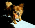
| 03/07/2008 04:55:35 PM |
The Morning Routineby RulerZigzagComment: CRITIQUE CLUB CRITIQUE
by karmat
5.3???? Seriously underrated.
The composition of this is superb. The dog is located in a strong place in the frame, and there is a lot of "space" for it to travel into. The light forms some nice lines leading the eyes to the dog. Perhaps a lower perspective of the dog (as one commenter suggested) might help, but this seems very natural feeling.
Technically, the focus is great. On my monitor, I can see details on the shadowed side, but I'm wondering if some darker monitors obscured this so that it looks harsher than it really is.
Sorry that I'm not a lot of help, but I think the shot is very strong as it is.
Karma |
| Photographer found comment helpful. |
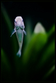
| 03/07/2008 04:31:09 PM |
Meet Fred. He Is Not A Hummingbird.by gocComment: CRITIQUE CLUB CRITIQUE
by karmat
Cool shot.
Compositionally, I like the location of the fish in the frame and how his "shape and direction" kinda mirrors the stuff in the background as far as direction goes. Technically, the colors and focus in this are great. Enough color without being oversaturated, and they compliment nicely.
I seriously don't know what could improve it. Maybe some of the voters were put off looking at a fish at this angle? It looks unnatural, or something? Not a lot of help, I know, but I seriously don't know what to do differently to make this any better.
karmat |
| Photographer found comment helpful. |
| 03/07/2008 04:19:26 PM |
|
| Photographer found comment helpful. |
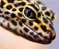
| 03/07/2008 04:14:09 PM |
Dropping inby CorySmithComment: CRITIQUE CLUB CRITIQUE
by karmat
Wow, nice shot. I am truly surprised this didn't score higher.
Compositionally, you have filled the frame nicely and it feels well balanced. Technically, it is excellently (is that a word) focused and the details on the "skin" and in the eye is tremendous. Perhaps the slight blur on the end of the nose put some people off, but to me, it just helps to reinforce how great the focus is on the eye.
The *only* thing that disconcerts me (other than the fact that I thought it was a snake at first) is the "mismatch" of colors in the background. The purplish hues contrast nicely with the yellow. The "flesh tones' for lack of a better word, just don't "match" to me for some reason.
Still, though, very nice shot!
karma |
| Photographer found comment helpful. |
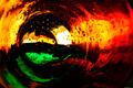
| 03/07/2008 04:12:31 PM |
|
| Photographer found comment helpful. |
| 03/07/2008 04:12:20 PM |
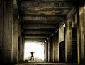
End of the Journeyby GiorgioComment: This is one of those shots that is done well, technically, but could easily be overlooked. Good composition and use of the leading lines. I also like that the "body" disappears into the light. |
| Photographer found comment helpful. |
| 03/07/2008 04:04:04 PM |
|
| Photographer found comment helpful. |
| 03/07/2008 04:02:10 PM |
|
| Photographer found comment helpful. |
Home -
Challenges -
Community -
League -
Photos -
Cameras -
Lenses -
Learn -
Help -
Terms of Use -
Privacy -
Top ^
DPChallenge, and website content and design, Copyright © 2001-2026 Challenging Technologies, LLC.
All digital photo copyrights belong to the photographers and may not be used without permission.
Current Server Time: 06/23/2026 09:28:55 PM EDT.