|
|
|
Showing 141 - 150 of ~9205 |
| Image |
Comment |
| 03/05/2010 04:47:29 PM | Delicate Touchby dahvedComment: Excellent. I like the simplistic black and white, and the way the roundness of the egg breaks up the parallel lines of the piano. Great shot |  Photographer found comment helpful. Photographer found comment helpful. |
| 03/05/2010 04:46:40 PM | |
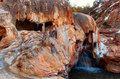
| 03/05/2010 04:44:29 PM | Totally Gnarlyby rajronComment: CRITIQUE CLUB CRITIQUE
by karmat
Compositionally, I like how the stone part starts in the left side of the frame and leads through the picture towards the right side. There is also a nice balance between the two "open" sections.
Technically, the colors are almost surreal, but in an appealing way. I like the coolness of the white/blue against the warmness of the orange rocks. There appears to be some over-sharpness and this could very well be from resizing to fit within dpc parameters. If you were shooting with a tripod, I am wondering what it would have been like to lower your ISO to as low as it would go, up the f-stop number, and slow the shutter speed down. This would have slowed some of the motion of the water and it wouldn't have been as "chunky" and thus wouldn't have artifacted as bad on resizing.
Overall a good shot, and a good entry for this particular challenge.
karma |
| 03/02/2010 10:19:54 AM | Snail's Viewby bspurgeonComment: Awesome!!! This is beautiful. Love the tones and the "softness" of the overall shot, but also that you have "the edge" in there as well. | | Photographer found comment helpful. |
| 02/26/2010 11:50:39 PM | Statuesque by idnicComment: i honestly think my head is just slightly crooked, so take this for what it is worth, but it honestly looks like this is tilted ever so slightly to the right. i seem to say that a lot, so i'm seriously starting to think my eyes are just crooked or something. or maybe i'm just dizzy or something. otherwise, i'm guessing idnic -- these shoes look like some she would wear/own. :P | | Photographer found comment helpful. |
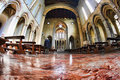
| 02/25/2010 08:01:46 PM | San Lorenzo Maggioreby Rino63Comment: CRITIQUE CLUB CRITIQUE
by karmat
First off, I really like the "expansive" feeling of this shot.
Compositionally, you have done will with the symmetry. Also, the man on the left really adds to the shot, I think, by giving the shot some "scale," but also some "human-ness." Without him, the shot would be just another of a huge monolithic, impersonal structure.
Technically, I like the subdued colors in this. In the upper part, though, it is a bit noisy/grainy, perhaps from post processing. While the grain, per se, doesn't bother me, and perhaps adds to the shot in some ways, across the top of the arch is colored artifacts, and that just seems to detract some.
Overall, very well done, and I'm surprised it didn't score a bit higher.
Karma | | Photographer found comment helpful. |
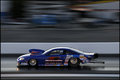
| 02/24/2010 02:33:11 PM | The Fastest Accelerating Machine Known to Manby tangueraComment: Excellent panning shot -- these are truly boogers to get and get well. I like the vibrance of the blue and the splashes of color in the background. It is just a tad dark to me, but that may just be a personal thing. | | Photographer found comment helpful. |
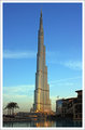
| 02/24/2010 02:31:28 PM | Tallest Needle(828m high) on earthby mqnaufalComment: Nice shot! I like the warmness of the building contrasted against the blue of the sky. Also, like another commenter mentioned, the sky and upper part of the building look just a tad grainy -- perhaps from post-processing? And it seems tilted to the right just a hair to me, but that may just be me; I'm starting to think my head is crooked. Otherwise, this would make an excellent postcard or advertisement for the building. Having the water in the foreground, tree on the left and other construction on the right helps to establish a sense of scale. Good work. | | Photographer found comment helpful. |
| 02/20/2010 04:28:00 PM | Waterfall.jpgby obscurityComment: I would echo the sentiments so far, and would add -- I get no sense of scale from this. Being familiar with ferns, I get the idea that this waterfall is probably only a few feet high, at the most. If it is bigger than that, a portrait orientation, and something else to give it a sense of scale might be helpful. | | Photographer found comment helpful. |
| 02/20/2010 12:38:04 PM | Hard to but Countable, and Easy to but Uncountableby CallistoComment: CRITIQUE CLUB CRITIQUE
by karmat
Compositionally, I like how you have placed the subject primarily in one corner and used the rest of the background as a dark "negative space."
Technnically, the egg is focused as is most of the rice, and that is a good thing. However, the lighting on this is very, very harsh. Flash? perhaps? or a directly hitting light? To me, the shadow behind the egg really detracts from the image, and it causes the rice to be lit unevenly as well. If you were to reshoot, or if you tried something like this again, I would recommend bouncing the flash off something white to help diffuse it. Even if you are using an on-camera flash, you can put a bit of tissue in front of it, or a white piece of paper to diffuse it or bounce it. Also, a lower perspective may make the overall shot a bit more interesting. As it is now, I am seeing the egg and rice as if it were sitting on the table in front of me. This is a view that I can see any time I want. To really engage the viewers, sometimes it helps to have a view that is atypical.
Overall, you met the challenge well. I honestly had never thought about the finiteness of rice or the perpetuity of an egg, but it is an interesting contrast.
Best to you in future challenges, and if I can further clarify anything, please let me know.
Karma | | Photographer found comment helpful. |
|
Showing 141 - 150 of ~9205 |
Home -
Challenges -
Community -
League -
Photos -
Cameras -
Lenses -
Learn -
Help -
Terms of Use -
Privacy -
Top ^
DPChallenge, and website content and design, Copyright © 2001-2026 Challenging Technologies, LLC.
All digital photo copyrights belong to the photographers and may not be used without permission.
Current Server Time: 06/19/2026 01:32:33 PM EDT.
|