|
|
|
Showing 1391 - 1400 of ~9205 |
| Image |
Comment |
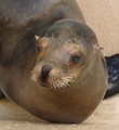
| 04/08/2008 03:28:05 PM | I am smiling!by actnoutComment: Compositionally, I find myself trying to "push" his head further right in the frame. I think having his head in the right of the frame, and his body filling the left would make the composition feel more balanced.
Technically, the focus seems off. I can't tell if it is truly out of focus, if it is compression artifacts from resizing, noise reduction, or if it is from a pretty severe crop. Either way, it really detracts from the overall quality. If the "focus" were spot on, I think you would have found the score to be substantially higher. |  Photographer found comment helpful. Photographer found comment helpful. |
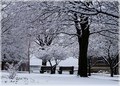
| 04/08/2008 03:25:06 PM | March Madnessby Donna21Comment: I really like the busy-ness of this shot. There is alot to look at, and it is almost possible to get lost in the mire of all the branches. That said, while I like it, there are probably some who didn't.
I think the overall effect of the shot is good. The elements work together in a balanced composition and offer a lot for the viewer to look at. In a competition like dpc, though, simple shots seems to do better. Whether that is good bad is a personal thing, but I suspect all the "stuff" in the shot may have attributed to some of the lower votes.
The only other little nit pick is that it feels tilted to the right a touch. That could easily be me, though -- sometimes I think my eyes are crooked. :)
Overall, a nice shot, and personally, I like the high contrast | | Photographer found comment helpful. |
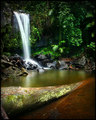
| 04/08/2008 03:19:25 PM | Curtis Fallsby surfdabblerComment: I really, really like the composition in this one. It isn't as straightforward as a "textbook" example, but it is still well-balanced and allows the eyes to wander around in the frame, and feels complete.
To me, the bright, bright greens are a bit off-putting. Everything looks so calm and subdued, except for the greens -- especially in the center of the frame. If that is what you were going for, it works. I know dpc seems to like the super-saturated green look (I call it drAchoo green), but it is kinda off-putting to me.
The other thing I noticed, and it may be just me, is that some of the rocks around the base of the fall looks a bit pixelated/over-sharpened/out of focus. It is not bad, but it is noticeable, and since our eyes tend to rest at the base of the falls, it may have made some of the voters feel that it was a touch out of focus.
Still, this is an absolutely beautiful shot. | | Photographer found comment helpful. |
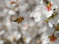
| 04/08/2008 03:13:58 PM | Bby VenomComment: I liked the balanced composition on this -- I think it adds interest to the shot and helps to isolate the bee. The bee does seem a bit soft, though I understand it seems to be motion blur, for the most part. He is suspended nicely. Overall, I think you have executed the shot well, but it may not "grab" viewers (and voters) the same way as a shot with a tack sharp bee would. | | Photographer found comment helpful. |
| 04/08/2008 03:11:51 PM | No Fog in Sightby Moose408Comment: Nice sky in this shot!
Compositionally, I think you could have done a couple of things to make this feel more balanced. The driftwood in the front and the lighthouse tower line up *almost*. I think a couple of steps to the right, then shooting, so that they were offset in a diagonal would make it feel more dynamic. also, I don't know how far the wood extends, or what might have been at the end of it, but cutting it off like you have makes my eyes follow it straight out of the frame.
Technically, you have good focus, exposure, colors, etc. I think though, that more shallow dof could have helped to isolate your subject more and made it a bit more interesting. If you wanted the focus on the lighthouse, making the driftwood be blurry, or vice versa. Personally, I think focusing on the driftwood with the lighthouse thrown out of focus could have added to the interest simply because it was "unexpected." also, a lower perspective may have given it a bit more interest. |
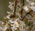
| 04/08/2008 02:45:52 PM | Early springby SoulMan1978Comment: I think you have good technical -- the focus is good, the lighting isn't too harsh, the exposure and white balance are good. I do think the composition hurts it the most.
The bee is almost swallowed up by the flowers and as a result, the technical prowess you exhibited there gets swallowed up as well.
It is *almost* centered which can lead to a "static" feeling to begin with, but it is just a bit off, so it also has a slight unbalanced feeling as well. I think either making the bee completely centered, or leading the composition left or right would at least eliminate one of the distractions.
For me, personally, the shot doesn't say a lot more than "I can take a bee picture in focus" (which is a good thing) or perhaps a bit more emotionally, "Spring is here!" Unfortunately, outside of nature (photography) enthusiasts, there may not be a lot in this shot to grab the viewer and compell them to be moved inside.
If your purpose is to create technically well done and pleasing shots, you have done well. If you want a bit more emotion in your shots, this may fall a touch short. | | Photographer found comment helpful. |
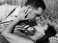
| 04/08/2008 02:26:28 PM | Para Sempre em Amorby JawnyRicoComment: CRITIQUE CLUB CRITIQUE
by karmat
Congrats on a top 20. This is a very nicely done shot and it meets the challenge well.
Compositionally, it is well balanced, I think, between your two subjects. You also fill the frame nicely so that there is not a lot of distracting background. I do find having just the tip of his head cut off, when none of her's is, a bit distracting, but nothing terribly important.
Technically, the focus is great and the "colors" per se, are good. There is a good range of blacks and grays. In looking at it, my eyes try to make the shirt white. I'm thinking his shirt is a colored one, and that will prevent it from being white. I am by no means a craftful BW person, but in looking at the *really really really* good ones, there will be some definite black and some definite whites. Also, the rose is almost un-noticeable. In color, it would probably really add (though I think BW was an EXCELLENT choice), but in bw, it kinda fades away, and at first glance, I thought it was another arm from somewhere. Perhaps if he had been stroking her face as she was his. . .
Still, a great shot.
If I need to further clarify anything, please feel free to contact me.
karma | | Photographer found comment helpful. |
| 04/04/2008 11:04:48 AM | | | Photographer found comment helpful. |
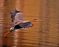
| 04/04/2008 11:00:07 AM | Great Blue Heronby lear202btComment: excellent focus and composition on this one. it does have a bit of an orangish cast and it is difficult to tell if that is on purpose or not. | | Photographer found comment helpful. |
| 04/04/2008 10:58:55 AM | | | Photographer found comment helpful. |
|
Showing 1391 - 1400 of ~9205 |
Home -
Challenges -
Community -
League -
Photos -
Cameras -
Lenses -
Learn -
Help -
Terms of Use -
Privacy -
Top ^
DPChallenge, and website content and design, Copyright © 2001-2026 Challenging Technologies, LLC.
All digital photo copyrights belong to the photographers and may not be used without permission.
Current Server Time: 06/23/2026 07:19:09 AM EDT.
|