|
|
|
Showing 1351 - 1360 of ~9205 |
| Image |
Comment |
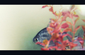
| 04/25/2008 04:39:00 PM | My Worldby freakin_hilariousComment: CRITIQUE CLUB CRITIQUE
by karmat
Compositionally, I really like this shot. I am a sucker for negative space, and I like how everything is on one side of the frame. You can almost feel the fish breaking for the open water there.
Technically, it has the feeling of an underexposed shot that was corrected in pp thereby leaving it with some edginess or graininess. At first glance, I didn't like that. This, I think, is a shot that would have to grow on you, because the more I look at it, the more I think it would work.
It has that "advant-garde" feeling that says, "I wouldn't put it on my wall, but I might put it in a fine art magazine."
Karma |  Photographer found comment helpful. Photographer found comment helpful. |
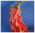
| 04/25/2008 04:31:00 PM | Pepper 1by EstimatedEyesComment: Greetings! I am taking [user]Louis[/user] up on his challenge to comment outside of our comfort zone. That took me to the HDR gallery -- not sure if it is truly outside of my "comfort zone," but I typically don't like HDR stuff. . .
That said, your image caught my eye because it is not the typical application. I honestly think in this instance, it works very well. It adds a lot of definition and depth that may, or may not, have been present without out it. As a result, it almost feels like you can "touch" the pepper. Also, the color combination/contrast is fantastic.
I'm a negative space freak, and i keep trying to visually move this to the left so that there is more open space on the right. To me, it is so centered, it almost feels static. Throwing a bit of "unbalance" in, I think, would help to add interest to the shot.
Great work, btw. | | Photographer found comment helpful. |
| 04/23/2008 11:03:53 AM | | | Photographer found comment helpful. |
| 04/22/2008 04:52:03 PM | | | Photographer found comment helpful. |
| 04/22/2008 04:48:38 PM | WE ARE HERE ...by HeiSchComment: great lighting and color contrasts. I don't care too much for the green stripe in the border, but that is neither here nor there, I suppose. | | Photographer found comment helpful. |
| 04/22/2008 04:47:30 PM | |
| 04/22/2008 04:45:55 PM | | | Photographer found comment helpful. |
| 04/22/2008 04:43:34 PM | |
| 04/22/2008 04:43:20 PM | The Hitcherby David1411Comment: good effect. you chose a good place. the barn speaks of "down home" which would seem to be safe and secure. |
| 04/22/2008 04:42:45 PM | |
|
Showing 1351 - 1360 of ~9205 |
Home -
Challenges -
Community -
League -
Photos -
Cameras -
Lenses -
Learn -
Help -
Terms of Use -
Privacy -
Top ^
DPChallenge, and website content and design, Copyright © 2001-2026 Challenging Technologies, LLC.
All digital photo copyrights belong to the photographers and may not be used without permission.
Current Server Time: 06/23/2026 01:26:08 AM EDT.
|