|
|
| Image |
Comment |
| 08/31/2012 12:20:25 PM | |  Photographer found comment helpful. Photographer found comment helpful. |
| 08/31/2012 12:19:58 PM | OldcarDPCby MJITBComment: Nice subject, nice composition - a little static... | | Photographer found comment helpful. |
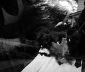
| 08/29/2012 06:06:20 PM | chaotic dynamicalby posthumousComment: Posthumous - we meet again! Two critiques in one sitting?!
Well, it's a dog photo that I like, which is nice. Actually it's almost a collage isn't it - a collection of images, textures and reflections. Organised chaos, or disorganised.
Technically, there is never much to say. I am convinced that this is exactly what you wanted, even to the amount of noise - which just gives us a little more texture to enjoy.
Artistically, you could always hammer this for it's lack of fractals. Maybe they are in there. There is certainly a whole cosmos with a series of elements in there. I reckon it would keep a whole class of arts students busy for a semester trying to dissect it and that has to be a good thing. There is chaos, and in Darcy's eyes perhaps some nervousness. Genius.
I'm glad I came to this last, after seeing your other dog. This definitely engages me more - perhaps I am predictable?!
Happy hunting,
Frank. | | Photographer found comment helpful. |
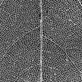
| 08/29/2012 05:56:57 PM | Skeletal Fractal by CrazyDiamondComment: HI Elle, welcome to the Critique Zone!
CrazyDiamond? Crazy fool - how am I supposed to Critique this?
Great choice of subject for the challenge, really well executed. I particularly like how you ignored the compositional rules demanding lines into the corners, third etc and put that stem right down the middle. It works.
Well done, A+. Now go and do it again!
Happy hunting,
Frank. | | Photographer found comment helpful. |
| 08/29/2012 05:45:32 PM | Flower powerby marvinComment: HI Robert, welcome to the Critique Zone!
Great concept / idea, and I disagree with the comment below, it's a pretty good execution.I'm guessing that your score has more to do with voters not getting the link to the challenge than any major problems. What would I do differently, having seen this?
Technically, its a little soft which for such a technical and structured image does not help. You had a tough choice of lenses for this. Did you try the 50mm? I think that the added sharpness and the ability to reduce the DOF would be interesting to try. I don't know how you did the lighting on this, but a little more on the right would also have worked for me.
Artistically, you have really used the rule of thirds to your advantage here - it's great. The perspective, crop and DOF are all spot on. The noise on the right is a little distracting - is this a very tight crop?
Overall, I think that you may have reached the limit of your lens here rather than the limit of your talent and imagination. Time for a new toy?! A true macro lens would probably have let you really nail this. Maybe borrow one? I would like to see that!
Happy hunting,
Frank. |
| 08/29/2012 05:37:44 PM | The Chamberby Ja-9Comment: HI Janine - welcome back to the Critique Zone!
This is definitely a DPC crowd pleaser and a perfect fit for the challenge. I don't think my old laptop screen does it justice to be honest. I need to be on a shiny iPad or something!
Technically, there isn't a thing I would change about this. The sharpness is great, the DOF as good as it can be and the lighting is definitely what sets this apart from the average. Artistically there isn't much to call either. I agree with the comment about balancing this vertically in the frame - it is such a geometric shot that the bigger gap at the top really stands out. Picky, I know... The negative space, on the other hand, is critically important so I don't think that a tighter crop would be a good idea. I'd be interested to see it positioned on the right third rather than the left third but reserve the right to decide that you were right after all!
This is definitely you on form - congratulations!
Happy hunting,
Frank. | | Photographer found comment helpful. |
| 08/29/2012 05:05:58 PM | Conq shell 1by marabu61Comment: Hi Daniel, welcome to the Critique Zone!
Where to start? This is an interesting shot, lots of detail and I think that you have succeeded in achieving the DOF that you were after, so good job there!
Technically, this is not soft at all, I don't know what that comment was about. Focus is very good all the way through. For me, it is the lighting which is a slight problem. Because of the angle of the light, you lose the shadow between the 'layers' of the shell and on the right, they merge into one. It is a very harsh light too, perhaps with too much contrast between the very bright right side and the dark left.
Artistically, this definitely meets the challenge. It's a great subject. I think you would get a very interesting perspective by angling the shell slightly to point to one of the corners, fixing the lighting to drop shadows behind each 'ridge' to get a really deep composition. I also have to admit that I'm not crazy about the blue colouring - perhaps a good subject for black and white?
I hope that didn't sound too negative - it's a really nice shot. I am just trying to find some things which might be of interest to you to try for next time!
Happy hunting,
Frank. | | Photographer found comment helpful. |
| 08/29/2012 04:56:44 PM | Little Boy's Bluesby photokopComment: Hi Mike, welcome to the Critique Zone!
I'll start by saying that I disagree with several of the comments below. Where to start? I think that the fabric up his nose is great - he's a young boy, made of snails and puppy dogs tails etc. He should be misbehaving! Secondly I think that it is a very 'interesting', or rather, captivating portrait with some minor technical issues rather than the other way around.
Technically, it's a little soft. Perhaps because of the very slow shutter? You can totally get away with ISO 400 or even 800 with that camera and some noise reduction software. But I think it is actually a focusing issue because his shoulder is very sharp. Really, it needs to be the eyes.
Artistically, there is much less to say. This is a perfect capture of a personal, candid moment. Your model is so completely natural - one could not ask for better. I personally also like the composition, the angles (making him look just a tiny bit upwards in a plaintive manner) and the crop. Some would say that you have to either include the whole head or crop in more tightly - I would disagree, this works perfectly.
To sum up, a slightly tighter focus on the eyes and perhaps a little more contrast (in PP?) and this is a killer shot. Without them, it's definitely a serious keeper and a reminder or a really great grandparent / kid connection.
Happy hunting,
Frank. | | Photographer found comment helpful. |
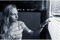
| 08/29/2012 04:46:08 PM | last day at the officeby ytshuvaComment: Hi Kobi - welcome to the Critique Zone!
My first impressions - this is a really nice shot. I have always been a fan of those who can get light to work for them 'photo-graphy' and you definitely have here. But it is a shame about the background. Why couldn't the screen manufacturer have made it a little taller?
Technically, I would have been interested to see this taken at f2.8 just to try and blur out those pot plants. Other than that, the focus is perfect and of course the lighting is what makes it.
Artistically, I would wonder how much to ascribe to you and how much to your model, but looking at some of your other work, either you are very lucky or you have a way of getting your models to give you what you need! This is really natural with a very nicely balanced composition.
I like it, like I said, it's just a shame that screen wasn't a tiny bit higher!
Happy hunting,
Frank. | | Photographer found comment helpful. |
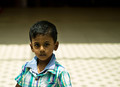
| 08/29/2012 04:32:16 PM | Dark & Lightby saraclicksComment: HI Saravanan, welcome to the Critique Zone!
Interesting idea, a portrait lit from above. Tricky, because of the lighting angle and the shape of the head. Obviously in a traditional portrait the emphasis would be on the eyes (especially for such a cute little guy!) but here that is just where the shadow is guaranteed to fall. Perhaps an opportunity for a story? Something along the lines of the 'forgotten' or 'anonymity'?
Technically, it could be better - it's pretty soft and the lighting is blown out on his shirt. I'm surprised that you went down to f1.8 on this lens. It'll definitely take it but it doesn't give much margin for error. You could easily have stepped down to f5.6, where this lens is razor sharp.
Artistically, for me the real problem is that there isn't a story to follow here. It's a compositional problem - with the eye automatically moving left to right, I prefer an isolated subject at the right (end) of the frame rather than the left (beginning). The light/dark boundary also runs straight through his head, which is unfortunate. And finally, his vertical position in the frame - its very central surrounded by lots of space. Just doesn't grab me.
I'm sorry if this all sounds a little negative - the tweaks to have a really great shot here are pretty small and your model is fantastic - I am sure you could ribbon with him if you keep playing with the settings and shot style. I hope something in this rambling is useful to you!
Happy hunting,
Frank. |
Home -
Challenges -
Community -
League -
Photos -
Cameras -
Lenses -
Learn -
Help -
Terms of Use -
Privacy -
Top ^
DPChallenge, and website content and design, Copyright © 2001-2026 Challenging Technologies, LLC.
All digital photo copyrights belong to the photographers and may not be used without permission.
Current Server Time: 05/25/2026 09:18:37 AM EDT.
|