|
|
|
Showing 101 - 110 of ~1021 |
| Image |
Comment |
| 07/18/2012 11:37:01 AM | OOOH! Colors!by RileyBearComment: Hi Tonya,
Welcome to the Critique Zone! Health warning: everything I have to say is completely subjective...
Fireworks shots are really hard to take - I know, I've tried and I'm no expert, so congratulations on getting this one nailed. Getting the firework shot while still making everything else look good is even harder.
Technically
This is slightly soft - hard to fix in camera so perhaps some PP sharpening to make it pop more? It may also be worth trying to see what happens if you use a tripod and longer exposure (and lower ISO to compensate)
Artistically
There is a lot going on in this shot - between the trees, the second firework and the cable bottom right, the eye is drawn all over the place which does detract from the focus. Difficult to know where the firework is going to off, so one way around this is to take a reasonably wide area and then crop down tight on the bit you want to focus on later - totally possible with the number of Mega Px in a 60D!
This shot looks like a great learning experience - I hope you enjoyed taking it. If you get good at firework shots, let me know and I'll come pestering you for 'how to' advice!
Cheers,
Frank. |  Photographer found comment helpful. Photographer found comment helpful. |
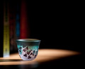
| 07/18/2012 11:14:47 AM | Simplicityby Dr.ConfuserComment: HI Doc, welcome to the Critique Zone (disclaimer: everything below is completely subjective!)
For me, this is so nearly a killer shot. The shape, the pattern and the lighting are really 'zen' and actually change the way I am breathing. Your control of DOF is excellent but I agree with the commenter that I would have preferred to have the rim and pattern really sharp to contrast with the gentle blur elsewhere. For me, the dark pattern provides an ideal focal point, curling perpendicular to the light shape - if you really did not set this up, it is quite some serendipity!
Artistically, I find the yellow book distracting - actually all of them. without then, this becomes minimalist and very beautiful.
All I can say is that your absence has not cost your skill or your 'eye', welcome back!
Cheers,
Frank | | Photographer found comment helpful. |
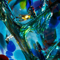
| 07/18/2012 11:08:30 AM | Fantastical lifeby snafflesComment: Hi Susan - I hope that you went and bought this anyway!
What can I say? I like it, but I love shiny things so that was a given. What else can I say?
Technicals
I think that this shot concept really demands razor sharpness and good long DOF and you have delivered both here. The lighting is great with plenty of sparkle.
Artistically
I'm asking myself why this didn't break 6 at least. Hmmm. My best guess is that there is not enough contrast between the T-bar shape at the front and the background glass - more light in one or dark in the other might have helped (in PP I guess?) If I stare long enough, the brown 'lozenge' on the lower right also doesn't seem to quite fit?
Overall, I like it, you like it. Mainly I think that it might be a bit too 'busy' for the voters (checking out the very simplistic concepts in the top ten) but that is their choice and their loss.
Cheers,
Frank | | Photographer found comment helpful. |
| 07/18/2012 10:58:59 AM | A Kissby rooumComment: Hi Clive - surprised to see you looking for a critique?! This is going to be tricky! I'm going to have to nitpick...
Technicals
I'm not sure I have anything to add. Could it be sharper? Probably - but I don't think it would be appropriate.
Artistically
I really like the concept and I'm 99% sold on the result. With the benefit of not being the guy standing on the hill taking the shot and capturing the moment, I would have placed the couple a tiny titchy bit further right and up in the composition. At the moment, my instinct keeps screaming that her foot has been cut off - I know it hasn't but that is the visual effect.
Overall, nice work - I'm sure that the lucky couple were thrilled!
Cheers,
Frank | | Photographer found comment helpful. |
| 07/18/2012 10:44:04 AM | Cousins Catchin' Cricketsby photokopComment: Hi Mike,
Welcome to the Critique Zone! Please remember that this is all entirely subjective...
Technicals
It's a nice, sharp photo and fairly clear. You have all the key points in focus etc. However, given your proven skill in managing the DOF I am surprised that you did not go for a shallower DOF to bring my eye onto the kids and blur out the background which is not that interesting. While there is generally plenty of light, I also would (20/20 hindsight!) have used a little fill flash to light up your grand-daughter's face a little and kill off that unfortunate shadow.
Artistic
I would guess that this is a candid snapshot from the look of it, which is fine as far as it goes but for me the composition doesn't quite work - I find that cutting off the edges of the bodies is a little visually uncomfortable. I would suggest either capturing the entire body or focusing in more tightly and really making me focus on their faces and the great expressions of interest and playing. Perhaps moving away and using your 70-210 racked out to blur out the background and tighten in the field of view?
Overall, it definitely fits the challenge and, as a candid, works quite well but I think that driving the viewers focus more specifically could have resulted in a truly great shot here.
Cheers,
Frank. | | Photographer found comment helpful. |
| 07/05/2011 09:43:42 AM | Absolut: So Good 2 out 5 Can't Resist Drinking Irresponsiblyby aprudhommeComment: Hi Alex, welcome to the Critique Zone!
I think that you are beating yourself up unnecessarily in the photographers comments. This is a really nice shot. Clinical, to be sure, but that's also the nature of Vodka so why not? You seem to be developing a somewhat minimalist, clean style and I, for one, quite like it.
There's really not a lot to critique - you have nailed the technicals from where I'm sitting. The lighting and 'tone' is spot on and whatever PP you have done works well. If I was being picky, the limitations are in the reflections in the bottle (a doorframe on the left and something dark on the right), and in being able to see the edge of the table - but that is really nitpicking - I'm not sure if the rules would allow you to make the table edge shadow disappear but it would be risky.
Overall, a really nice take on the challenge.
Happy hunting,
Frank. | | Photographer found comment helpful. |
| 07/05/2011 09:28:16 AM | Absolut Before: The Root of It Allby adigitalromanceComment: Hi T.Aaron, welcome to the Critique Zone!
What a great idea - kudos to you on both the concept and execution. I think that you pretty much nailed what you were trying to do here so this will be a really short critique!
This needs to be sharp, and it is - a classic example of how the kit lens is so much more capable than it is often credited with. The lighting is spot on, the perspective works etc etc.
You have produced a great illusion - I want to see the bottle even though my brain tells me it isn't there. The only way that this could be better (I don't feel the need for the top right of the bottle to be perfect!) would be if you could arrange an absolut label in the middle - but it would have to be perfect in order to not hurt the rest of the image.
Great job, hopefully a sign of more genius to come!
Happy hunting,
Frank. | | Photographer found comment helpful. |
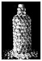
| 07/05/2011 09:10:57 AM | ON THE ROCKSby dreambigxoxoComment: Hi Michelle, welcome to the Critique Zone!
First off, this is a great idea and I am very impressed by the dedication you put into realising your vision. Hopefully you still have the bottle because I think you could re-shoot this (if only for your own pleasure).
Technical: Your aperture is pretty wide for a shot of this nature, and the edges of the bottle are consequently a little fuzzy. I'd have used your 18-55 kit lens instead, set to about f7.1 and done it all with a tripod and delay / remote - that way you get a really sharp image, which this concept demands. The kit lens can be very good, so don't listen to all of the naysayers and stories. With a tripod, you can drop the ISO and use whatever shutter you need - it's still life, it's not going anywhere!
PP: You noted that you desaturated and used brightness / contrast - these are pretty blunt instruments. Have a look at the curves and b/w conversion tools in the lessons on DPC for some ideas on how to retain more control - there is some great knowledge in there. Also worth knowing that re-sizing can destroy sharpness, I always re-sharpen after re-sizing, just a little bot less so it doesn't look crazy.
Artistic: This shot starts from a great point: the glitter and glow, the contrast and lighting are really smart. I think that the perspective could be more interesting though - maybe offset, maybe looking up at the bottle? Something a little more unusual than the every day perspective we might see from our own eyes. Also, on DPC people are really picky and the dented cap is an issue for an 'ad' challenge where the bottle should be new.
I think that with a slight re-framing, this shot could be a killer, although the beads don't look like ice so I would have gone with 'abolut gem' or some such. You clearly have a great eye for the unusual, and I look forward to seeing more of your work.
Happy hunting,
Frank. | | Photographer found comment helpful. |
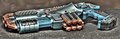
| 07/05/2011 08:29:58 AM | Old Laser Gunby odesukComment: Hi Viacheslav, welcome to the Critique Zone!
Obviously this was not the right shot for the challenge, but putting that aside...
I am not sure what you are trying to do with this shot. If it is an HDR experiment, then for me it is a little cartoony, but I don't know why you would need HDR to shoot this subject, good lighting should be enough. HDR really excels where there are really bright and dark areas which both need to be brought out.
Your lens won't shoot at f1.4, so I suspect that you mean this was shot at f4. Is it enough? Depends on what you are trying to do! The muzzle is out of focus, but that could be intentional. I also think that it is cropped a little too tightly - give it some space!
Anyway, I look forward to seeing some more of your (intentional) work in the future...
Happy hunting,
Frank. |
| 07/05/2011 08:21:33 AM | The Absolut Dad: Always Fun and Drinks Responsiblyby DdhjokerComment: Hi Douglas, welcome to the Critique Zone!
I have a feeling that this might be a long one, so please sit comfortably! Also worth bearing in mind that this is just my opinion and at least one of your other commenters would disagree. To me, this shot looks uncomfortable and a little rushed. There clearly is a story here but I initially thought that it was mostly in the name - it wasn't until I read your extensive comments (thanks for those - really helped me understand what you were going for!) that I 'got' it. Obviously during a challenge, the voters don't have that and will have dismissed this as not meeting the challenge.
Technical: The shot is soft. Likely to be several reasons - your aperture is pretty wide for the Depth of Field that you need, I wouldn't drop below f7.1 for this really. You also mention some resize problems (see below) which can kill sharpness. The lighting is not good - your white balance is off giving this a really amateur 'warm' cast. You could correct this by using custom white balance (see the manual!) or by shooting in RAW and fixing it later, which would be my choice. The Canon DPP conversion tool is really effective, I use that instead of the Photoshop RAW converter so there is no excuse to shoot JPEG really.
Post-Processing: I think that the saturation is over done - this is a really busy shot anyway, and too much colour doesn't help. If you are using photoshop, sharpen using the Unsharp Mask tool at full size, then re-size the image using the image size tool in the 'image' menu (72 dpi and 800px on the long side) and sharpen again, using a smaller radius (0.6px?) and strength (70% or so). Use the 'save for web' command in the file menu and select 'optimise' and set to 300kb. That's how most people do it.
Artistic: The $64billion question... I personally don't like the perspective - it is too commanding and doesn't give the intimate family / drinker feel that I think that this needs. Perhaps making it look as if the viewer (the camera in this case!) is 'at the table' would help? It's also just way too cluttered - without the scattered lego and the tea sets I might have noticed the bottle, but I didn't until after reading your comments. Less is normally more. On the plus side, it does look as if you have a couple of fantastic models who might just help you get some cracking shots in the future!
Hope at least some of this helps.
Happy hunting,
Frank. | | Photographer found comment helpful. |
|
Showing 101 - 110 of ~1021 |
Home -
Challenges -
Community -
League -
Photos -
Cameras -
Lenses -
Learn -
Help -
Terms of Use -
Privacy -
Top ^
DPChallenge, and website content and design, Copyright © 2001-2026 Challenging Technologies, LLC.
All digital photo copyrights belong to the photographers and may not be used without permission.
Current Server Time: 05/25/2026 10:20:43 AM EDT.
|