|
|
|
Showing 741 - 750 of ~994 |
| Image |
Comment |
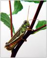
| 07/30/2003 08:55:19 PM | Holding On.... by buzzrockComment: Although I'm not very partial to macros, I cannot deny beauty.
A tad more light on the (foreground) branch/stem and lower legs, perhaps? But even the frame is well chosen, the title brief and apt... > 7 (second place, IMO) |  Photographer found comment helpful. Photographer found comment helpful. |
| 07/30/2003 06:01:50 PM | Fork & Spadeby RichT8496Comment: Clever idea, well executed. Insufficient content for interest though, as a photo. An extra point for humour.
| | Photographer found comment helpful. |
| 07/30/2003 05:41:46 PM | | | Photographer found comment helpful. |
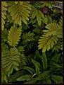
| 07/30/2003 05:38:05 PM | Through the weedsby HavokComment: Sharp, decent tonality retained in the b & w, a mode very apt for an emphasis on these variegate forms. Perspective and depth, particularly, are made to be 'felt'.
There points of slight overexposure here and there. Negligible, given the range of greys. | | Photographer found comment helpful. |
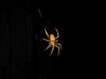
| 07/30/2003 05:25:57 PM | I'm Waitingby freeride21aComment: This is, really, a wonderful photo, revealing only what is essential, and that beautifully, but...
I wish the spider appeared much bigger (!) and bolder. It's also a lil too centered within the frame, to my taste. |
| 07/30/2003 04:54:57 PM | The First Mistakeby PSUBeckerComment: Artistically, the capture appears quite posed and clicheesque without adding any other feeling or sense. The (given) facial expression is too trivially vacuous to convey anything beyond the factual visual data contained in this shot. I'd prefer to see the subject more to the left within the frame, in order to provide ample space for the eyes to view.
Technically, the dof is too shallow to clearly create an association between the grapes and (current) subject. To achieve this, IMO, would add a vital element, presently lacking.
Ideally, the background could be significantly more blurred, also, which may be partially accomplished by increasing the dof toward the foreground.
I would suggest to step down the exposure to avoid the light burns on the leaves in the foreground. Message edited by author 2003-07-30 16:55:47. | | Photographer found comment helpful. |
| 07/26/2003 05:32:14 PM | Cubisim Art Trendby patriciabrown2001Comment: An connoisseur would consider cubism a 'movement' rather than a 'trend'. The clock in this capture is certainly 'trendy', although not purely 'cubist'.
As a photo, the approach here is straigthforward enough. Outside and beyond the challenge, I doubt it can support a life on its own. | | Photographer found comment helpful. |
| 07/21/2003 01:35:18 AM | Rush and Recessby zeuszenComment: While I accept anyone's aesthetic preference, the effect you refer to was needed to emphasize the perceived surrealism inherent in the given (prior to camera interference) scene (the overly rich hues, the white chests of the pidgeons in the distance). Without it, this critical element would have been lost.
The photo was taken early in the day, btw.
|
| 07/21/2003 12:45:51 AM | Rush and Recessby zeuszenComment: Evaluating the stats:
I see forty votes in the 1 - 3 range, sixteen of which are 1's. A near equal number of voters awarded a rating between 6 and 10. The discrepancy is not quite clear to me.
Six (6!) voters commented, three of which I marked as 'helpful'. The remaining three comments were not at all helpful, since no reason(s) was (were) given to substantiate the judgements expressed. One was clearly uninformed and a little too personal and derogatory to reflect anything sincere or warrant a response. Message edited by author 2003-07-21 00:46:47. |
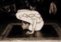
| 07/16/2003 11:22:07 PM | As round as she can go!by cloud9Comment: The photo seems overly manipulated (\"pushed\") without achieving a satisfying \"external\" aesthetic. Items, in the background, remain sufficiently lighted for a conspicuous ambiguity. The edge of the frame or table top (foreground) is overexposed, rendering a distraction. Framing and composition, too, are awquard (almost corner to corner > bottom left - cut off > bottom right). The subject is centred, which might be justified for an object with an entirely \"contained' dynamic and without the given larger perspective (beyond the foreground rectangle). There's also a fair amount of noise in the photo, likely due to post processing.
Despite all these apparent flaws, the capture itself is remarkable. Apart from the astounding physical feat presented here, the subject's concentration and discipline are clearly caught. The timing of the shot, also, is marvellous (note the left hand and fingers and the perfectly tuned light on this detail).
I could imagine intending to incorporate \"some\" of this capture's flaws to place the photo within the context of an old pictorial from far-away lands... (or to hide an all to obvious talent). Still, the application of such artifacts here, if in fact there is one, is excessive. > 6 | | Photographer found comment helpful. |
|
Showing 741 - 750 of ~994 |
Home -
Challenges -
Community -
League -
Photos -
Cameras -
Lenses -
Learn -
Help -
Terms of Use -
Privacy -
Top ^
DPChallenge, and website content and design, Copyright © 2001-2026 Challenging Technologies, LLC.
All digital photo copyrights belong to the photographers and may not be used without permission.
Current Server Time: 07/26/2026 01:48:08 PM EDT.
|