|
|
|
Showing 701 - 710 of ~994 |
| Image |
Comment |
| 09/03/2003 12:18:30 AM | |  Photographer found comment helpful. Photographer found comment helpful. |
| 09/03/2003 12:16:44 AM | |
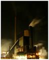
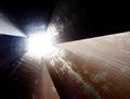
| 09/02/2003 11:11:09 PM | The tool makers forgeby ozthunderComment: This remarkable photo suffers from a number of significant problems, some of which may be challenging to remedy without sacrificing its essence and difficult beauty.
Light and dark are unbalanced, with most of the light concentrated at the bottom of the image, extending to the very edge of it and in several places. Except for a blown swath from the lower chimney (right) and an ambiguously faint one from the taller chimney (left), the structure of which, itself, is barely bright enough to be visible.
I also question the inclusion (partly by choice of perspective?) of the busiest area, and its blown-out illumination in particular, at the very bottom of the photo.
The horizontal line (causeway?) running perpendicular to and then into the border (bottom left to bottom centre) only stresses an unfortunate composition (here). As a dominant horizon line, it appears at the foot of the image, meeting the border. Yet the whole shot appears aligned between the vertical borders and the taller chimney on the left.
In fact, all efforts and attention seem to be bent on rendering a particular painterly effect in areas conducive to the task (the centre third, horizontally).
Here, however, the image achieves a superbly satisfying dark aesthetic. The warm muted tones (surfaces) brought out by the surrounding black, with a single swath of smoke sufficiently illuminated to show which way the wind blows. This and the given arrangement of surfaces, almost textureless tones, to me, are a rare find indeed and worth struggling with this entry. | | Photographer found comment helpful. |
| 09/02/2003 10:49:46 PM | Harnessing the old stalkby Dim7Comment: The subject is unique, the capture holds considerable interest. The photograph should be considered 'art', for these reasons alone.
Technically, exposure/contrast are too high, perhaps. I'd also prefer a more generous crop, subordinating the subject to the wonderful pastoral environment and allowing more directional space at the left of the photo. Personally, I'd definitely consider re-taking this shot several times, preferably at dawn or dusk (for the light) from varying perspectives. > 6 |
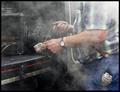
| 09/01/2003 11:44:44 PM | Hot Workby ImagineerComment: The steamy ambiance together with such well-oiled solidy (iron, copper, brass, leather) suggests a hands-on railroad idyll a la Kerouac. Such soiled elegance in black, red and white would credibly be serviced by a man in denim. Having only been a passenger on a train, I can't tell what the tool is or does. What the image does give me as a whole, is what it must be like (I can almost smell it too) to be a railroader.
If I strained to find one fault, I'd say the photo weighs a little too much to the left, likely due to the 'very light' section in the upper right of the picture. | | Photographer found comment helpful. |
| 09/01/2003 09:47:12 PM | "We don't need no education"by ellamayComment: Wonderful typecast for this role (well ;-) except for the pale blue beauty with necklace who's icecream is probably melting close-by)! I like broken-up group photography vs. a centrally composed background, the props and vivid colours vs. the pastels of the wall, the lines of which approach thirds. The most frontal face (shades) seems to draw an upward light, as from a reflection on the ground (?), adding her own character.
I do wish the shot were a tad sharper.
|
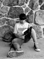
| 09/01/2003 09:35:15 PM | Quiet Moment Between Classes.by SonifoComment: A credible straightforward shot with a very 'real' feel to it, technically aedequate.
I admit that the wall is not without interest, but question the need to iclude as much of it as has been done. I feel similarly about the central composition, given the restful, uneven posture and casual attire of the subject. I can imagine a more charged and less static image, if the rule of third had been considered for this picture.
I like the choice of b & w. It's less likely to be viewed as a snapshot and, instead, seasons the picture.
| | Photographer found comment helpful. |
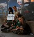
| 09/01/2003 05:51:43 PM | Back to Schoolby mgkarimiComment: Refreshing image capturing more than what one expect, given the (topical) invitation to produce a clichee. Technically, I consider the photo a little dark and have some reservation about the large DOF, icluding so much of the background. I would, perhaps, wish for a slighter sharper focus of the faces. The sign the is hilariously effective here, given the trend.
All in all, a worthwhile piece of photojournalism with a strongly contemporary subject.
| | Photographer found comment helpful. |
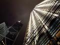
| 09/01/2003 04:28:52 PM | Inside Pentagonal Towerby ImagineerComment: Beautifully balanced light/dark composition. The deliberately (?) overexposed sky adds a flat dimension to an otherwise spatial image, encouraging attention to texture and its corresponding patterns. The tension between these two elements makes for a dynamic photo rich with the kind of utilitarian/industrial detail not only a minimalist will enjoy. Remarkable, IMO, is the distribution of available light in this capture.
Certainly NOT an avarage shot.
Zeus' Top Pic(k)s: 3rd Place | | Photographer found comment helpful. |
| 09/01/2003 03:24:40 PM | Bank Of China and Cheng Kong of Hong Kongby justesmeComment: Powerful and contemporary interpretation of the challenge topic! The dizzying perspective proves apt here to achieve a sheer monolithic impact. The lighting is kept suitably harsh to prevent a too easy and pleasing impression. There are no distracting technical flaws, that I can detect. Outstanding!
The Colour of Money would make a plausible an alternate title (for prosperity), even though your choice is a good one for the challenge, IMO.
• Zeus's Top Pic(k)s: 2nd Place Message edited by author 2003-09-01 15:25:56. | | Photographer found comment helpful. |
|
Showing 701 - 710 of ~994 |
Home -
Challenges -
Community -
League -
Photos -
Cameras -
Lenses -
Learn -
Help -
Terms of Use -
Privacy -
Top ^
DPChallenge, and website content and design, Copyright © 2001-2026 Challenging Technologies, LLC.
All digital photo copyrights belong to the photographers and may not be used without permission.
Current Server Time: 07/26/2026 02:49:09 PM EDT.
|