|
|
|
Showing 291 - 300 of ~994 |
| Image |
Comment |
| 01/28/2007 01:35:12 PM | |  Photographer found comment helpful. Photographer found comment helpful. |
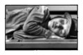
| 01/19/2007 11:40:33 PM | Meby walrus451Comment: Considering the quality of this image, I'd have the title as subject 'I'. "Me", IMHO, would suit something less consciously composed and cared for. Personally, I'd choose a formal name (first and last) to restore the honesty the glasses robbed your subject of.
An interesting juxtaposition of genres, btw, cropped to leave no doubts. -
Treatment, too, is aptly pushed and contained. -
Texture, tone and line stand out as if in a fashion shot. -
The dominance of the veiling elements (shades and hood) together with the tight, straight-on take and near-discomforting proximity of the subject amplify the underlying, inherent dualism that make this image and provide its mysterious energy. | | Photographer found comment helpful. |
| 01/09/2007 04:11:54 PM | i walk on the airby SkipComment: perfect and pure.
apt title. nice
expanse of tonal range
within limited scale.
liberating. atmospheric. breathable
emptiness.
who
does not have
an appetite for
a clean place with
a malleable
view? Message edited by author 2007-01-09 16:14:14. | | Photographer found comment helpful. |
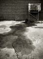
| 01/07/2007 05:44:37 PM | Stainby RKTComment: I love this capture for its quirky composition and expansive depth of field, which strips it of the usual selective emphasis on an isolated physical subject. Instead, I feel encouraged to explore the tonal and textural qualities of the entire vista, leaving me to elect my own gusto and ways without the familiar prompt.
Neither can I tell what's behind the delectable poise of contrast by field and edges (sharpening), which appears to offer me a canvas and easel bearing a primitive art made of a vacated oil drum placed vicariously at the edge of some post-industrial idyll.
While this strikes me as hardly the image benefitting from considerations external to itself, I feel it could be improved by balancing tilt (angle) and horizontal distortion discernible in the lines of the brick wall.
I envy the eye that saw a photo here and appreciate the deductive treatment that made it an art. | | Photographer found comment helpful. |
| 01/07/2007 05:44:28 PM | Joy of Speedby gocComment: Ah...
lovely, radiant, quirky, wonderful slight-of-hand: a classic!
Thank you. | | Photographer found comment helpful. |
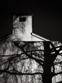
| 01/07/2007 05:34:47 PM | Dby GnarfComment: A remarkable image, well seen and so nearly well composed, I feel prompted to comment.
As the horizontal division of the portrait format into two equal panes appears naturally dictated by givens of the subject (and its parts), the remaining negative space in the upper half could (and, to my senses 'should') be trimmed to suit a 1/3 - 2/3 proportion in this section. This (IMO) would introduce a tension (a more dynamic force) to the image which is not there, if the two sections remained balanced (as presented). Also,
the roof line of the wall is slightly, albeit critically tilted, which could easily be corrected by rotating accordingly.
A little dodging (or some other means of revealing the deteriorated outlines in the middle and upper half, especially toward the left) may benefit a clearer and quicker appreciation of the compositional geometry which is so superbly ordering the chiaroscura on the walls (both bottom and top).
A remarkable image, worth more than words, nevertheless. |
| 01/07/2007 04:20:22 PM | Tour de Soleilby PhotologistComment: An enjoyable photograph for everyone, well seen, composed and rendered, and...
and outstanding stock photo. | | Photographer found comment helpful. |
| 12/24/2006 10:23:52 PM | | | Photographer found comment helpful. |
| 12/24/2006 10:21:48 PM | fRaGiLE........please take a closer lookby LOWLANDSComment: Seeing it expand from the thumbnail, I laughed out loud.
(I don't laugh too often, certainly not out loud, these days).
And, really, there's nothing funny about the photo. I am, apparently,
laughing for no other reason.
-There is no ego in this image, either - wonderful! Message edited by author 2006-12-24 22:52:25. | | Photographer found comment helpful. |
| 12/06/2006 11:21:18 PM | O N Eby BradComment: 1/4000, huh? I use that for hummingbirds on Ritalin.
That's quite a decent bouquet. | | Photographer found comment helpful. |
|
Showing 291 - 300 of ~994 |
Home -
Challenges -
Community -
League -
Photos -
Cameras -
Lenses -
Learn -
Help -
Terms of Use -
Privacy -
Top ^
DPChallenge, and website content and design, Copyright © 2001-2026 Challenging Technologies, LLC.
All digital photo copyrights belong to the photographers and may not be used without permission.
Current Server Time: 07/26/2026 06:42:01 AM EDT.
|