| Image |
Comment |
| 04/08/2008 11:34:33 AM |
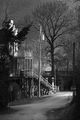
215 Kilby Rd.by zeuszenComment: Yes, I was expecting objections to the dominance of the power pole in the image. Funny thing though, it was the power pole that prompted me to take the picture. I should have, perhaps, chosen a title that would have made this a little clearer for some.
But then, I'm glad I didn't pander to demos. Message edited by author 2008-09-04 19:42:30. |
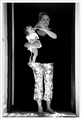
| 04/07/2008 07:17:23 PM |
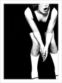
NC-17by grigrigirlComment: Energy/Range/Story: 8/7/7
Composition/perspective/manner: 5/5/6
Aesthetics/Technical:6/6
Presentation: 6
Total:6.2
Vote: 6
Remarks: a genuine candid! I like the light mood and the inclusion of the spectators, especially the contorting figure on the extreme right. I can't tell, if the title is a private reference or not. If it is, I'd consider either a more universal one or a real doozie. A perfect piece of journalism and worth a ribbon, in my book. |
 Photographer found comment helpful. Photographer found comment helpful. |
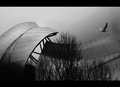
| 04/07/2008 12:46:10 AM |
Memories of Flightby pointandshootComment: I gave it a 6, ranked it 3rd in the challenge and left the honours to posthumous who must have squandered all his ribbons. (I also liked the "No bugs" comment, below). Message edited by author 2008-04-07 00:47:12. |
| Photographer found comment helpful. |
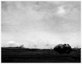
| 04/06/2008 12:59:15 PM |
high flungby skewsmeComment: Energy/Range/Story: 6/7/6
Composition/perspective/manner: 6/6/7
Aesthetics/Technical:6/6
Presentation: 6
Total:6.2
Vote: 6
Remarks: The letter box, IMO, is a critically apt choice for this image. It prevents the sky from dissolving into the page and provides just the right amount of balance to force the eye into the gist of things, instead of allowing it to hunt for detail in the blocked shadows at the bottom. I found that my appreciation of the mysterious abstract qualities (via line, tone and gradient texture) increased significantly with greater viewing distance. -The photo holds a greater personal appeal for me than reflected by the stats (above), which are meant to be less subjective... |
| Photographer found comment helpful. |
| 04/05/2008 12:37:43 AM |
Between the light and the shadowby onarComment: Energy/Range/Story: 6/7/6
Composition/perspective/manner: 6/6/9
Aesthetics/Technical:9/8
Presentation: 6
Total:7
Vote: 7
Remarks: O God, great stuff. Thanks. Hallelujah! |
| Photographer found comment helpful. |
| 04/05/2008 12:29:15 AM |
Choir Boyby JutildaComment: Energy/Range/Story: 7/6/6
Composition/perspective/manner: 7/6/7
Aesthetics/Technical:7/5
Presentation: 7
Total: 6.4
Vote: 6
Remarks: Fun(ky), bold and great graphic energy. Effective title. |
| Photographer found comment helpful. |
| 04/04/2008 11:54:57 PM |
Watching the Dancersby OmanOtterComment: Energy/Range/Story: 6/6/6
Composition/perspective/manner: 6/6/5
Aesthetics/Technical:6/6
Presentation: 6
Total:5.9
Vote: 6
Remarks: Perhaps due to one viewers unfamiliarity with both setting and subject(s), the image holds a photojournalistic interest. I'm looking forward to the dancers. :) |
| Photographer found comment helpful. |
| 04/04/2008 11:42:38 PM |
Winter's Last Gaspby KenComment: Energy/Range/Story: 6/6/5
Composition/perspective/manner: 6/7/6
Aesthetics/Technical:6/8
Presentation: 6
Total: 6.2
Vote: 6
Remarks: I suppose my personal taste for tone-mapped photos (?) is a little restrained by a little too much of a good thing. Here the landscape has survived the technique, not only intact but with good detail and a credible colour store.
A quiet shot, clearly composed and enjoyable. |
| Photographer found comment helpful. |
| 04/04/2008 11:41:15 PM |
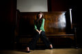
not for longby mayizeComment: Energy/Range/Story: 6/8/6
Composition/perspective/manner: 6/6/9
Aesthetics/Technical:7/5
Presentation: 6
Total: 6.5
Vote: 7
Remarks: The lighting is a little harsh, lens distortion discernible, horizontal tilt too subtle for an obvious deliberation, and it all works! The laissez-faire pose certainly benefits from such a manner! -Where it doesn't so much shine (pun intended) as convincingly is by the sizable reflection in the varnish of the otherwise grand wooden bench and by some loss of detail on the lighted parts of the subject's face.
The photo appeals to me immensely. I like the classic wide-angle approach for its genre-independent
impression and its greater integration of a subject into its environment. |
| Photographer found comment helpful. |
| 04/04/2008 12:10:27 AM |
Spring is here!by SaraRComment: Energy/Range/Story: 6/6/6
Composition/perspective/manner: 6/7/6
Aesthetics/Technical:8/7
Presentation: 6
Total: 6.4
Vote: 6
Remarks: An illustration, really, but a rare, magical one! |
| Photographer found comment helpful. |
Home -
Challenges -
Community -
League -
Photos -
Cameras -
Lenses -
Learn -
Help -
Terms of Use -
Privacy -
Top ^
DPChallenge, and website content and design, Copyright © 2001-2026 Challenging Technologies, LLC.
All digital photo copyrights belong to the photographers and may not be used without permission.
Current Server Time: 07/26/2026 05:34:33 AM EDT.