| Image |
Comment |
| 05/07/2004 06:55:47 PM |
Reflectionsby kosmikkreeperComment: Reflections on moving water are always interesting. Great colour, however there is not much contrast in the green areas. You might want to try this again in Autumn for the colours. 7 |
| 05/07/2004 06:18:51 PM |
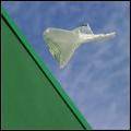
Freedomby leafComment: The colours here strike me and the diagonal line adds some drama, however the image as a whole does not work for me. Maybe without the plastic bag... Just a thought. 6 |
 Photographer found comment helpful. Photographer found comment helpful. |
| 05/07/2004 06:07:05 PM |
Tulipby NeilComment: Wispy and well balanced. Reminds me of a silk scarf.
|
| Photographer found comment helpful. |
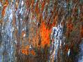
| 05/07/2004 05:58:30 PM |
two colors or perhaps moreby eirasiComment: Colour and exposure are good, however the composition seems a little out of balance. This could be that the transition line between the grey and red is a bit too close to center.
The texture on the left with the specs of orange is wonderful. An image with just this part of the image may have worked better. 5 |
| Photographer found comment helpful. |
| 05/07/2004 10:33:04 AM |
Rusty's paintingby dorinnComment: The colours are nice and vibrant, however it's hard to judge the focus and exposure due to the small size of the image. It looks like there may be a few hot spots in the brighter areas.
This subject may have worked well in a vertical (portrait) composition due to the vertical lines in the image. It may have had more impact that way. 5 |
| 05/07/2004 10:29:06 AM |
Watering The Plants by JasComment: The water droplet is clear and sharp. Having it centered however seems to make the image rather static. Maybe a different perspective (maybe at the level of the holes) could help make the image more dynamic as well. 6 |
| 05/07/2004 10:24:10 AM |
Abstract in Perspectiveby pumaComment: The colours are nice, however, having the image a little less out of focus may have drawn them out more. Also, it seems to be cropped slightly too much on the bottom. 6 |
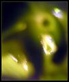
| 05/07/2004 10:19:34 AM |
Lightby MonaComment: Interesting use of shallow DOF. It might have worked better if only one point was in the band of actual focus. The additional points of focus are a bit distracting. Also, the transition from focus to out of focus seems a bit abrupt. Maybe having a background that was slightly less blurred would of helped. 6
|
| Photographer found comment helpful. |
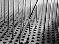
| 05/07/2004 09:22:17 AM |
Guide Rail..by toddheadComment: I get a great sense of depth from this image. Well done with the DOF. The main vertical bar seems a bit too central therefore making the image seem a little unbalanced. Exposure is good. Not blowing the highlights on reflective surfaces can sometimes be a challenge. 7 |
| Photographer found comment helpful. |
| 05/07/2004 09:16:14 AM |
Coloursby agwrightComment: Tulips always have such wonderful colour. The curved lines shown here give a sense of tranquility (IMO). It might have worked even better without the stamen on the left. The DOF and exposure seem to be bang on. 7 |
| Photographer found comment helpful. |
Home -
Challenges -
Community -
League -
Photos -
Cameras -
Lenses -
Learn -
Help -
Terms of Use -
Privacy -
Top ^
DPChallenge, and website content and design, Copyright © 2001-2026 Challenging Technologies, LLC.
All digital photo copyrights belong to the photographers and may not be used without permission.
Current Server Time: 06/22/2026 06:07:44 PM EDT.